Safier Mediterranean Deli
Safier makes really great Mediterranean food. Trust us, the food speaks for itself. During one of our frequent visits to the cafe, a casual conversation revealed the restaurant had been acquired by new owners who wanted a new, bold look to elevate the experience.
THE CHALLENGE
Not your typical Mediterranean Café
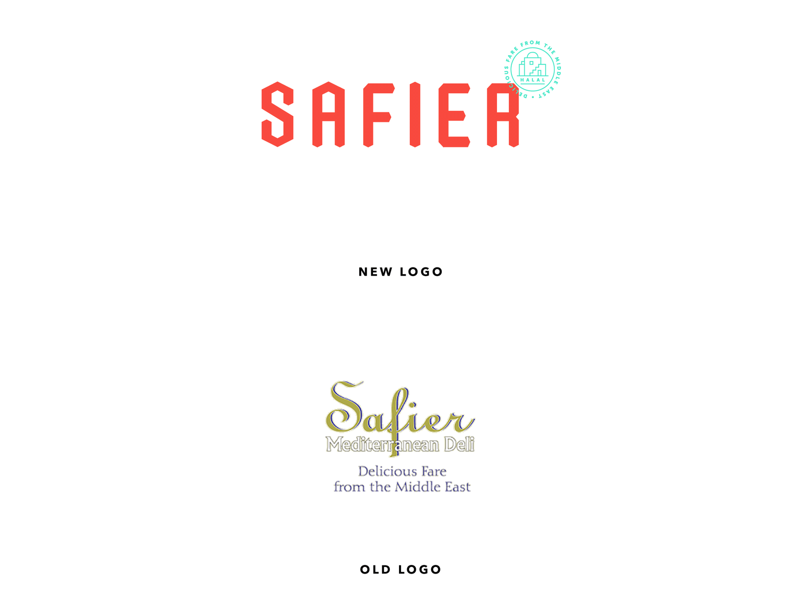
Under new ownership, Safier Mediterranean Deli wanted to separate themselves from the previous brand and to look different from what you see at most Mediterranean restaurants. They wanted to communicate a new Safier in a way that would be bold and stand out from what you see at most Mediterranean restaurants.
THE APPROACH
A true team effort
From the start, as with all our identity projects, we dived right in and researched other cultures and countries, similar restaurants and varying trends in the industry and outside it. This research is always important for creating a new brand that stands out among its competitors.
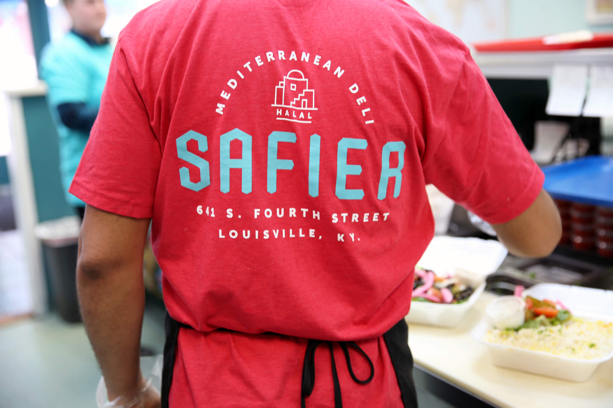
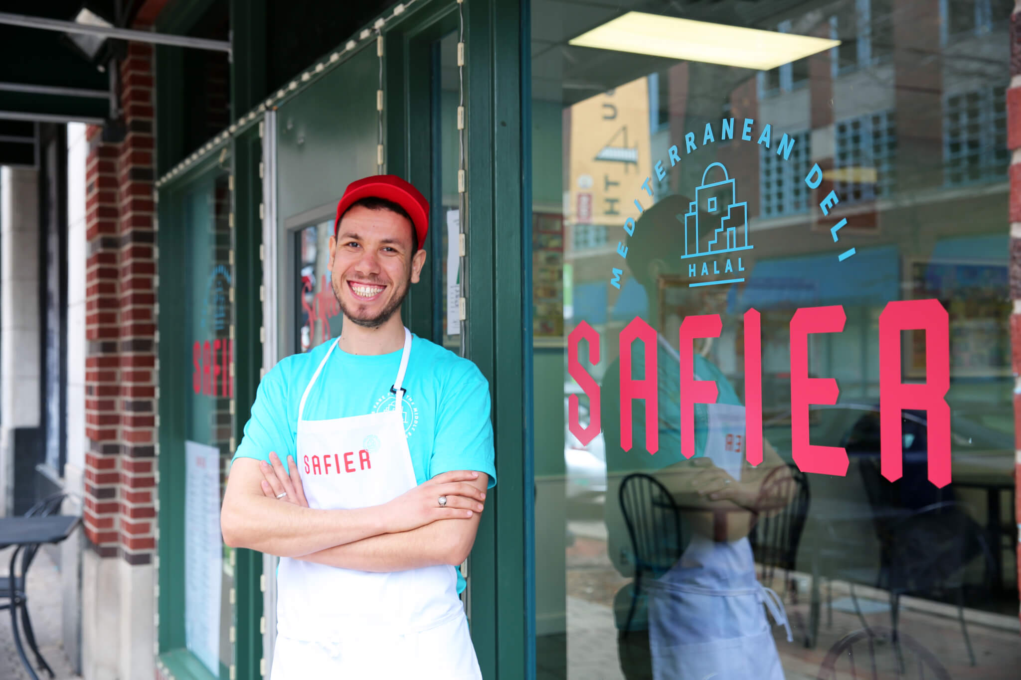
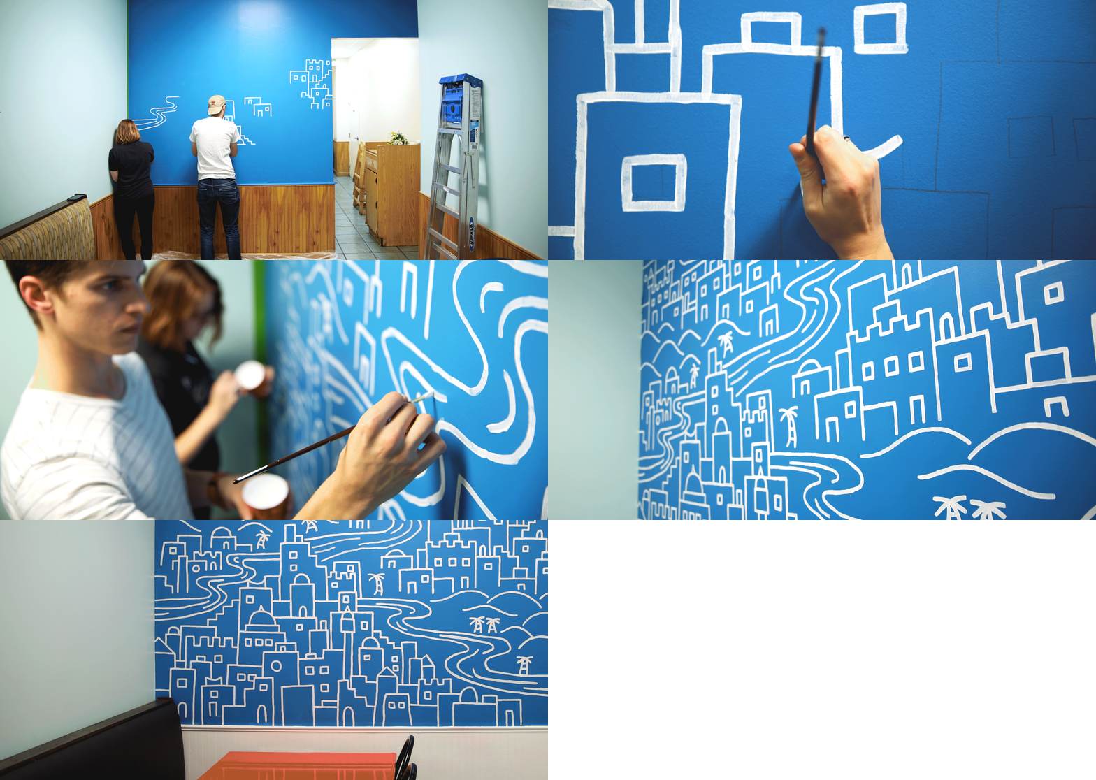
The final logo is bright and modern with a touch of influence from its Mediterranean culture. The geometric letterforms are derived from the Moroccan architecture and tile patterns seen throughout the country. In addition, our team created a mural in the restaurant interior. The overall look is more modern and sophisticated, helping to set the expectations of the experience and matching the quality of their amazing food.
THE RESULTS
The new go-to for Mediterranean cuisine
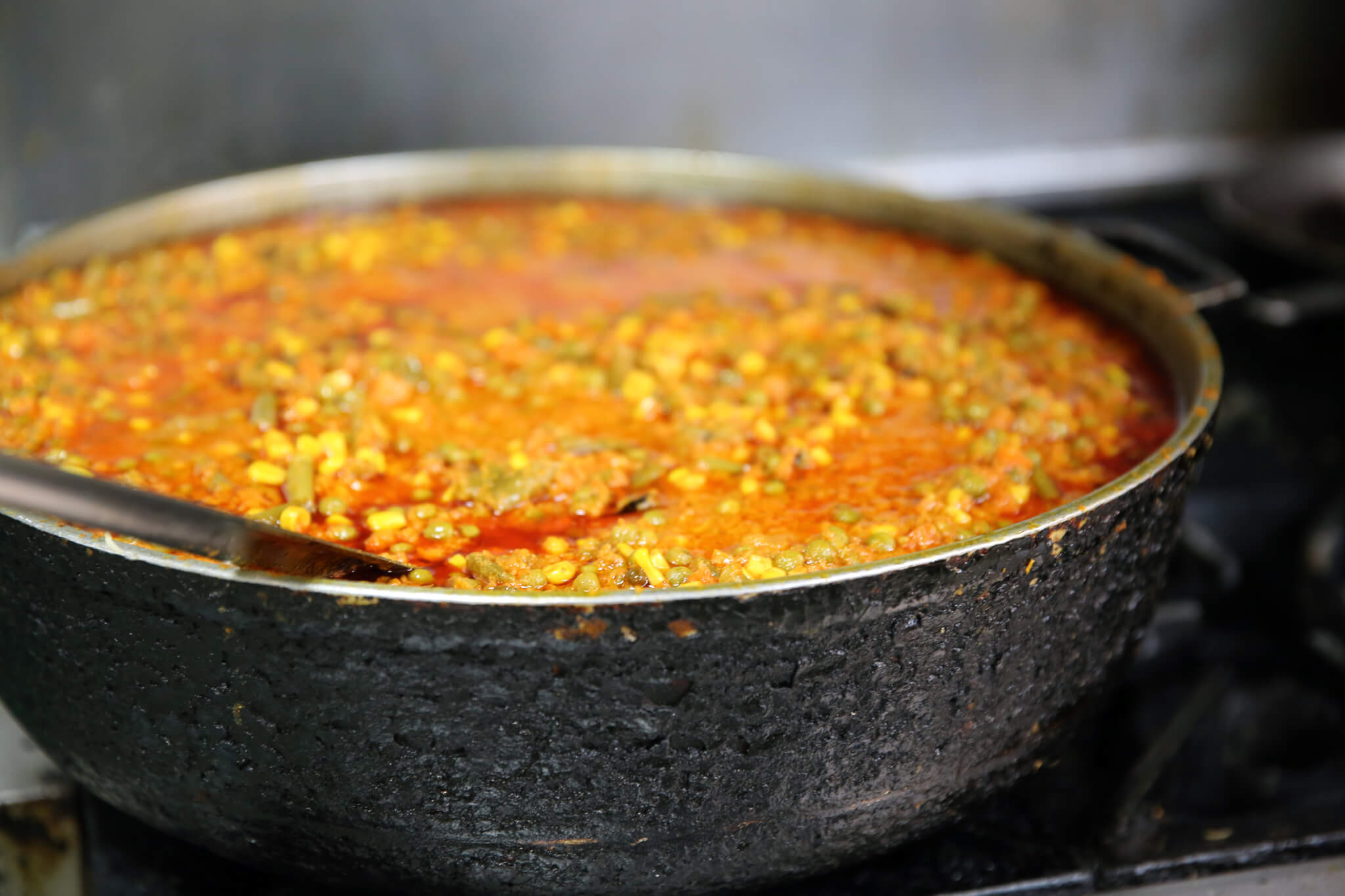
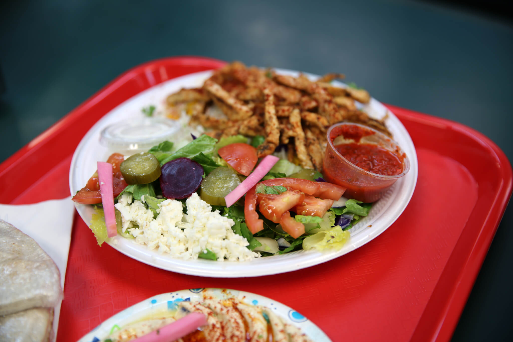
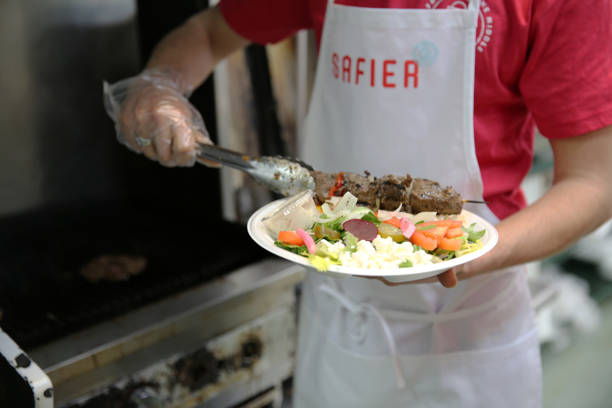
The new owners and their entire team really love the new brand. It elevates the overall experience for patrons and has increased business, with the restaurant receiving rave reviews about the food and decor. Safier is now a LEO Weekly Readers’ Choice winner and garners hundreds of 4- and 5-star reviews on popular sites.

Fieldtrip is absolutely the best team. I have had such a beautiful experience with them.
