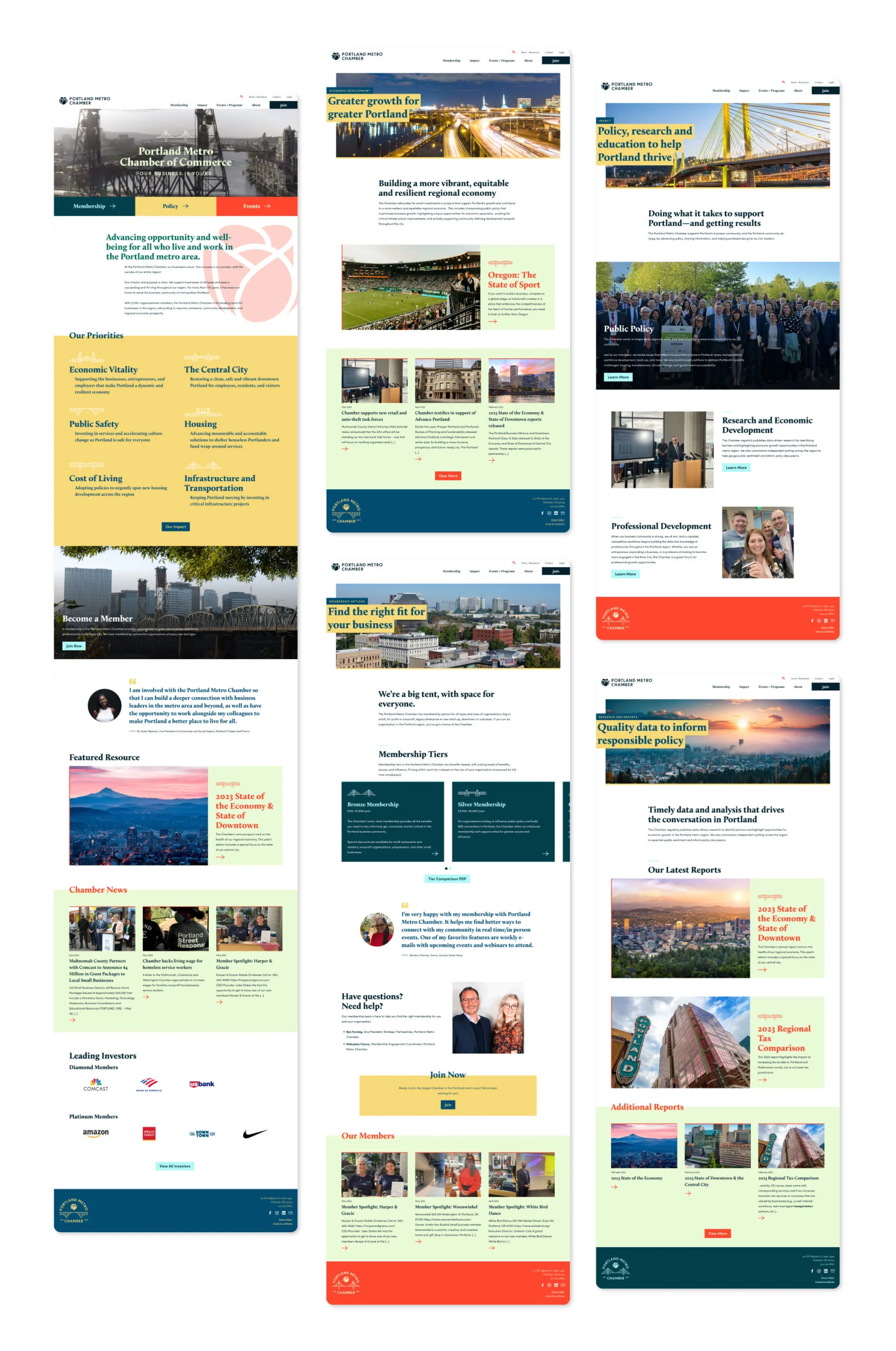
Portland Metro Chamber: Brand and Website
The Portland Metro Chamber is the chamber of commerce for the greater Portland, Oregon area. They are uplifting the entire region, building on the strengths of the vibrant community, and connecting businesses to the people and communities that support and benefit from them.
The Challenge
Unifying a tight-knit yet diverse community.
Portland, Oregon relies heavily on small businesses and large corporations, however these groups often have opposing policy, politics, and economic development priorities. Additionally, the city is known for a sometimes adverse attitude and distrust towards larger businesses. The Portland Metro Chamber (PMC) needed to build a brand could bridge both sides of this economic and cultural divide, and become a key part of advancing the wellbeing of both the region’s residents and businesses.
Additionally the organization was held back by a complicated brand architecture with multiple sibling organizations, and overlapping areas of branding, goals, and responsibilities. Their former name “The Portland Business Alliance” also disguised the organization’s role as a true chamber of commerce. The PMC needed a new face, and a new sense of clarity and purpose.
The Approach
Invest in the future.
Our first step was to immerse ourselves in the city and develop a solid understanding of the chamber and its audiences. A four-day workshop with stakeholders, field trips, and member panels yielded the audience’s needs, motivations, and obstacles influencing website priorities and purpose.
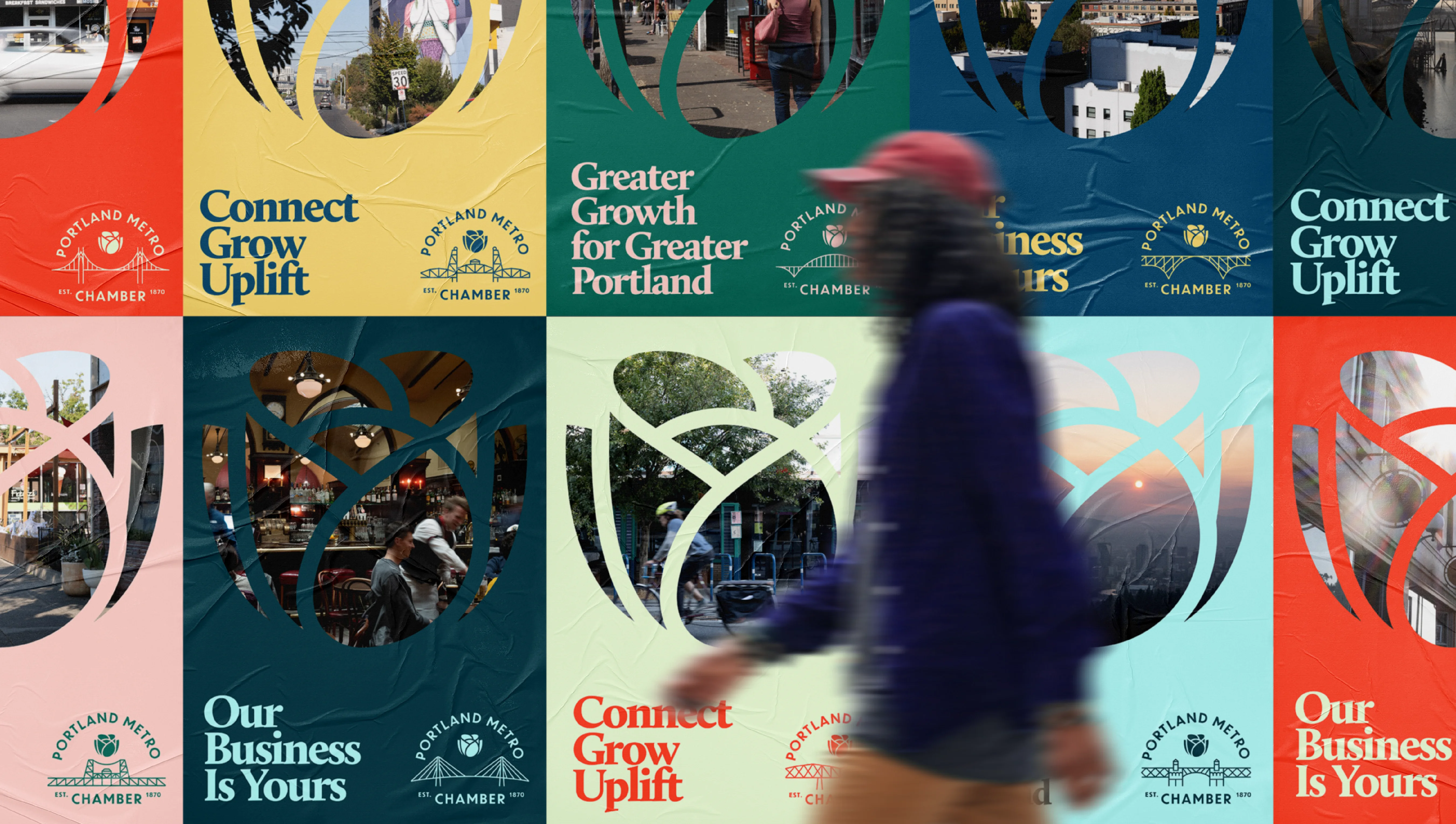
The organization was renamed from Portland Business Alliance to Portland Metro Chamber as the research identified a gap in the understanding that the organization is the Chamber for the Greater Portland Area. The new brand leaned into civic pride and highlighted locally-loved Portland visuals and the unique personality of the city’s citizens. Informed by audience insights, Chamber leaders restructured membership levels and benefits to fit needs and expectations. Membership benefits, policy work, professional development, and networking events were prioritized to demonstrate impact and reasons to belong.
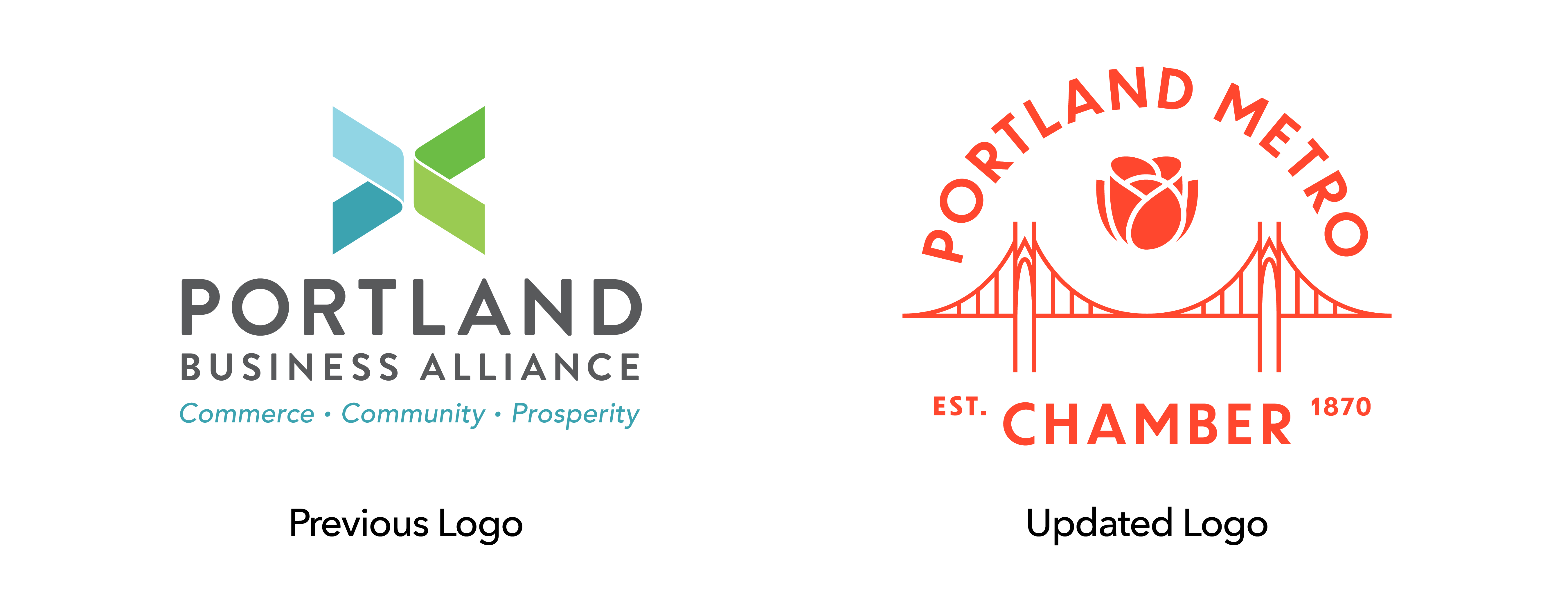
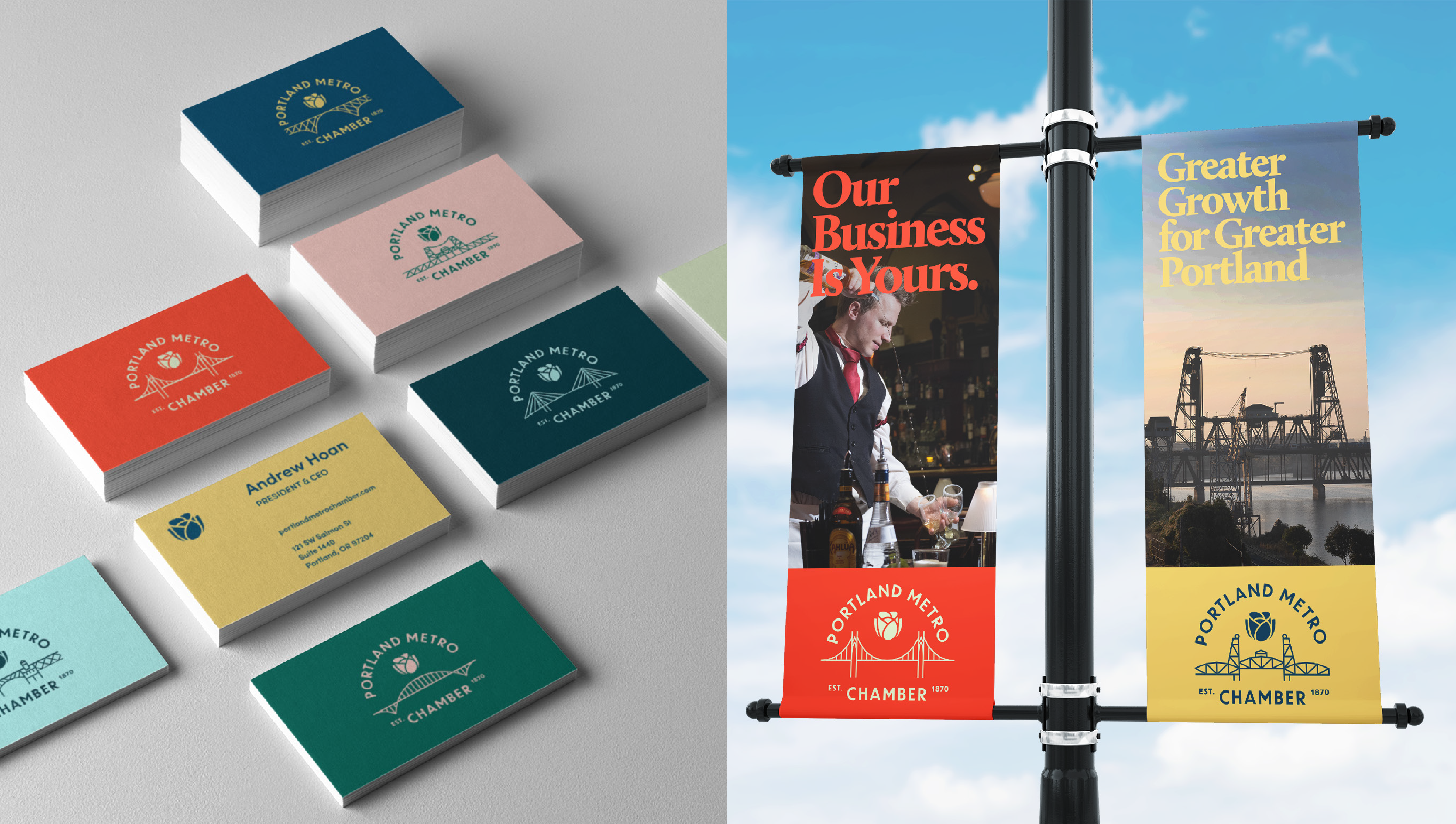
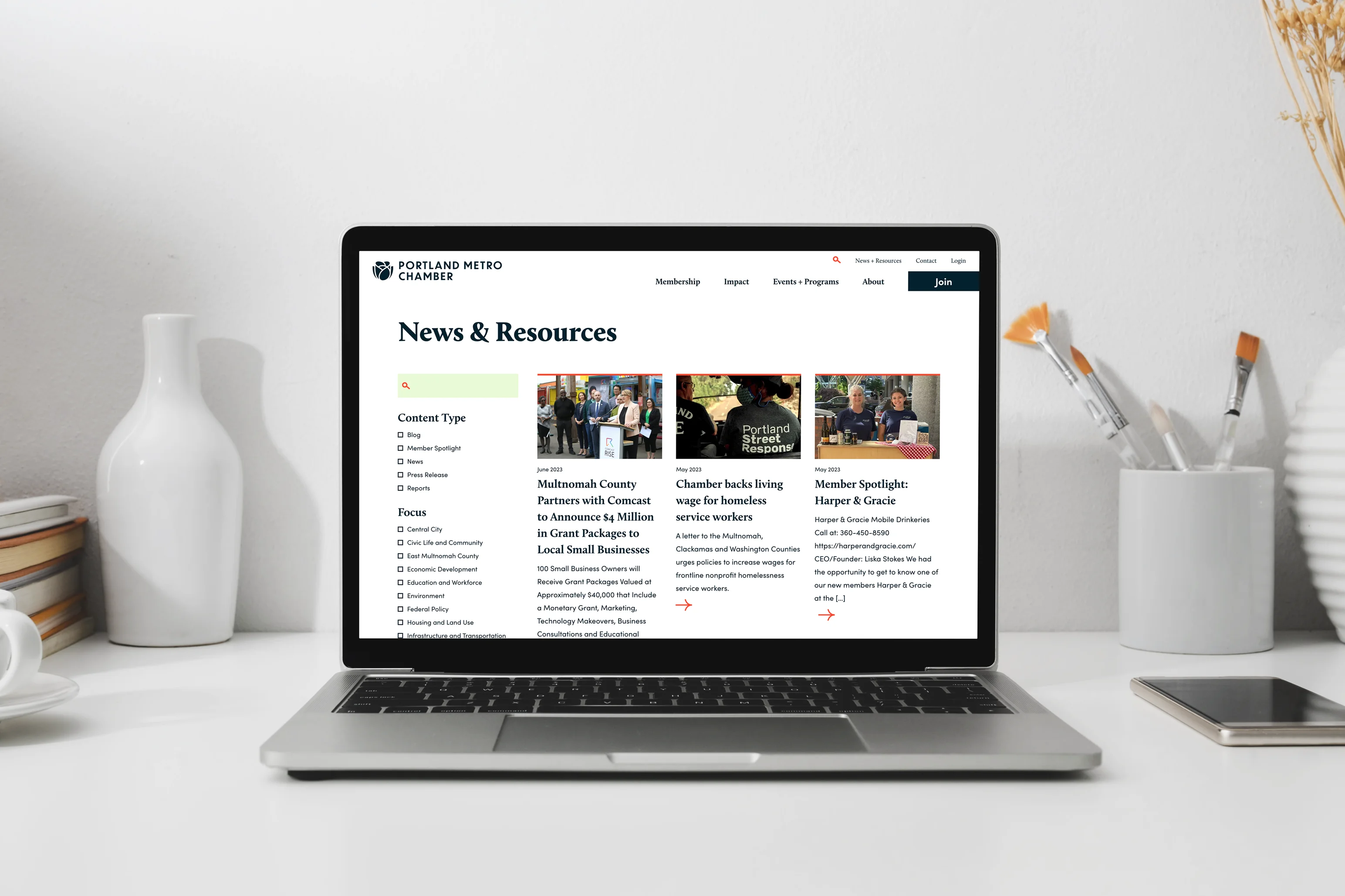
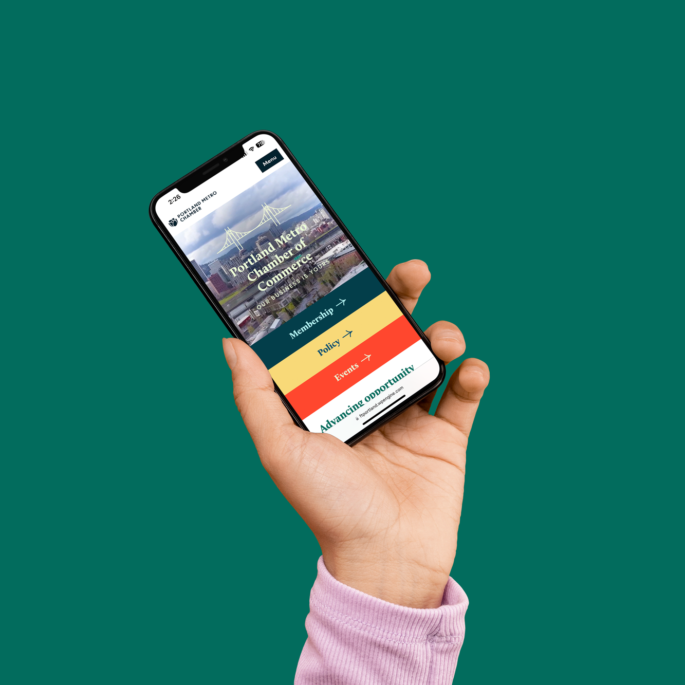
The updated brand identity uses a dynamic logo set featuring a rose nestled within eight variations of the iconic bridges of the Portland and a variety of accompanying color combinations. New photography highlighted Portland scenes both familiar and off the grid. These visuals provided the building blocks for a new website, that would serve as a resource for advocacy, professional development, and networking to prospective and current members, large and small.

The Results
Building excitement for the Portland Metro Chamber and its impact.
This project recently launched and is achieving the key performance indicators established in Envision. The brand and website were unveiled at the annual meeting and were met with immediate buy-in and excitement, but more importantly, the organization is meeting its financial and operational goals.
