Louisville Youth Group: Brand and Campaign
As Louisville’s only LGBTQIA+ youth serving nonprofit, the Louisville Youth Group gives young Louisvillains a space and environment to explore their identity through programs, resources, and a shared community.
THE CHALLENGE
Subtlety vs Standing Out
Like many smaller nonprofits LYG’s team was forced to wear many hats, and were often occupied with serving their mission in a day-to-day capacity with big-picture marketing and communication falling to the backburner. Fieldtrip was brought on to help expand and elevate those efforts, allowing their team to focus on the core aspects of their mission.
LYG faced a complicated communications challenge, needing to appeal first to the youth they served, but secondly to the potential donors, partners, and the community at large. A delicate balance was needed to communicate their mission and audience, while allowing a degree of subtlety and potential anonymity to youth facing a potentially hostile environment outside of LYG.
While equipped with an existing logo, broadly their communications lacked consistency and clarity. This could help them avoid any negative spotlights, but was simultaneously clouding their offerings to those who need them most. We would need to delicately balance this while bringing modern, professional, and engaging branding to their organization.
THE APPROACH
Bold, Bright, And Brave
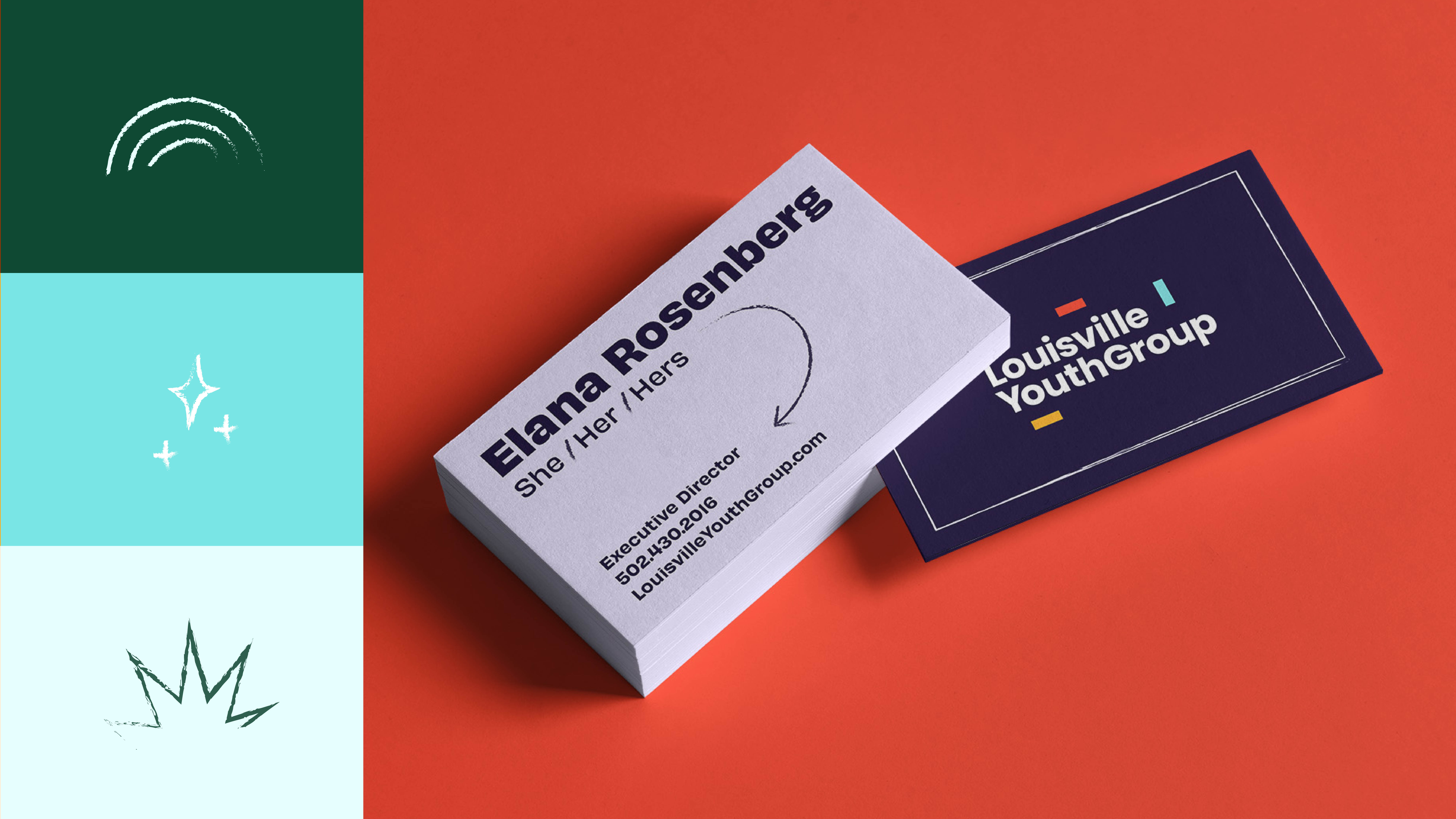
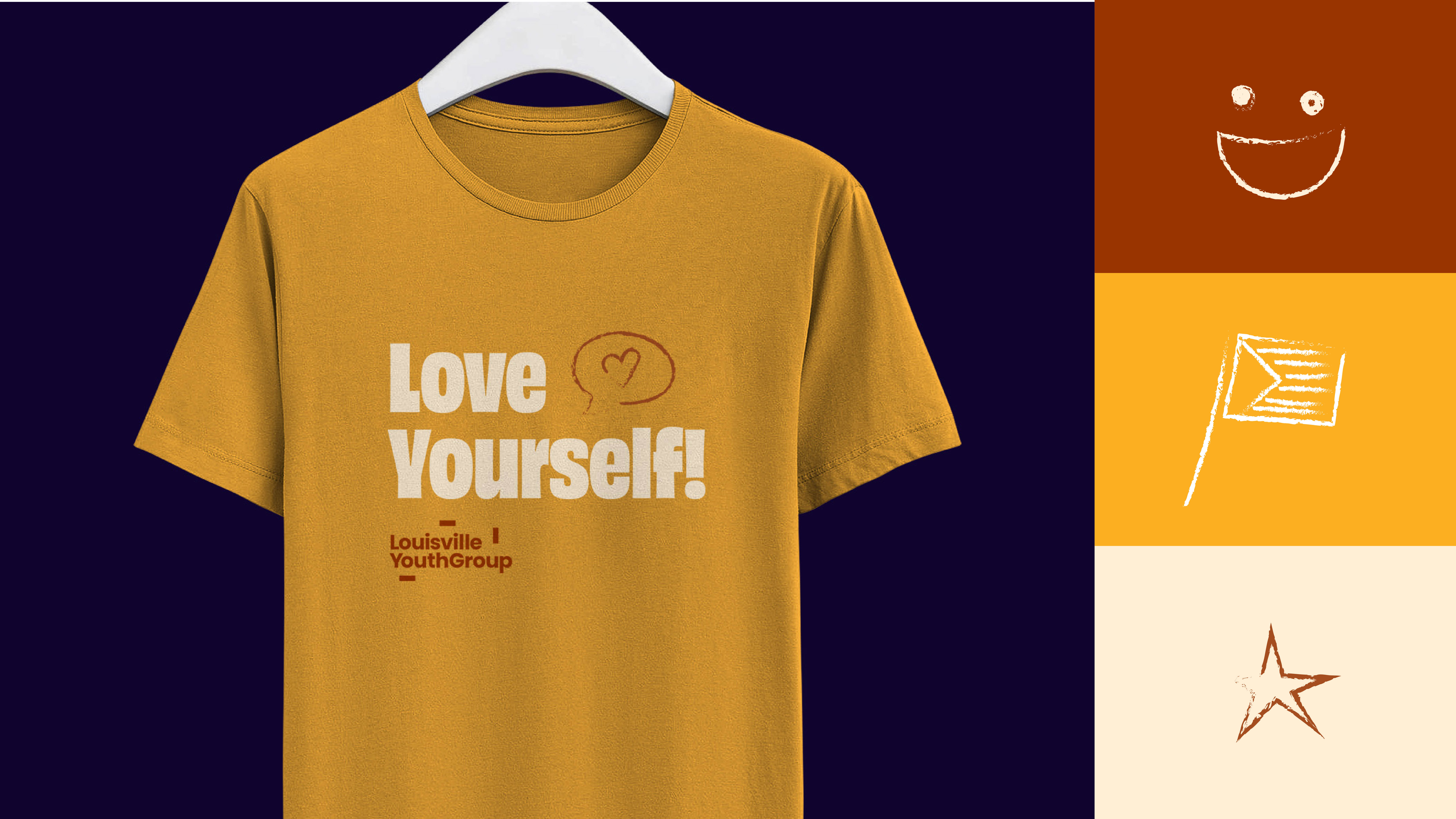
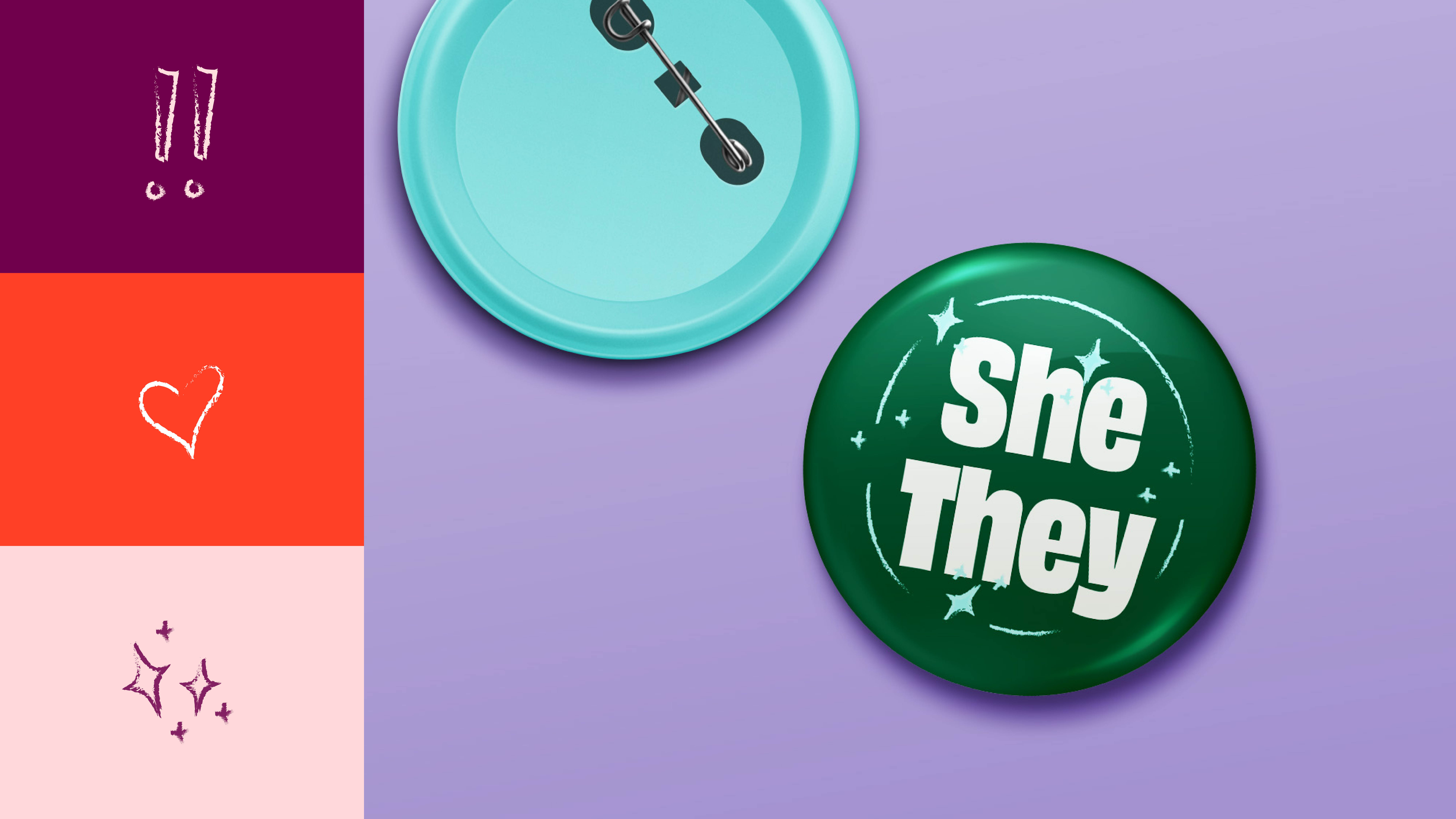
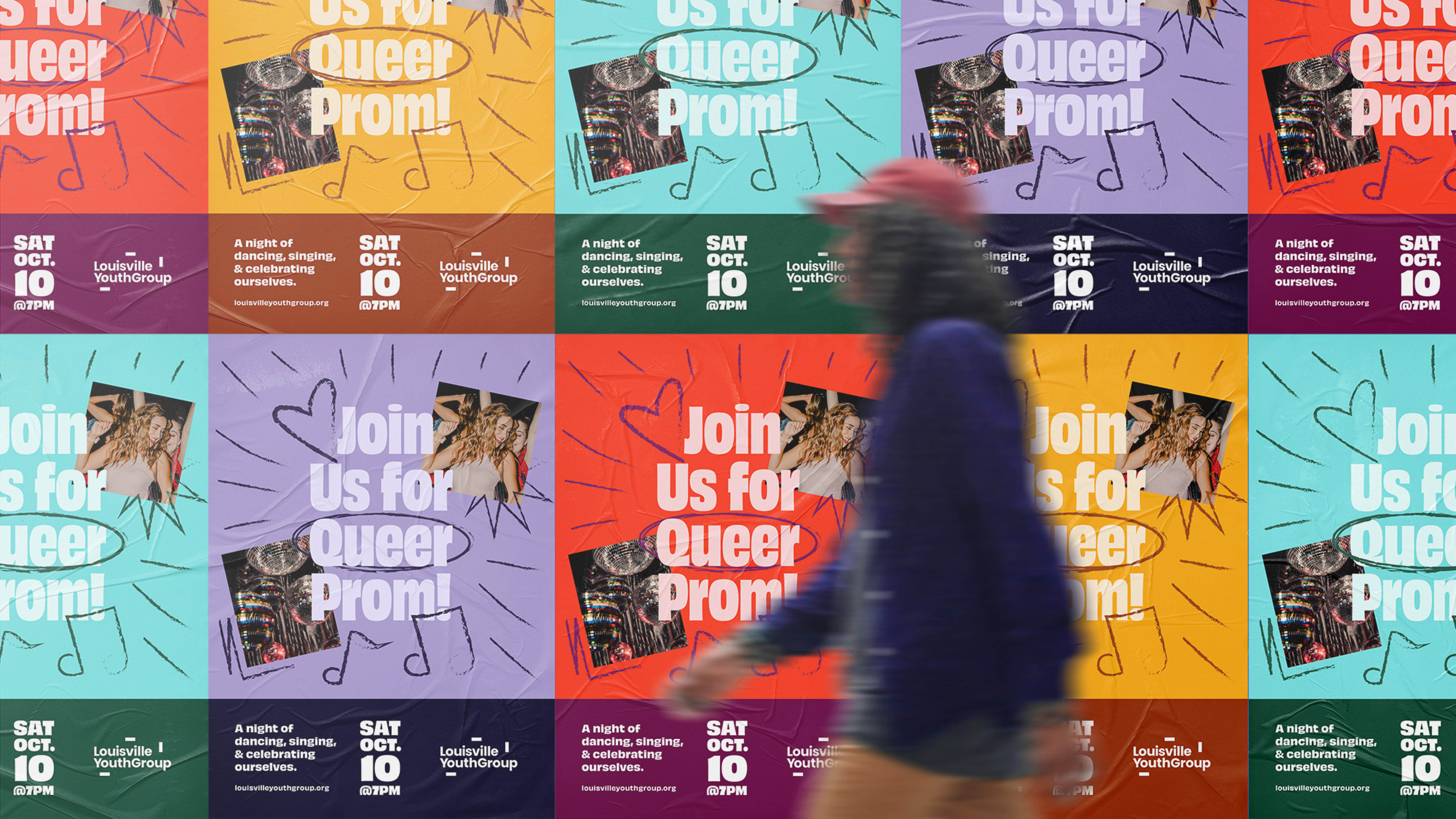
The new brand would evoke a youthful energy combining bright color combinations and hand-drawn iconography, with a professional design system that would show the community this was a sophisticated, modern organization. Building off of their existing logo the brand was expanded to include updated typography, photo guidelines, iconography and illustration, as well as guidelines to implement the new look and feel.
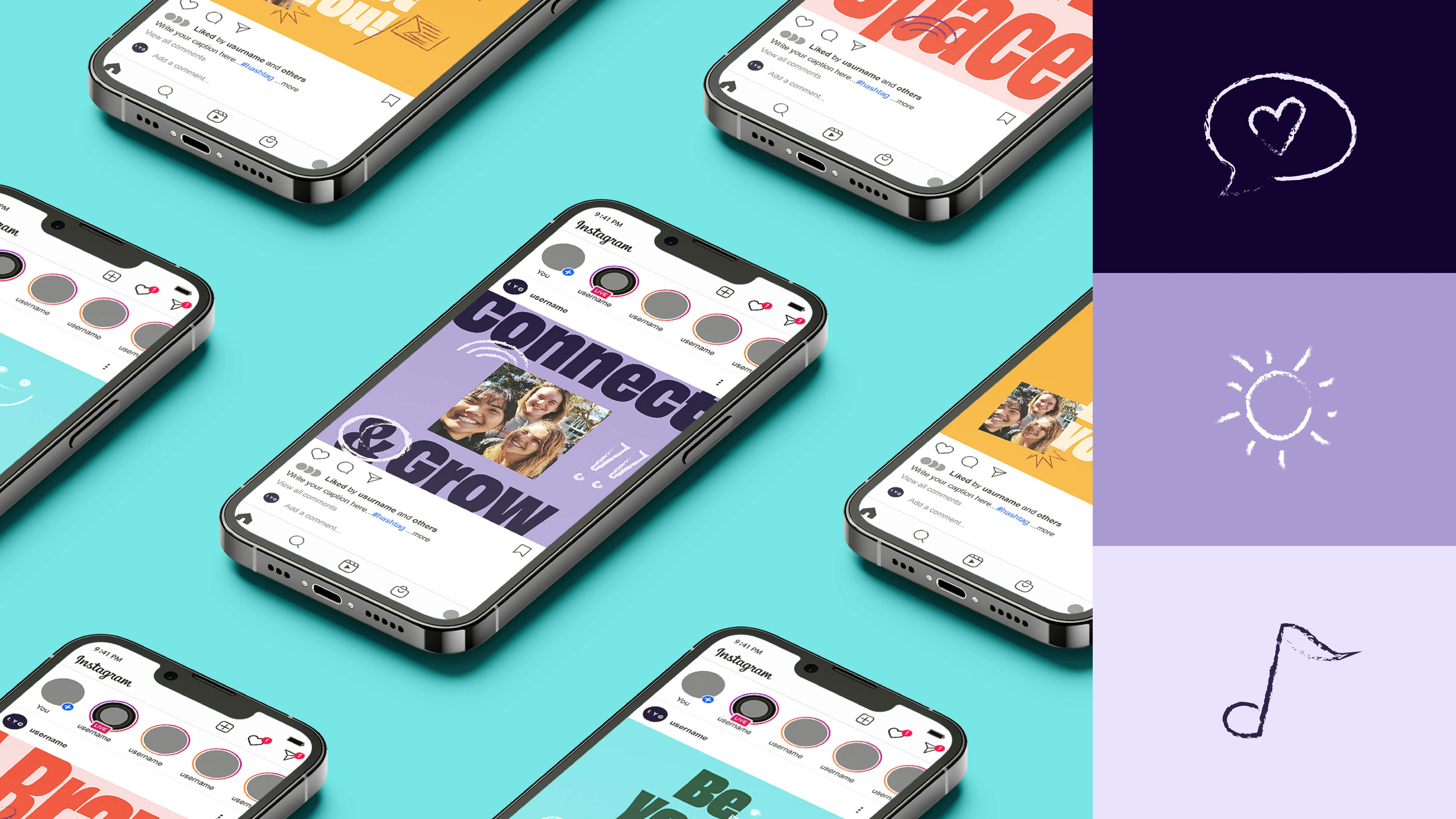
Additionally, Fieldtrip created a scalable marketing plan and strategy that would allow for a smaller nonprofit to operate efficiently, and grow in concert with the organization. This was supported by an in-depth messaging audit and toolkit. The messaging was segmented by a variety of audience groups allowing for LYG to best curate each communications touchpoint.
THE RESULTS
A Focus on the Future
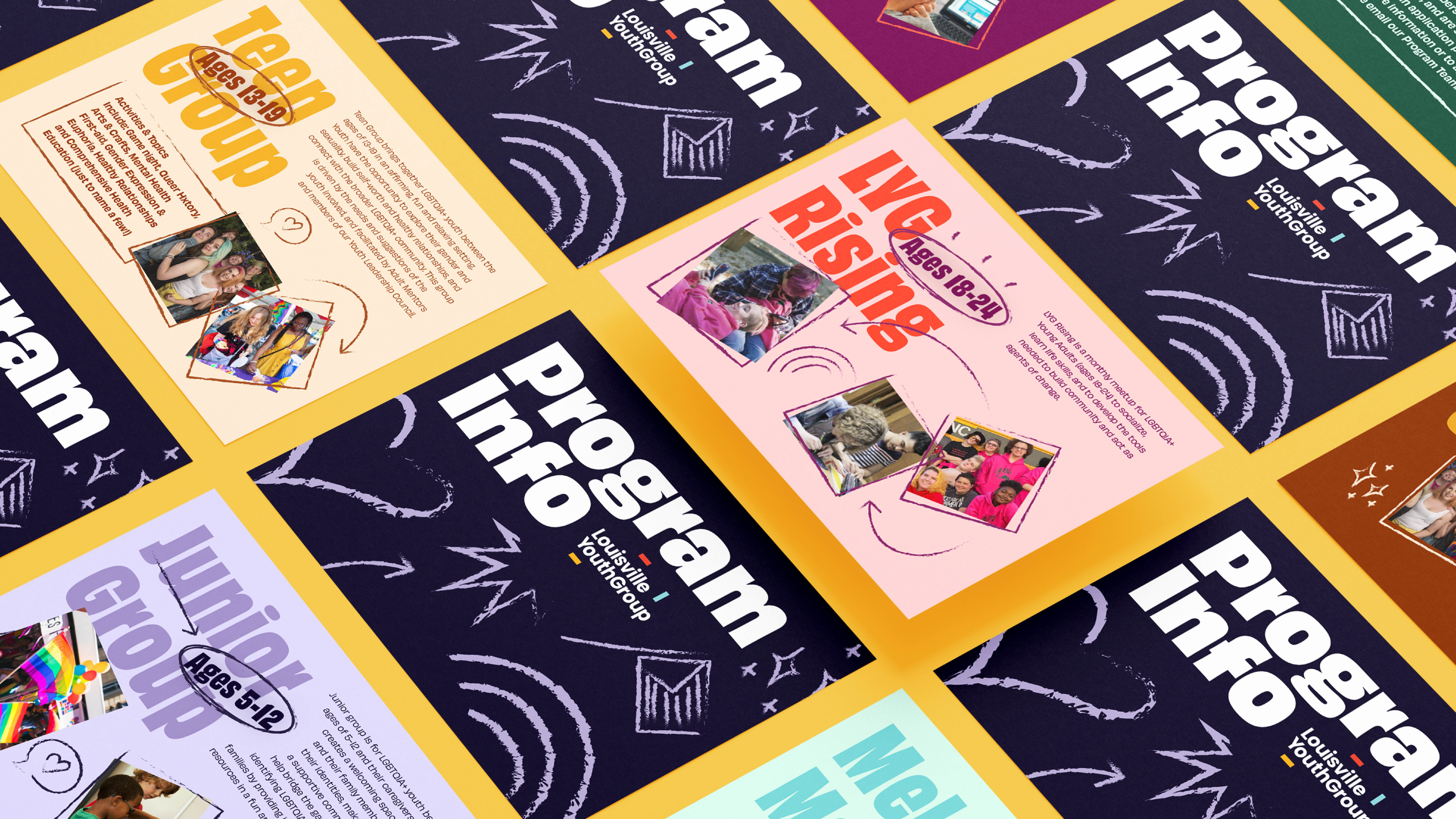
Equipped with their new brand, foundational promotional pieces and collateral were crafted that LYG staff could use in their regular communications. This included everything from brochures, program cards and leave behinds for each individual program, and social media templates to allow their in-house team to create and build their own materials. LYG could now move their focus and energy back to their mission and future, confident that they have the brand and materials they need to get the attention they deserve.