The Hub for Innovative Learning & Leadership: Brand
While mergers frequently present challenges, they often also offer up opportunities. In this case Fayette County Public Schools’ (FCPS) Career and Technical Education Department was combining two CTE centers into one, but looked to use this moment to reframe and rebrand how CTE is viewed and counter the negative perceptions it has accumulated. This entire effort would take the form of their new groundbreaking center in downtown Lexington, Kentucky.
The Challenge
Redefining the perception of CTE
Across the country CTE is seen as the lesser option, meant for those not cut out for higher education, and has a long history of being stigmatized. In truth FCPS’ CTE provides high quality, innovative courses leading to sophisticated, high-paying careers, and can enhance the traditional educational path to college.
The project began with naming. FPCS convention dictated that all new schools would be named after people or locations, but a special opportunity was presented to name this center in a way that would capture broad community interest and enthusiasm, and better represent the innovation and aspiration of the center.



Our Process + Solution
A modern school of the future
After conducting thorough research and interviews a brand platform was created to serve as the foundation for the name and visual identity of the brand. The next step was developing a name that would get buy-in from a wide range of stakeholders and disparate needs. The HILL—or The Hub for Innovative Learning & Leadership—captured the ambitions and spirit of the center and served as a nod towards its place as a community-wide learning center, and more than just a traditional school resource.
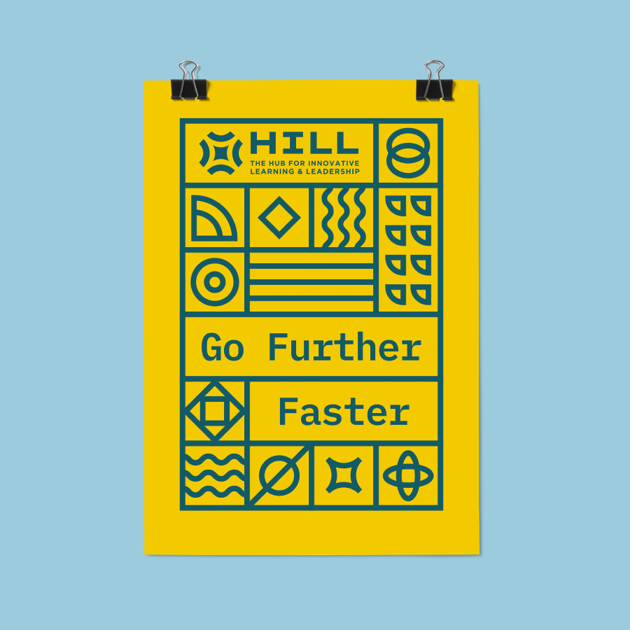
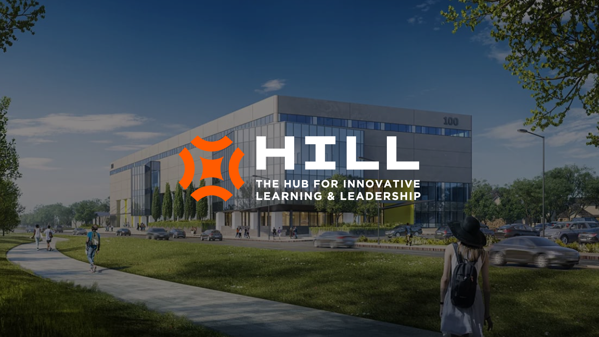
The building and interiors were already in progress, so it was essential for the visual identity to harmonize with the physical space it would live in. Both the center and its programming were incredibly modern, and stood out from the rest of the district’s offerings. The brand now needed to mirror that, differentiating itself from traditional schools. A logomark was designed featuring four hills coming to a center hub, paired with a simple, sleek, but playful brand, and a colorful palette inspired by the interiors.


The Results
Opening in Fall 2025
The HILL will open in fall 2025 with applications beginning soon. The district is now beginning their awareness efforts to build enthusiasm and excitement around this innovative new center and CTE education.

