Partners In Diversity: Brand and Website
Founded in 2005, Partners in Diversity is a nonprofit organization based in Portland Oregon. They aid employers and employees across Oregon and southwest Washington to attract, participate in, and maintain a strong, diverse workforce for the region.
THE CHALLENGE
Driving Diversity
Amid widespread DEI misinformation and program shutdowns, the need for workforce diversity is stronger than ever. Often employers lacked the resources to find and connect with a diverse employee base, and needed assistance in supporting those already within their organizations. Many employees themselves were looking for networking opportunities, community, and careers where diversity would be valued and seen as a resource. PiD was a hub for all of those efforts, but could only be effective with awareness and engagement across a wide user base. A new brand and website would allow them to build that equity and better organize and communicate their many offerings.
THE APPROACH
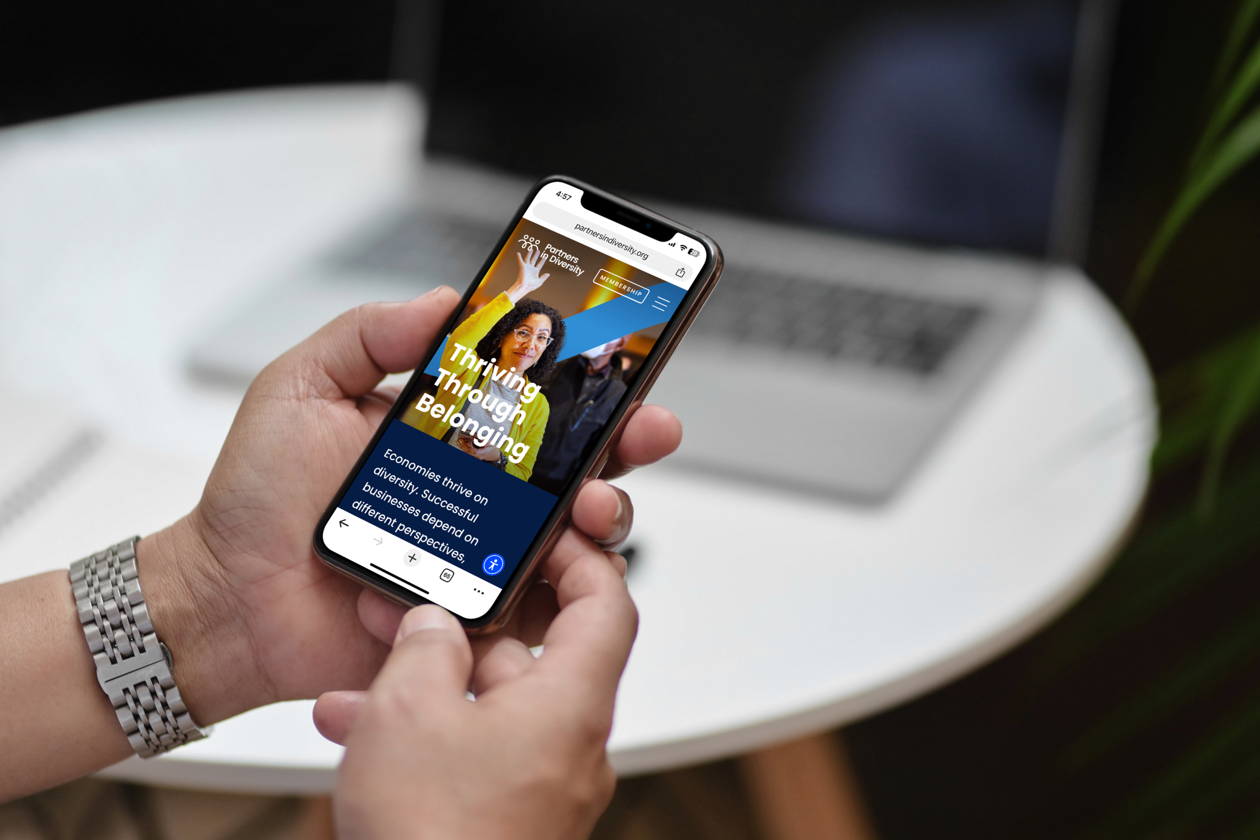
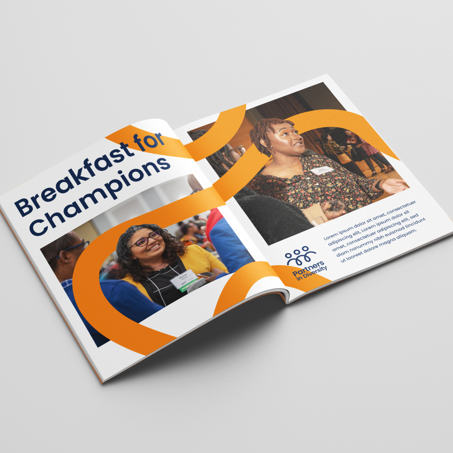
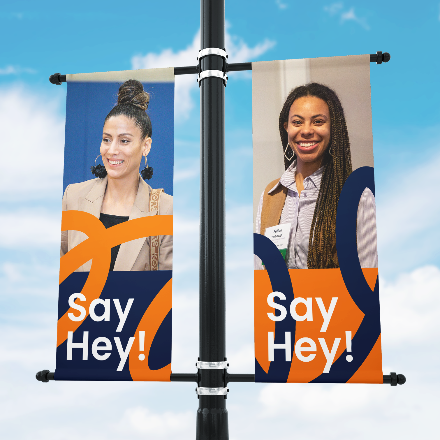
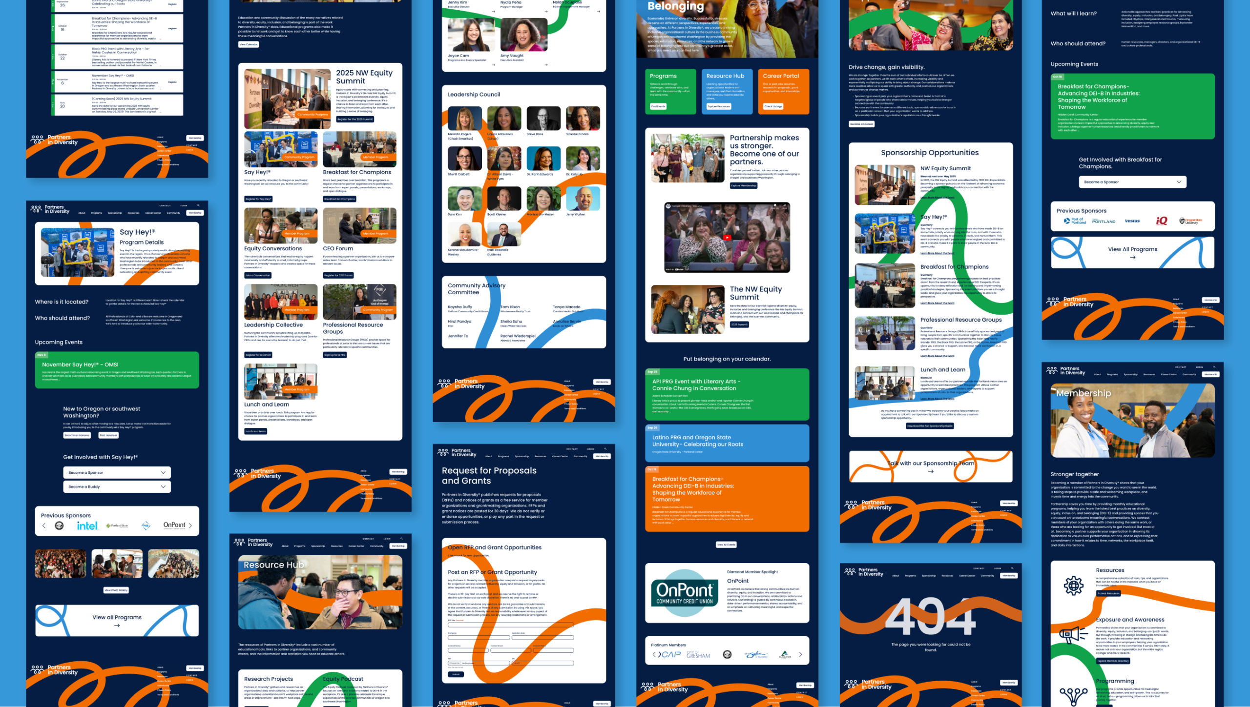
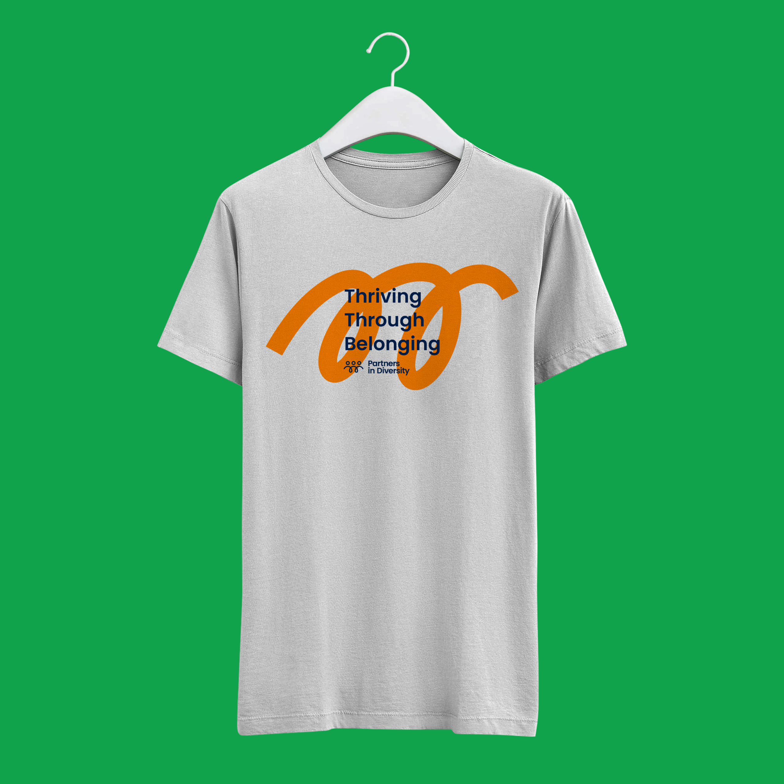
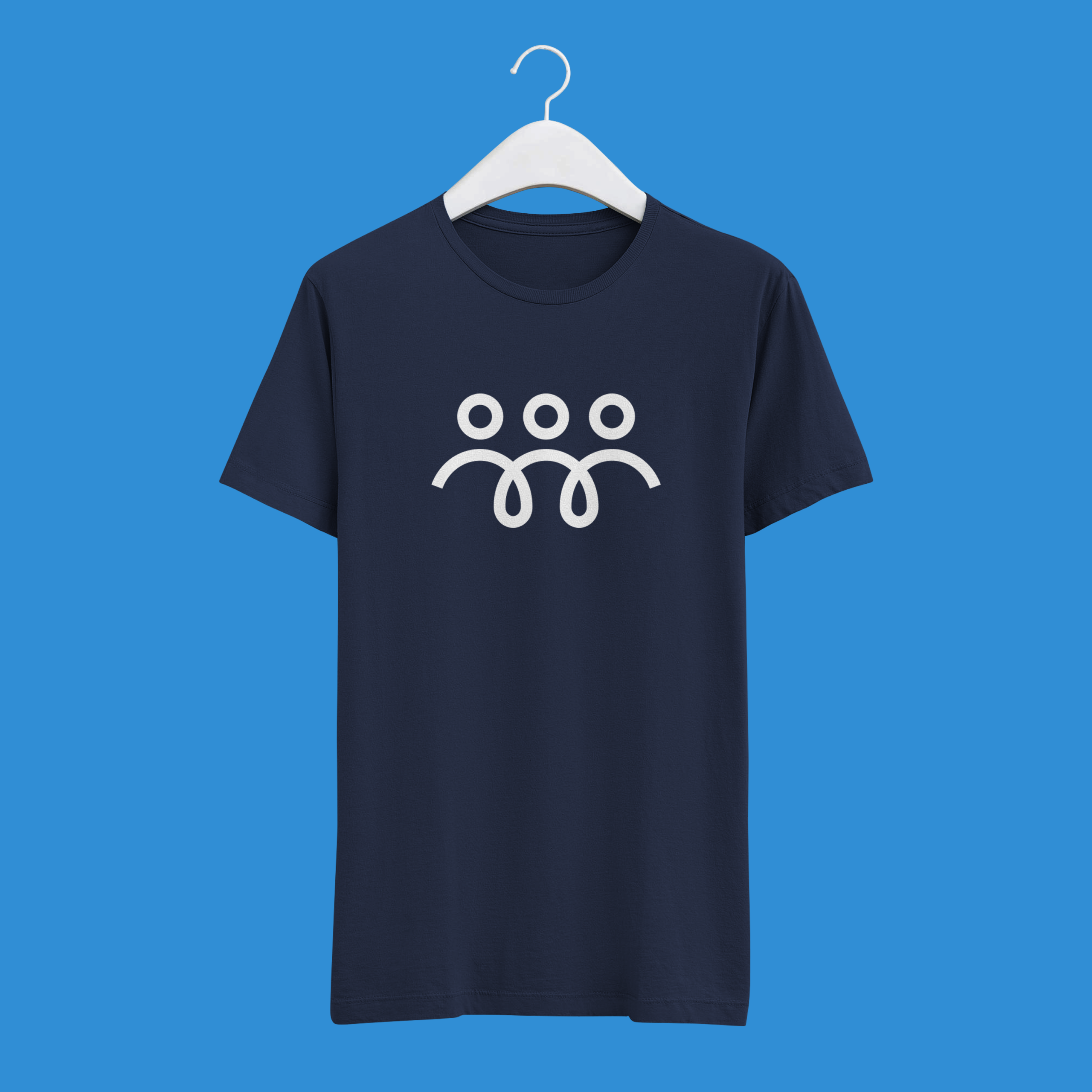
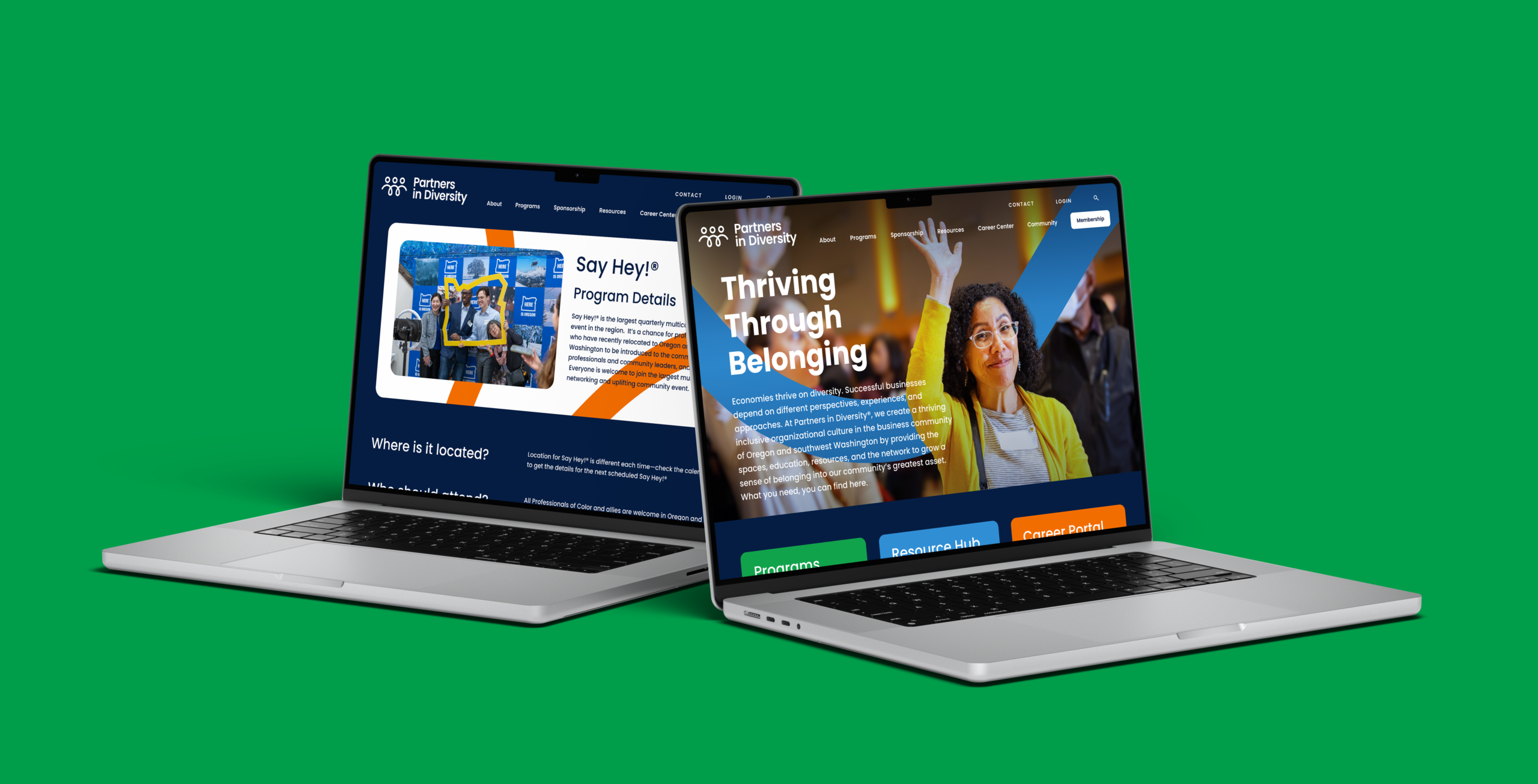
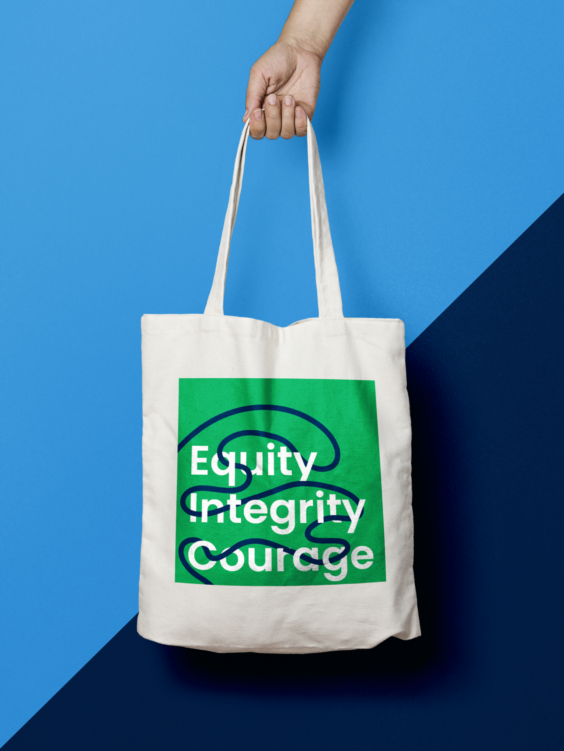
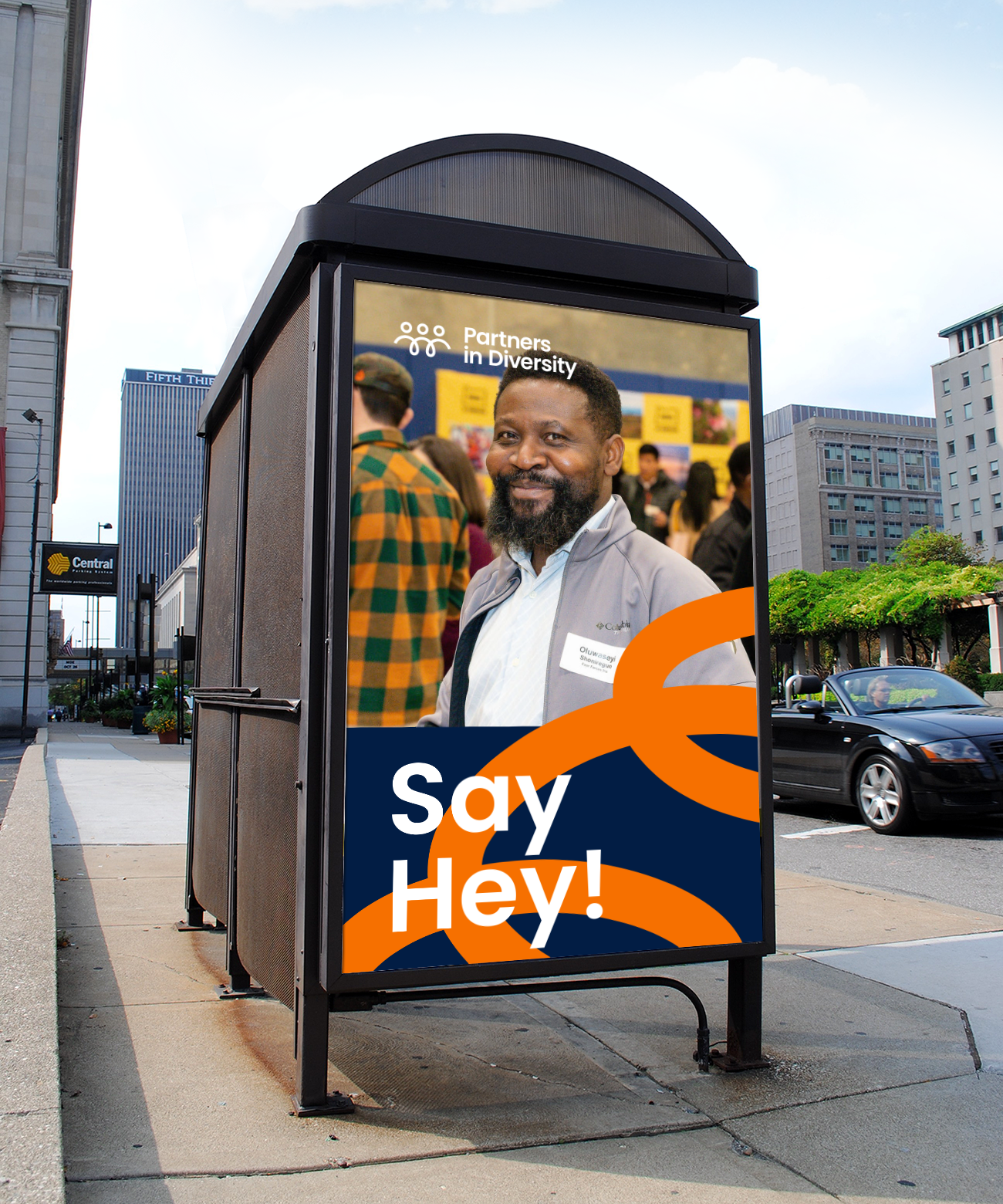
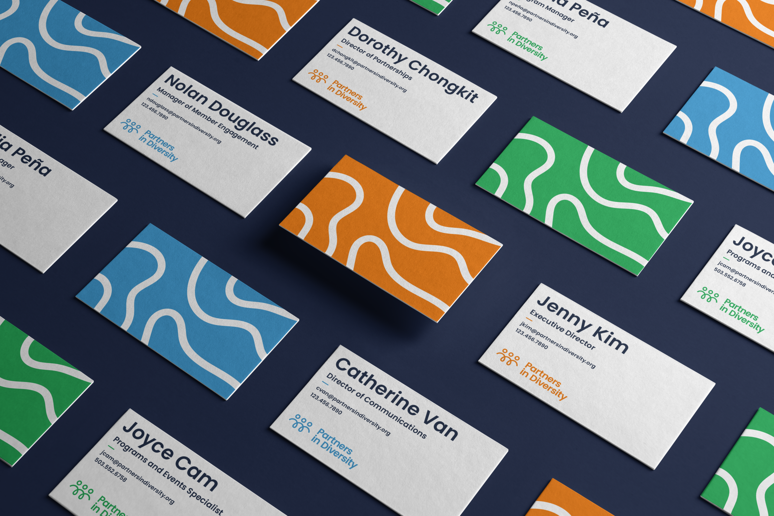
A Fresh Face for the Future
Like many nonprofits, PiD’s focus had been on executing their mission, with communication efforts often taking a backseat. They lacked a cohesive brand identity, and easily navigable website. Through board member meetings and our Survey phase, alignment was created around PiD’s approach to its new brand and website. After a brand audit, a new visual identity and logo were developed, with flowing lines evoking connection within the community, and bright, modern colors bringing life and energy to the brand. Finally, the audience and brand work culminated in a new website that is robust and intuitive, allowing users to find exactly what they need, exactly where they expect it.
THE RESULTS
An Expanding Network
Organizations like PiD can only deliver on their mission with a thriving network economy. Their offerings and benefits are exponentially more successful with each business or individual that is aware of, and engages with the organization. A consistent, clear, and exciting brand and website paves the way for that level of engagement. In the first 30 days the newly launched website received 12,657 visits from 4,294 unique users, both up 130% on average from the previous 30 days. The average session duration lasted for 2:44 showing a high level of interaction and interest.