
After nearly 30 years of catching waves on the internet, we’ve all seen countless websites. And with all that experience, we inherently know a great – and terrible – website when we see one. What’s not so obvious is how to build an effective website. We put together this handy best website practices guide where you’ll learn 6 ways to build trust and credibility with your web users.
But first, the obvious 5
We’d be remiss if we didn’t check the most obvious points. These are tips that you can find on any number of blogs, and for good reason; these are foundational elements that all websites should be doing. In no particular order:
1. User-friendly navigation
Don’t frustrate your visitors. Make navigating the website clear and simple.
2. Accessibility in colors, captions, etc.
Make your website easy to read–for all. Make efforts towards ADA accessibility with tools like the WAVE Report from WebAIM.
3. Clear CTAs
Make it clear what action users should take on your website and build steps to lead them there.
4. Use of white space to let content breathe
Digital feng shui. Allow for room balance and flow. No need to cram a bunch of content into a small amount of space.
5. Responsive design
Perficient, a digital consultancy agency, found that across the world, 68.1% of web traffic came from mobile devices. This ain’t 2009. Optimize your website for desktop and mobile devices.
Now that we got that out of the way…
Best Practices for Nonprofit Websites
1. Utilize authentic videos and images
Minimize your use of typical stock photos… you know the ones, bright photos with manicured business-types synergizing over firm handshakes. Instead, use real images of real people, where appropriate, of course. Authentic images feel real and give instant credibility points. Not only that, but the brain processes visuals in 1/10th the time as text. A picture is worth a thousand words, after all. Images and videos speed up your ability to share captivating stories without requiring nearly the amount of mental effort that reading does. So should you eliminate text from your website entirely? No, of course not. But quality images can illustrate your message much clearer and quicker than a wall of text.
Who’s doing it well: Bill & Melinda Gates Foundation. Images are authentic and well shot but not overly manicured like a generic stock photo. Their imagery illustrates positive engagement with the communities they serve that feels hopeful.
2. Engaging content
Creatively engage users with bite-sized bits of information to keep them engaged, scrolling, and clicking. Be bold and clear about the mission of your organization. Prioritize your key audiences and communicate in a relatable manner. And our favorite: call out important information and details in interesting, interactive ways.
Who’s doing it well: American Forests. We loved the call-outs and highlights for the “Why we need forests” and donations sections.
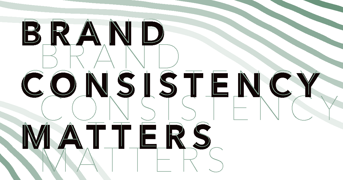
3. Strong branding
This is a core ethos of Fieldtrip: strong branding will lead you to stronger messaging. And be consistent with it. Not just on your website but in all materials, both internal and external. Using these elements consistently requires more work, but the payoff is that your organization will be perceived as organized and professional. Don’t forget about establishing a personality and tone; how you communicate matters and doing it consistently will breathe life into your brand.
Who’s doing it well: Onward. Strong branding that is consistent throughout the web experience. Photo treatments, use of type, and color. It’s expressive and beautiful.
4. User-specific features
Do you know your web visitors’ needs? Obstacles? Challenges? How can you and your website serve them better? When you can provide a meaningful solution for a specific problem, it will be clear the amount of care and attention your organization can provide.
Who’s doing it well: Women’s and Girls’ Emergency Centre. A domestic violence help center in Australia with a “Quick Exit” button in the top right. It’s functional and shows that they unquestionably understand the needs and reality of their web visitors.
5. Real stories
Tell real stories without glorifying the beneficiary. Show readers how change leads to a positive impact, not just on the immediate person, place, or thing, but will trickle down to others as well.
Who’s doing it well: March of Dimes. Real stories with real people that don’t just shine a light on a painful experience but make it abundantly clear that “you are not alone”.
6. A reason to donate (if applicable)
Transparency is the road to trust. Share how donated dollars will get allocated. The more donors can understand how their donations will be put to work, the better.
Who’s doing it well: Girls with Guts. Lists the costs of specific programs, giving donors an awareness of how their donations will get spent.
Closing thoughts
While there are certainly other considerations, if your organization can nail these six items, Fieldtrip believes your website will generate the action you need. What’s great is that these are simple enough that every organization can execute themselves; it just requires time and effort. We also understand that not every organization has the luxury of putting more time or effort into its web presence. Luckily, Fieldtrip is here to help. Drop our team a message and we’ll be happy to help your organization build a better nonprofit website.