How soon can you have it done? This is a question that has crippled more projects than perhaps any other factor in the advertising and branding world. Yet we hear it time and time again. It sacrifices quality, thoughtfulness, and long term goals all for the sake of a deadline. This risk can be clearly illustrated by comparing two massive NBA rebrands, the Milwaukee Bucks and the L.A. Clippers. Both teams looked to unveil their new brands for the 2015 season, but their varying paths showcase the dangers of prioritizing speed over all else.
When the Clippers first set out to rebrand they approached their internal design team with an aggressive deadline of roughly seven months. They were promptly rebuffed. Their design team asked for a year to complete all the massive amount of work that goes into rebranding an entire NBA franchise. It’s more than just designing a new logo, rebrands of this scale involve research, identity design, typography, color, uniforms, websites, stadium, vehicle, and environmental graphics, and a launch plan. It is a monumental task, but rather than compromise or accept that their ask was unrealistic they did something unthinkable, they asked the internal design team of the Miami Heat—A RIVAL NBA FRANCHISE—to take the job. Now, asking a rival team to do your rebrand is unbelievable, but with a large payment offered and little investment in the Clippers’ success the Heat’s design team proposed to complete the rebrand in as little as six weeks.
Compare this to the approach taken by the Milwaukee Bucks. When the time came for their rebrand they brought in Doubleday & Cartwright, a renowned design studio with a variety of sports branding experience. As true branding experts working on a more realistic timeline they were able to dive deep into the history and needs of the team and community. The new brand is littered with thoughtful details that make the designs truly unique: the “M” disguised in the neck, the basketball formed by negative space in the antlers, the colors inspired by the Milwaukee’s “Cream City” nickname. In contrast, the Clippers’ rebrand reeks of trend-chasing, and explanations retrofitted by the LA team rather than thoughtful decisions made during the creation. The typography and designs are uninspiring, and the prominent use of black is derived more from overused sports trends and the Miami Heat’s aesthetics rather than any real connection to Clippers’ history.
Their unveiling and subsequent responses were exactly what you’d expect. The Bucks and their fans embraced the new look and in subsequent years have built and expanded upon it, cementing one of the most iconic brands in the league. Meanwhile, the Clippers’ new brand was received with a mixture of indifference and disdain, with reports that few even on the team or staff actually liked the brand. Already this season Los Angeles has incorporated a new look and uniforms and seems to be transitioning quietly to a new identity.
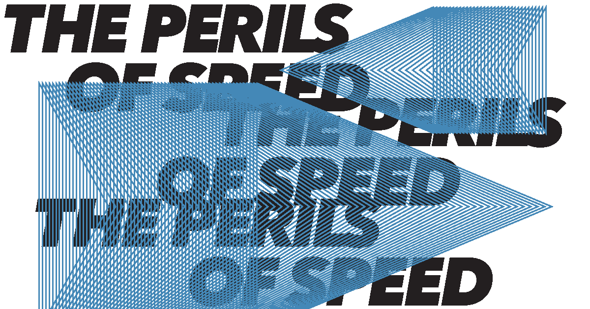
These are the perils of speed. When you sacrifice everything for the sake of swiftness rarely is the outcome longlasting. Many are familiar with the idea that you can’t have something good, fast, and cheap. And if it’s fast you want, it most likely won’t be good, and if you have to do it all over again, then it’s definitely not cheap. There will always be deadlines and a need for urgency but for those willing to take the time to do it right, the results will be worth it.