Fieldtrip Animated F Logo

Bridgebee

When playing bridge, it is all about the strategy and taking tricks. To master the game, players learn through new ‘hands” from directions found in a book or passed from player to player. Bridgebee created an app allowing users to purchase curated practice ‘hands’ from renowned authors. These guided walkthroughs are far more interactive than the original books, with nothing on the market like it.

Brand Identity UI/UX design
A flat lay of colorful brand guideline booklets and cards arranged on a marble surface, featuring red, yellow, and green themes, with text like brand platform, brand usage, and various logo designs.

THE CHALLENGE

Welcoming and accessible to all

The bridge audience is largely an older population. This was concerning as this audience is generally skeptical of online platforms. Additionally, they were looking to expand to a younger demographic, widening the potential reach of the product. Bridgebee needed to become a service welcoming new players of all ages while not alienating longtime fans.

Bridge Bee logo with a stylized yellow beehive design and the words bridge bee in yellow, set against a maroon background. The lower half of the image is white. A red playing card box with a geometric pattern and bridgebee.com written on the side, containing a deck of cards with the ten of clubs partially pulled out.

THE APPROACH

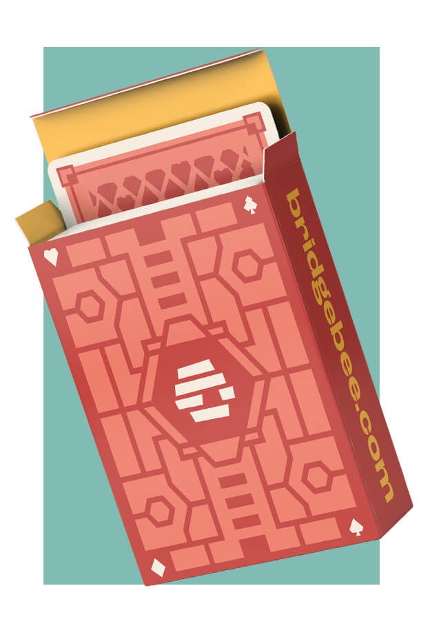
Blurring the lines between physical and digital

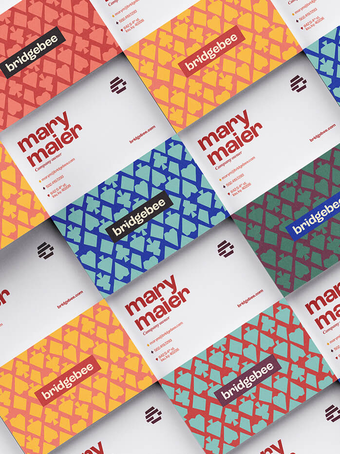
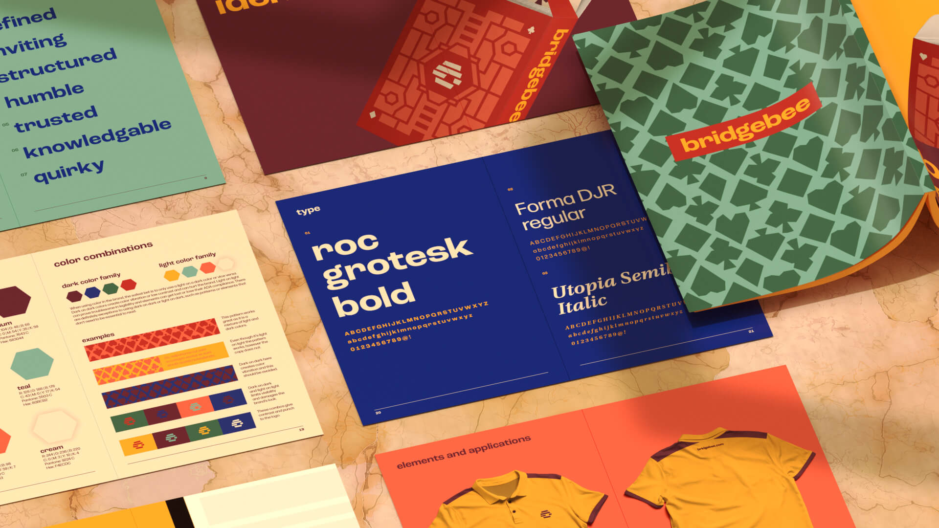
To make users feel like the brand was rooted in the real world and tap into a sense of trust and familiarity, an identity was developed to give an illusion that everything you see is cut from paper—from the bee icon to the back of the playing cards. Careful thought and attention was put into each piece of the Bridgebee brand to apply this approach consistently across all applications.

Screenshot of Bridgebee’s homepage featuring interactive bridge lessons, author highlights, a computer displaying the platform, featured lesson cards with images, user reviews, and a promotional offer for free lessons.

THE RESULTS

The future of Bridge

The Bridgebee brand shaped the app UX and was enthusiastically implemented across all platforms. The Bridgebee team is currently debuting their new identity at trade shows while developing the app and website for release in the near future.

A graphic split into four vertical sections, each showing a stylized green or yellow beehive icon with the words bridge bee in blue or red, set against different colored backgrounds: yellow, coral, red, and teal.
A red box of playing cards, partially open to reveal the cards inside. The box features geometric patterns and the text bridgebee.com on its side. A grid of colorful business cards for bridgebee and Mary Maler, featuring vibrant geometric patterns on one side and contact details on the other. The designs use yellow, blue, red, and green color schemes.
Awards Icon

Awards

AAF Addys People’s Choice Award: Brand Identity AAF Addys Gold: Brand Identity AAF Addys Silver: Logo Design
A row of simple icons on a beige background: envelope, spade, bar chart, heart, key, diamond, telephone, and tree. Each icon is a different color.
A flat lay of colorful branding materials, including booklets, brochures, and clothing mockups, featuring bold typography, geometric patterns, and brand colors on a marble surface.
Quote Marks

It has been a long journey, but so rewarding. Everyone who sees that app comments first on how beautiful and well designed it is. I can't thank you enough!

Mary Maier
A scattered pile of red playing cards with a white geometric logo in the center and a patterned border design, all facing down. Two shelves with books of various heights and colors. Some book covers have card suit symbols, such as a diamond, spade, and club, against a yellow background.
A patterned green background with abstract shapes of playing card suits. In the center, a red rectangle contains the word bridgebee in bold yellow lowercase letters.