Springfield Public Schools: Brand
Made up of 24,000 students and 60 schools in Southwestern Missouri, Springfield Public Schools (SPS) is the state’s largest school district. As a wide-ranging district with a diverse and incredibly passionate community, public sentiment was divided with competing ideas of who the District was, and where it should go in the future.
The Challenge
Too Big to Succeed?
Can success ever be seen as a negative? Well in the case of Springfield Public Schools the title of largest district in the state was being used against them. The surrounding smaller districts and schools were capitalizing on negative sentiment towards public education and SPS’ size was perceived as leading to more problems. In reality SPS offers an outstanding level of education and an unmatched variety of pathways and classroom options. Charter schools were an ever-present threat and the District needed to reframe the conversation.
The staff, students, and education was already in place, so the next step was replacing their outdated brand with something that modernized their public face, and posited that with size comes sophistication, opportunities, and resources.
The Approach
Open Doors
The work began where it always does, with a thorough exploration into the background, and context of the brand, the schools, and the community they serve. A thorough series of interviews, brand audits, surveys, focus groups, and analysis of competing districts and other challenges informed key insights that inspired a brand platform. Over and over the theme of “Choice” emerged as a key point of differentiation. No other district in the region could offer anywhere close to the number of different education options that SPS could. From professional learning opportunities and special education resources, to a technology center and virtual learning program that the entire state had come to use, SPS offered students from all backgrounds more choices at every turn.
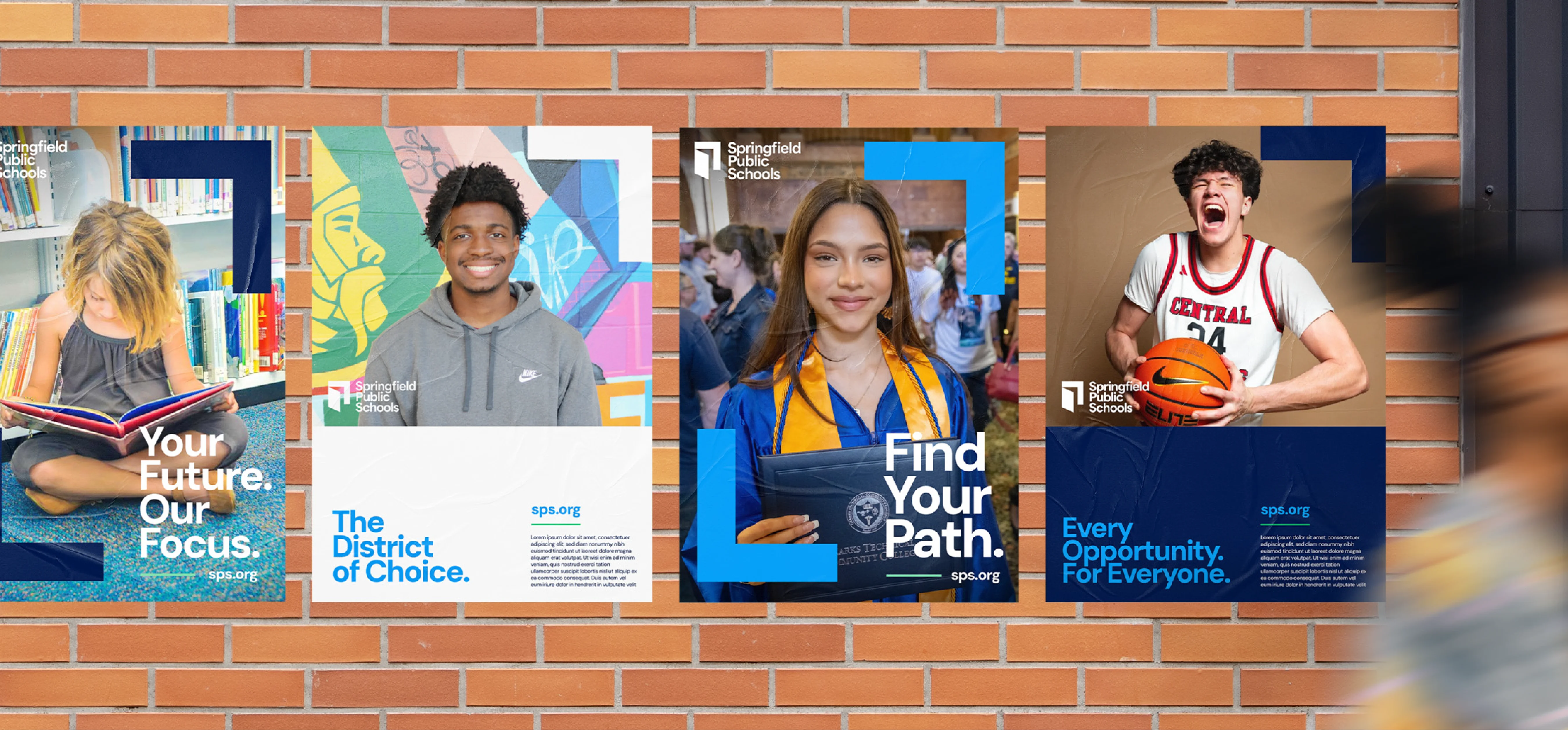
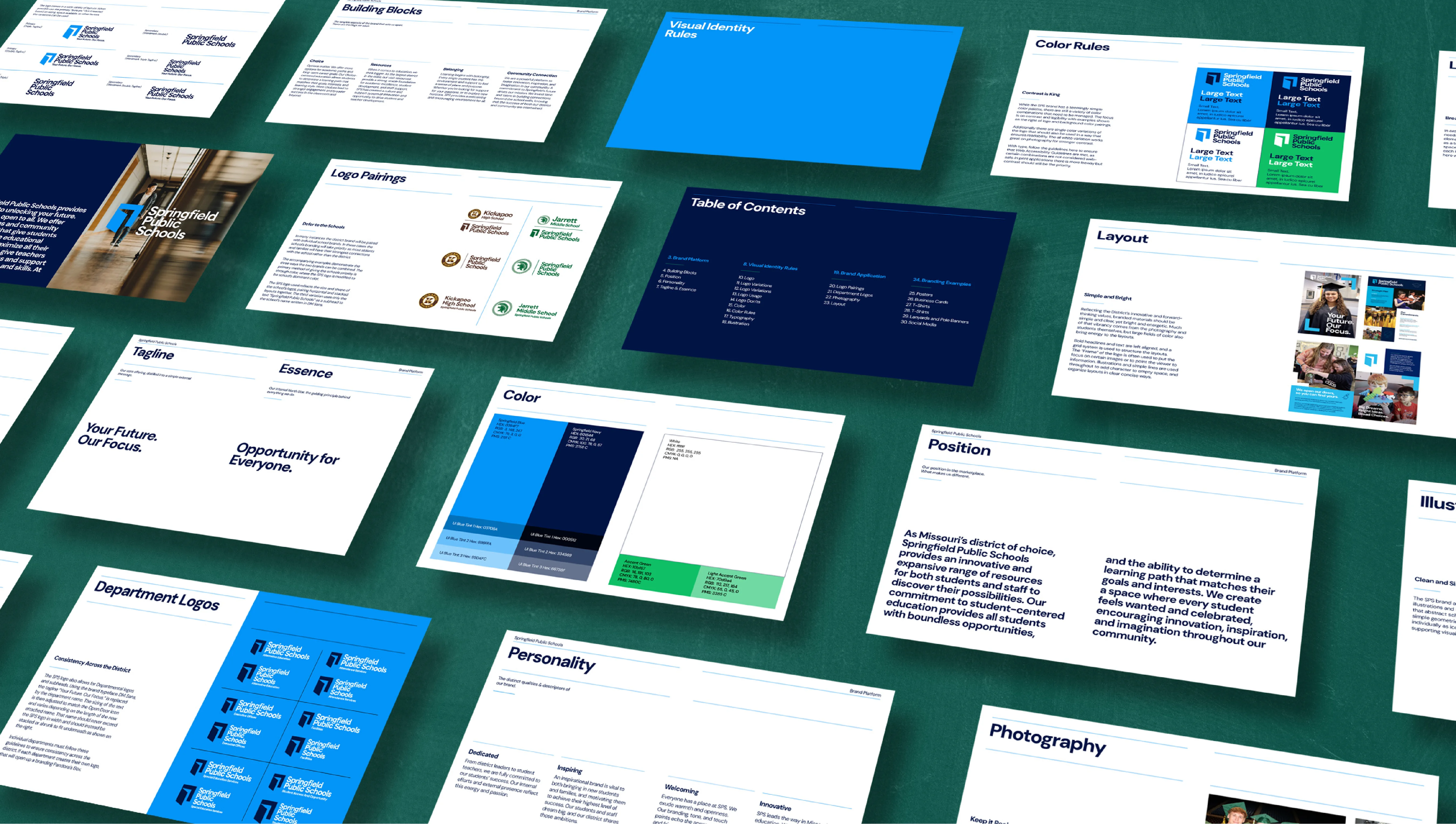
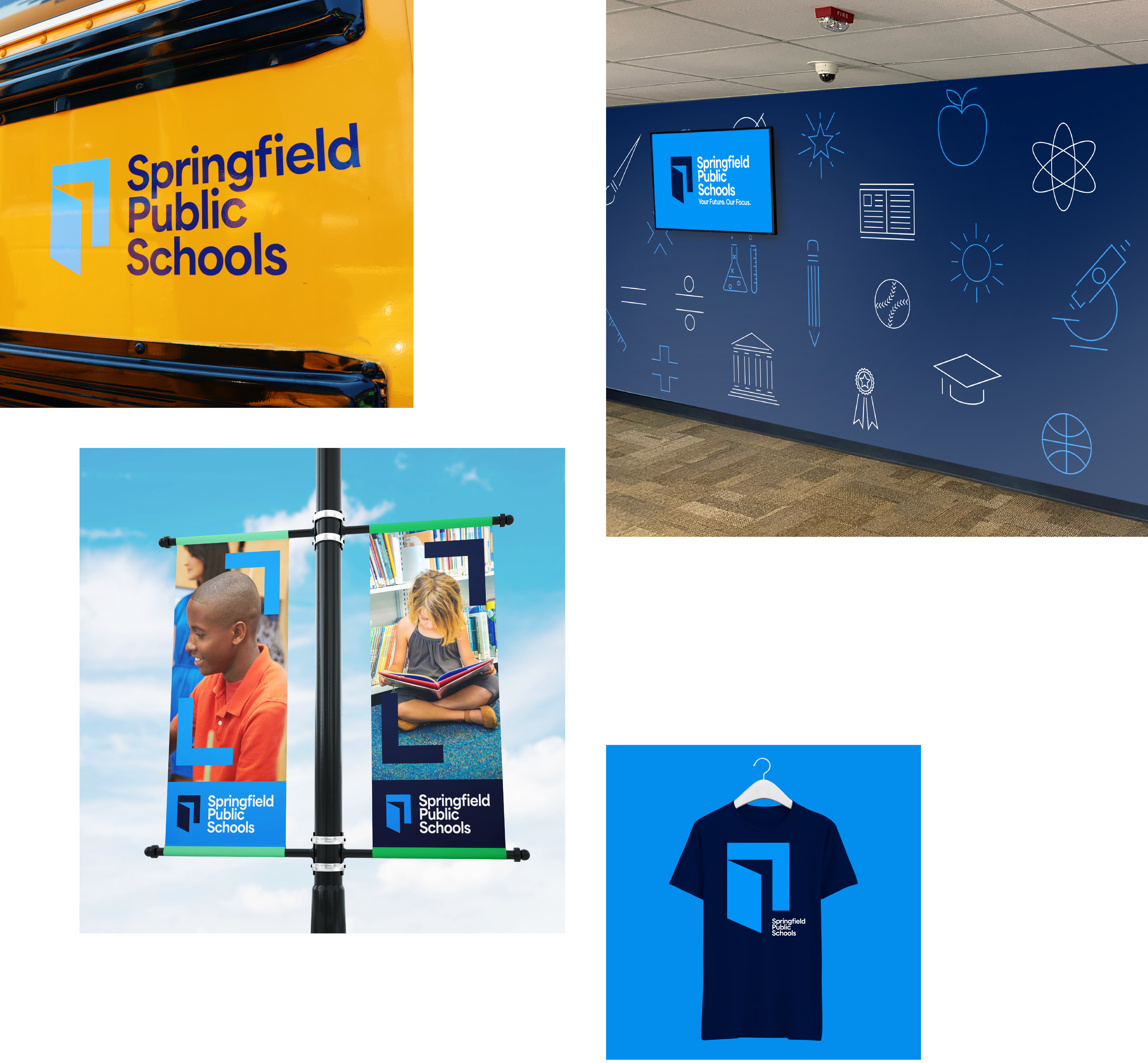
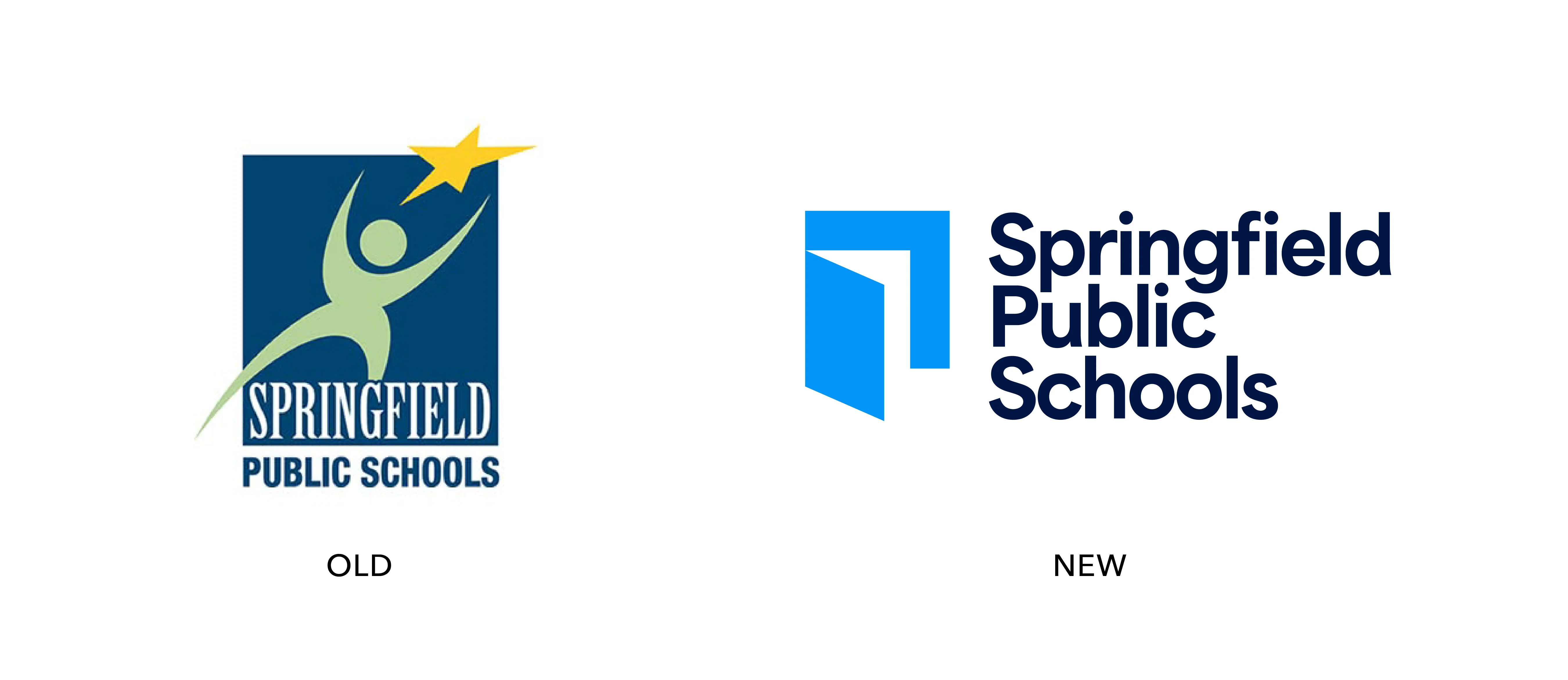
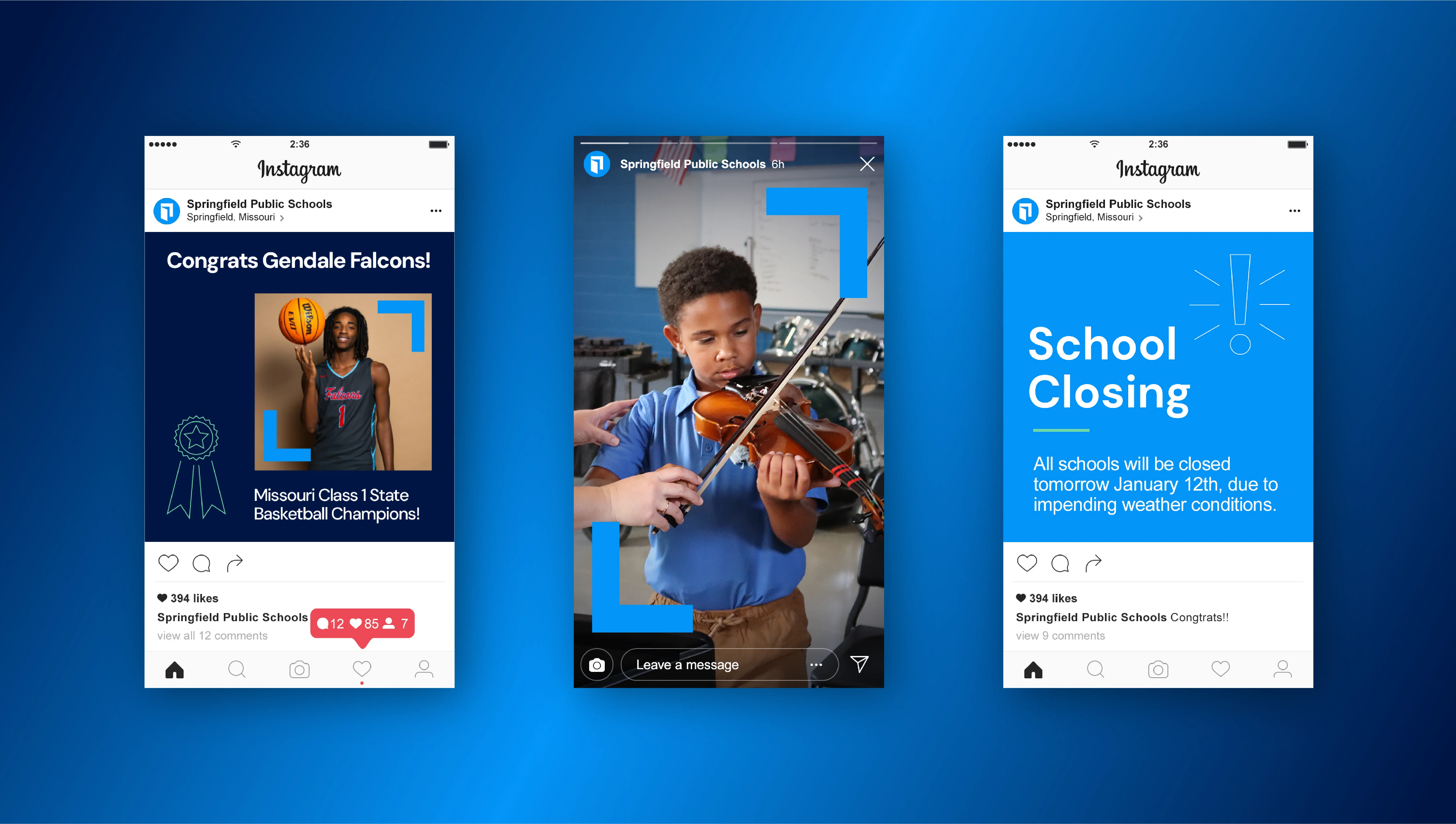
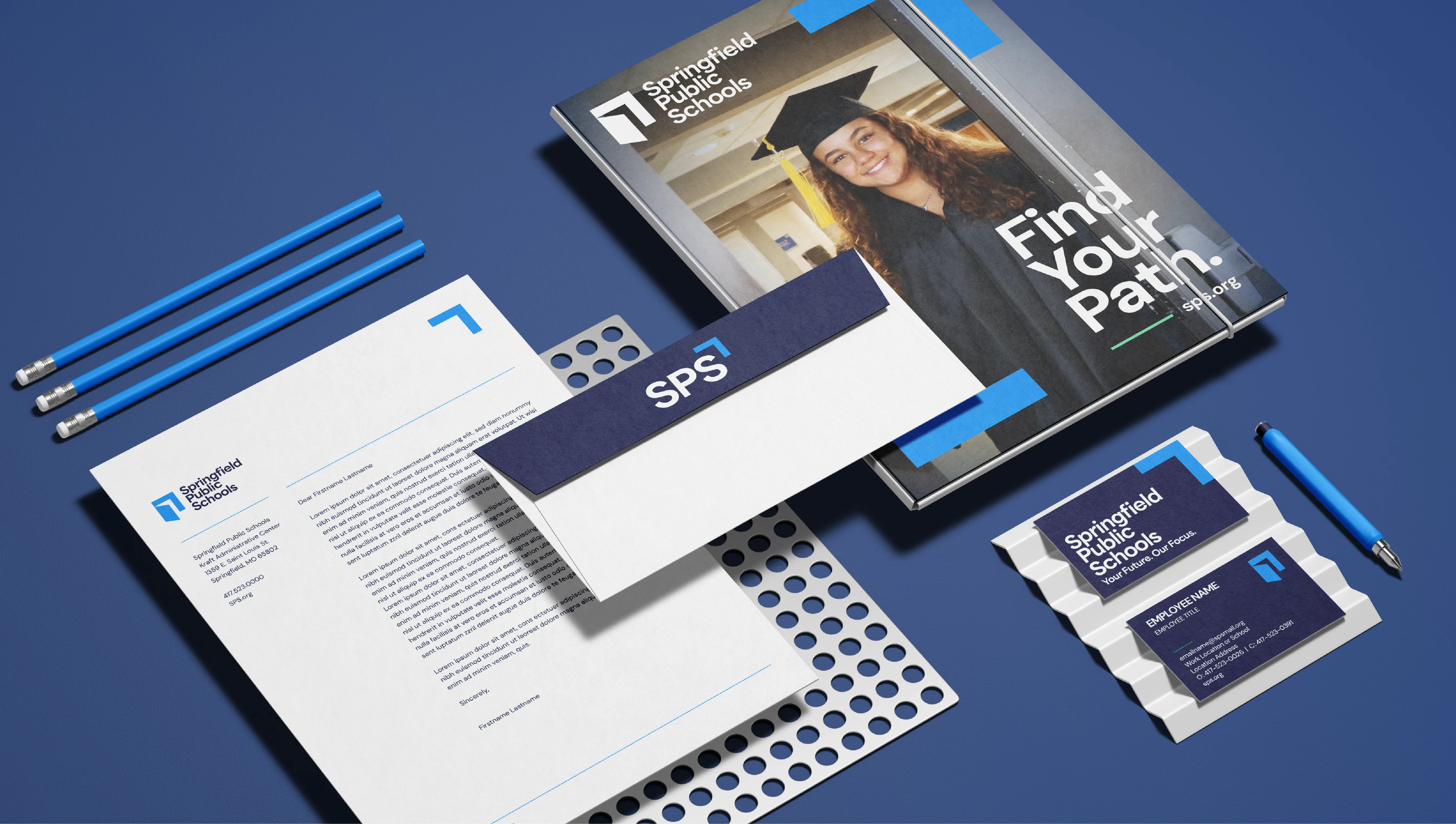
The new brand was created to embrace this unique advantage of the District. Centered around a logo made of two simple shapes, together they formed an opening door representing both the welcoming nature of SPS, and the opportunities that they provide their students during and after their time in the classroom. Elements of the logo also served as framing devices in branded materials putting the focus on the students and staff that make up the District. An entire new brand identity was implemented with new typography, color, illustrations, and signage, ensuring that the brand would remain consistent at every touch point.
The Results
Ready to Launch
A launch video featuring students and staff, and accompanying promotional materials were created to introduce the brand to the public in 2024. This coming year SPS is continuing the process of rolling out the brand across the entire range of applications, from welcoming murals, to bus decals, to employee badges.