The Dot Experience: Website
American Printing House (APH) is the world’s largest nonprofit organization creating accessible learning for people who are blind and low-vision. The Dot Experience is the public facing, immersive exhibition space of APH, designed to be the most inclusive museum in the world.
The Challenge
The Ultimate Test of Form vs. Function
As The Dot Experience was created to be the most inclusive museum in the world, their online experience needed to match that lofty goal and set a new bar for website accessibility. Often websites designed to feel visually dynamic and engaging can unintentionally create barriers for people using assistive technology, keyboard navigation, or different cognitive and sensory pathways. The challenge was not just to meet basic accessibility standards but to ensure the experience worked well for every visitor, regardless of how they interacted with the website.
Our Process and Approach
Replace Accessibility Assumptions with Lived Insight
Accessibility and inclusion guided every stage of the process, not just as a final check. Starting with extensive research of accessibility standards, our team went deeper than the surface level best practices. We met with individuals using assistive technologies to understand and see their experience, explored websites through screen readers ourselves, and redefined our benchmark of accessibility using POUR principles.
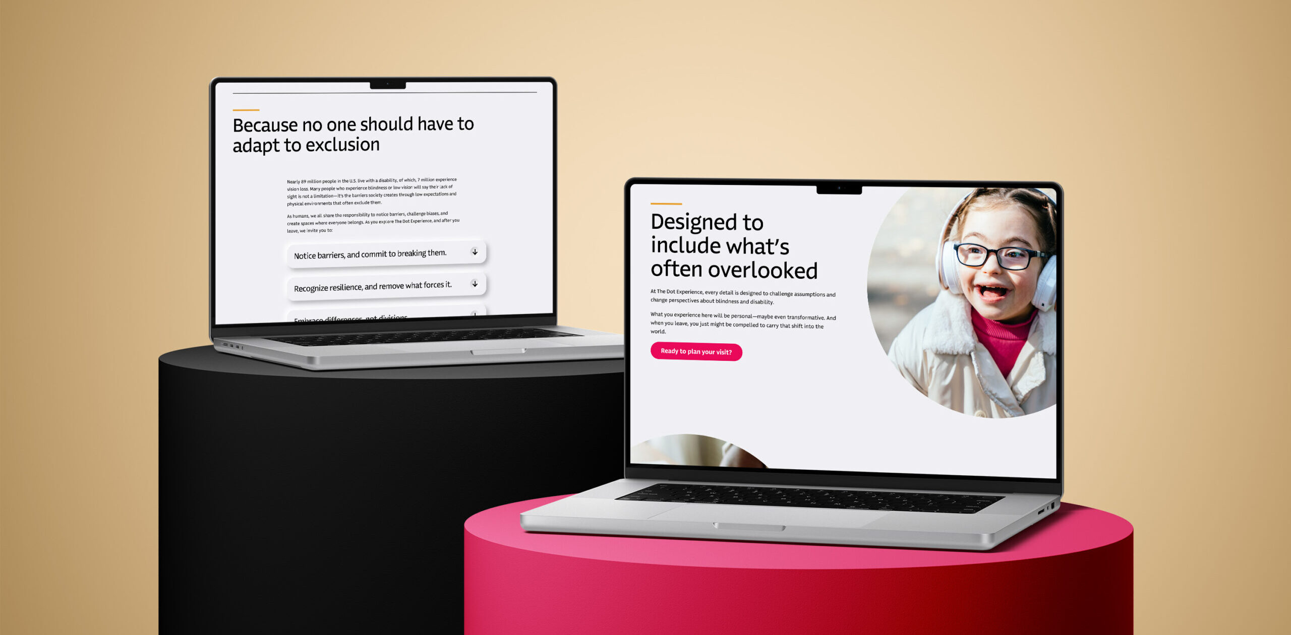
This became the foundation for every decision made moving forward, ensuring that structure, hierarchy, and interactions were intentionally built to support a wide range of users from the start, shifting our target from only accessibility, to inclusivity. Each element needed to add value and be technically flexible, all while remaining visually engaging and elevating the pre-existing brand.
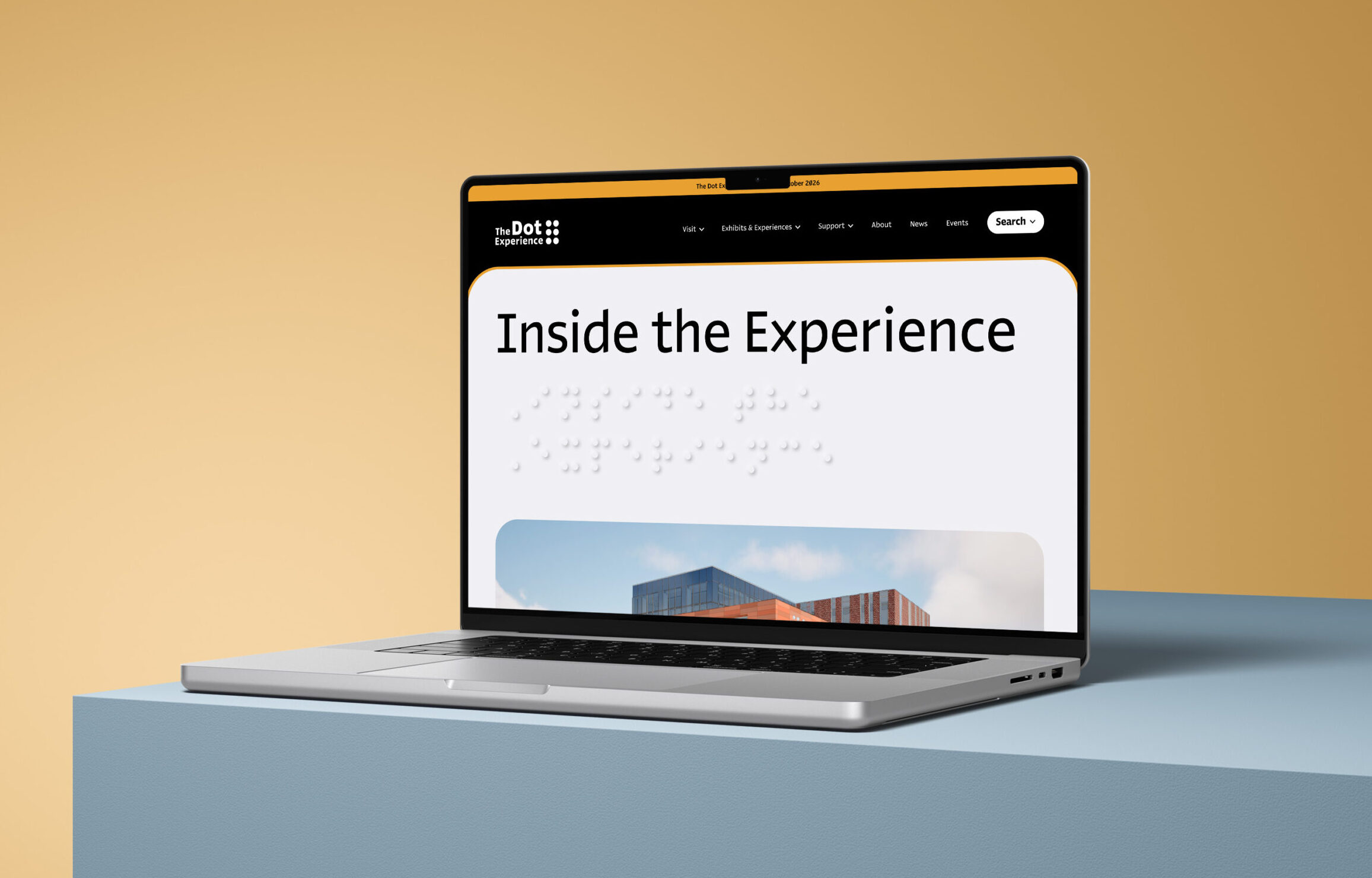
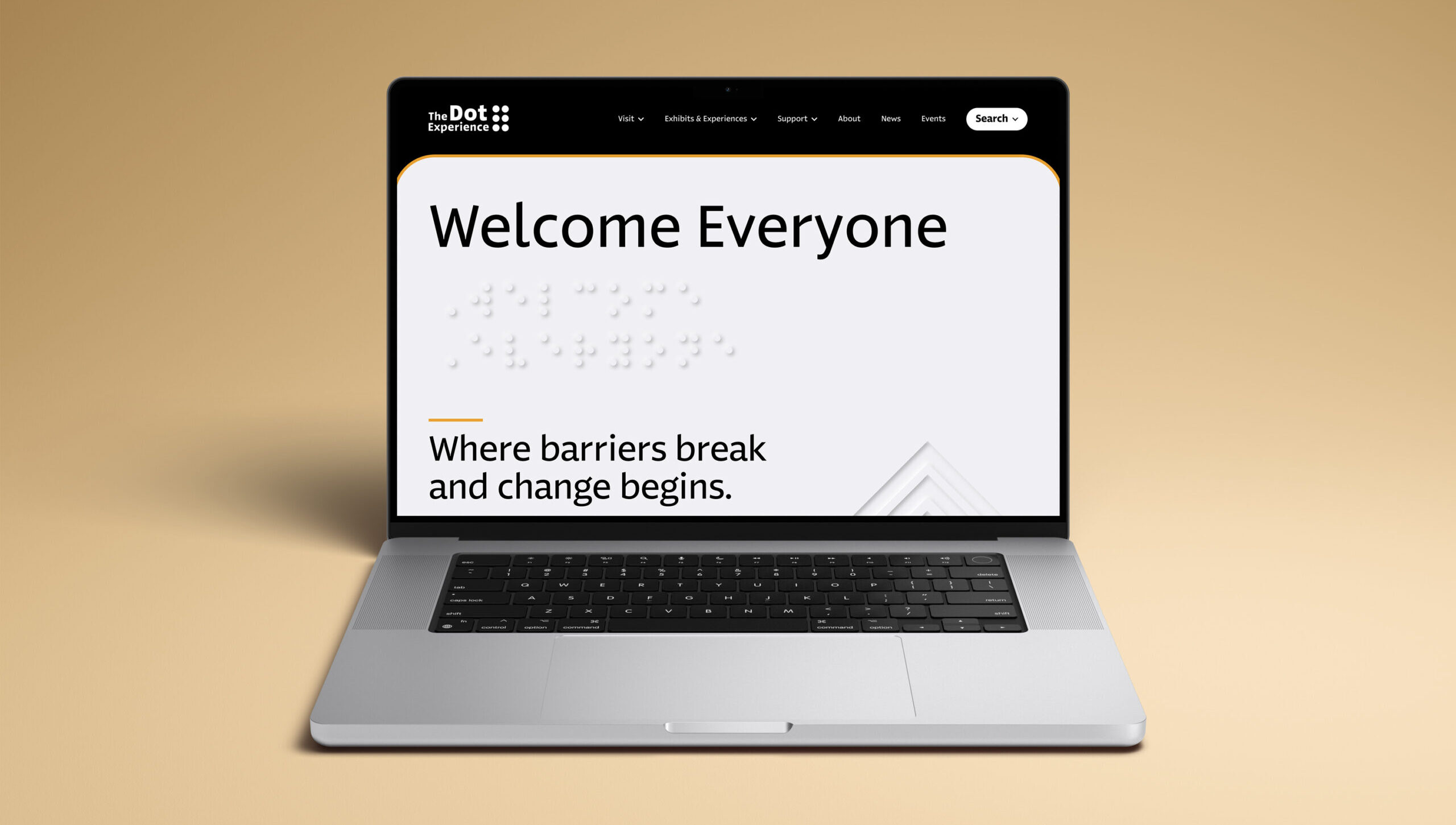
The design of the website mimics the in-person experience, bringing the tactile experiences to a digital screen. Neumorphic-style braille text reinforces each H1 in the same way tactile plaques do this throughout the museum. This serves multiple audiences. For the sighted user, this is one step closer to experiencing elements more common for our visually impaired audience. For our screen reader audience, alt text describes the experience so they are aware of the educational elements happening. While this design is utilized throughout, it is never used as the only indicator of interaction, ensuring low-vision users have the same opportunities to interact with key elements.
The Results
Thorough Testing for an Inclusive Experience
An extensive Quality Assurance (QA) process took place during each stage of development. When the website was complete, a final QA round included testers with a variety of accessibility needs to ensure the website was meeting AA Web Content Accessibility Guidelines requirements in real use cases, not just the checklist. The website is actively being used to promote the upcoming launch of this first-of-its-kind, barrier-free experience.