
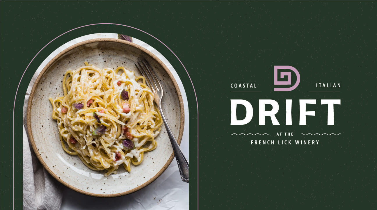
Drift Italian
Located inside the Famous French Lick Winery, a team of restaurateurs dreamt up a premiere Italian dining experience in an otherwise untapped location. Drift planned to open its doors to customers within a matter of weeks and needed branding assistance ASAP. Fieldtrip helped Drift bring to life a brand identity that gave the restaurant class and sophistication to match their coastal Italian cuisine.
THE CHALLENGE
Bringing Coastal Italy to French Lick
When the Drift team approached Fieldtrip they knew what they wanted. Drift Italian was just the beginning of a master brand. The Fieldtrip team made sure Drift was built for the future, cooking up an adaptable brand that could house all types of restaurants while still paying homage to its Italian roots. After some workshops, research, and mood boarding, it was all systems go.
THE APPROACH
Fluid shapes meet solid structures
Drift operated under Fieldtrip’s Pioneers Program. An in-house service that aims to create lean timelines and budgets catering to small businesses and start-ups. We jumped into a hands-on workshop with all the Drift stakeholders, creating mood boards in real-time and exploring both the business and branding goals of the restaurant.
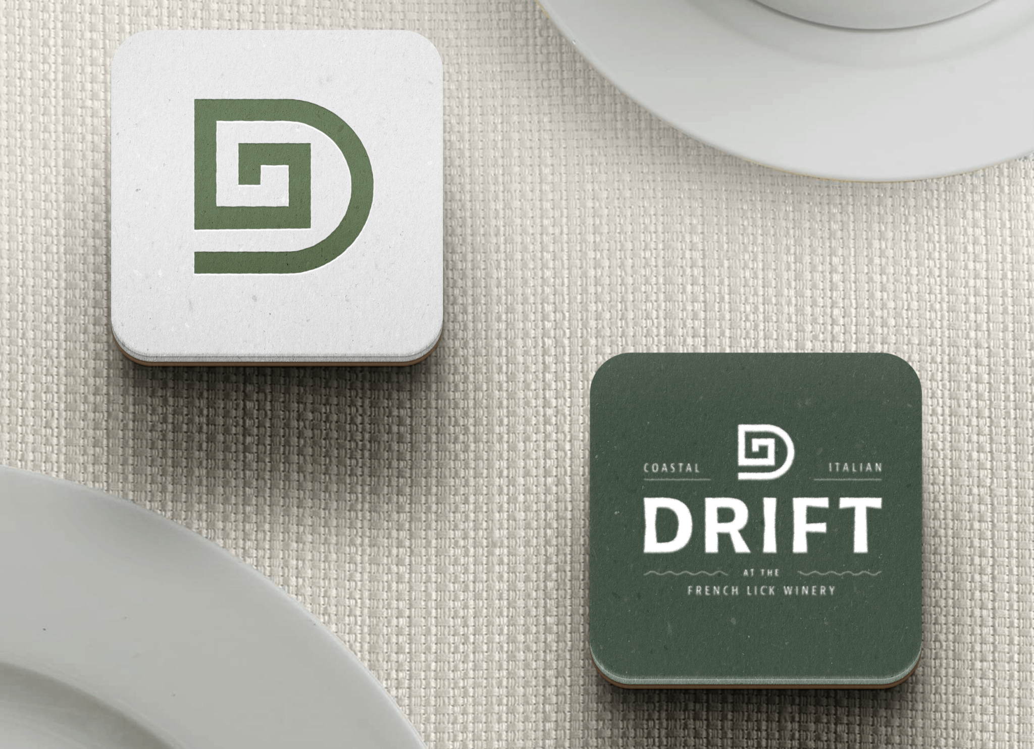
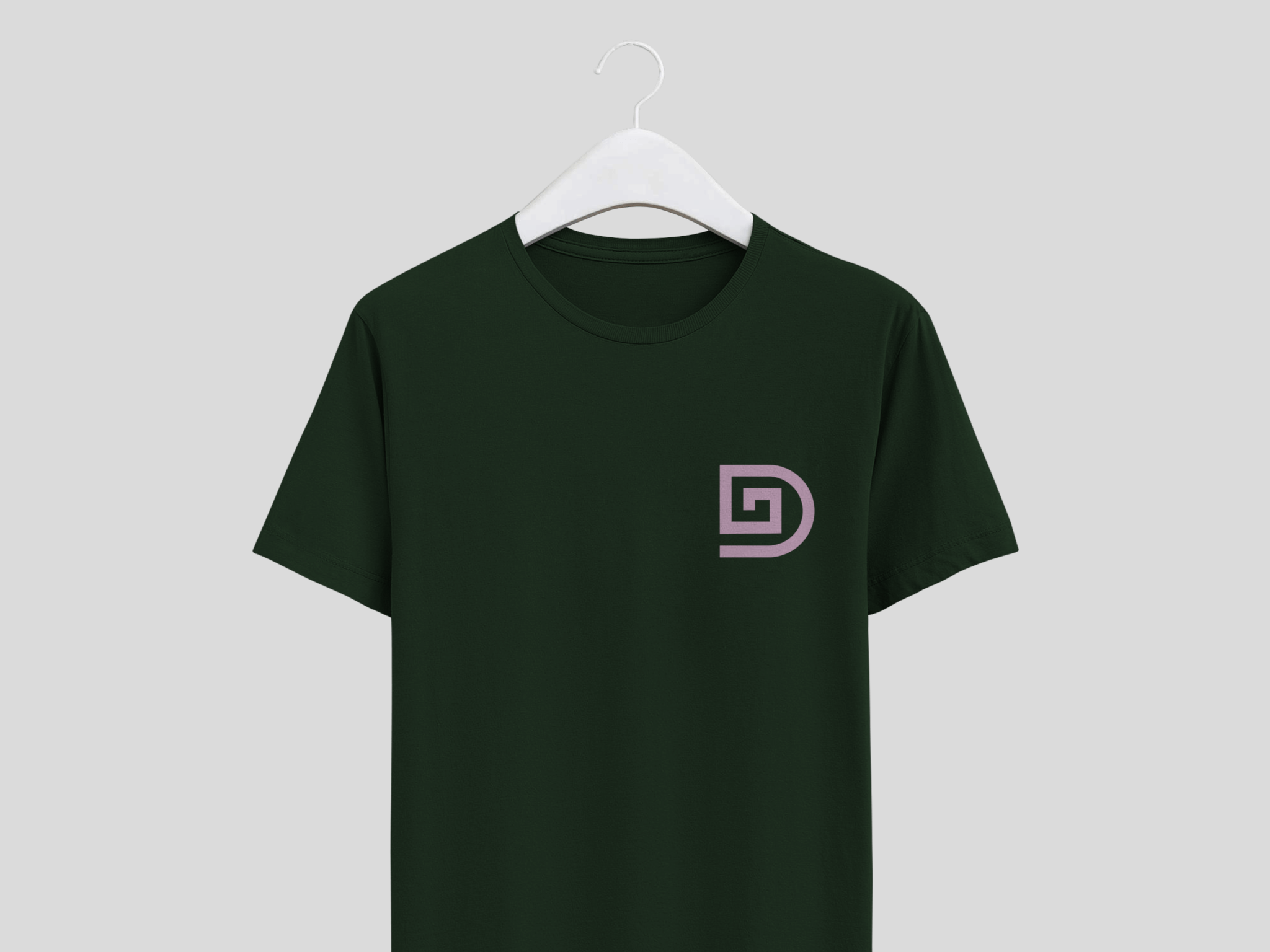
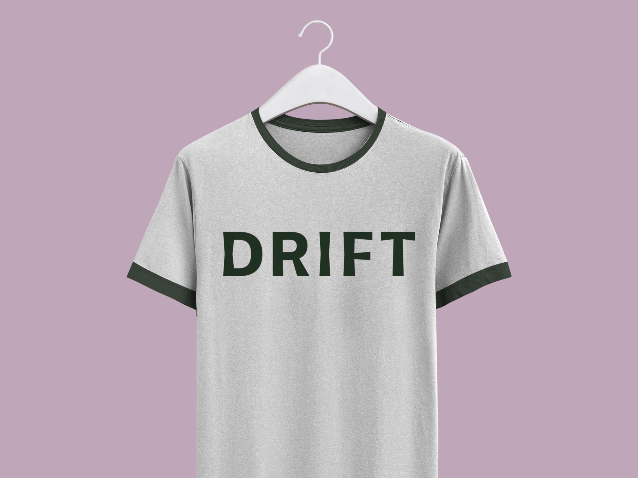
The final logo derives itself from classic Italian architecture and design. The custom typeface with slightly skewed angles represents the structureless and irregular forms of driftwood, the inspiration behind the name. Paired with the larger brand identity, Drift conveys a refined and thoughtful approach to Italian cuisine, while avoiding the stuffy or outdated aesthetics many upscale restaurants fall for.
THE RESULTS
una bella identità di marca (a beautiful brand identity)
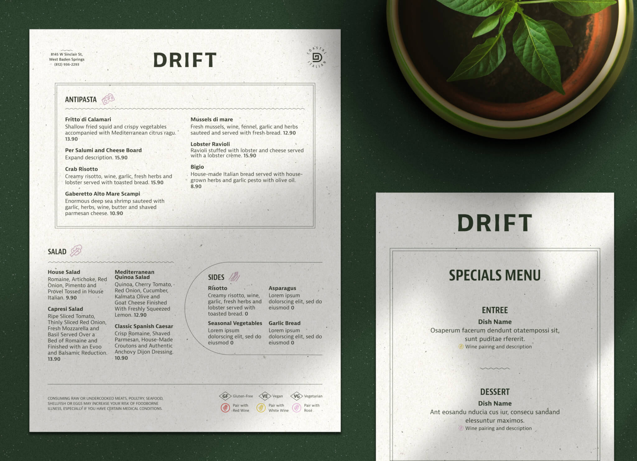
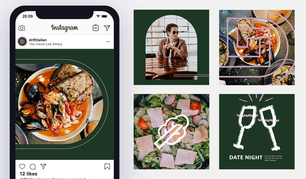
Drift opened its doors with its new brand in the summer of 2021. Attracting date nights, wine-aficionados, and those looking for a change of pace in southern Indiana, Drift Italian serves up a top-of-the-line menu and brand.