Jordan Valley Health
Founded in 2003, Jordan Valley Health is Missouri’s Largest Federally Qualified Health Center (FQHC) serving over 67,000 patients across the region. While the brand was known, and their service, facilities, and care are of a high quality, there was a persistent lack of understanding around their services. Their regional perception also suffered from an outdated and inaccessible brand that communicated something lesser.

The Challenge
Fighting Past Perceptions
Jordan Valley Health faced significant barriers in patient utilization and public understanding. To support their strategic expansion and improve health outcomes, they needed to evolve from a misunderstood “community health” organization to one that addresses the real, emotional barriers patients face when seeking health care.
20+ years after their humble beginnings in a single provider office, JVH had grown tremendously in scale and reach. However much of their branding and communications remained stuck in the past. With a new CEO and marketing team in place, 2025 was the perfect opportunity to build a brand for the future.
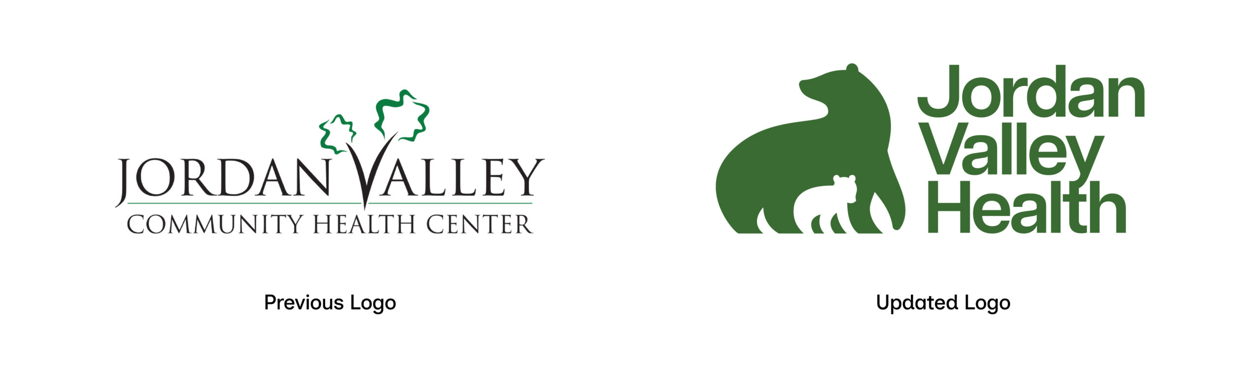
The previous brand borrowed their logo from a neighboring park, and their name at the time, “Jordan Valley Community Health Center” implied a single location, and was saddled with the baggage that “community health” often evokes in some. While operating on the scale of a large complex healthcare system, they still were still perceived as a smaller, low quality organization. The reputation did not match the quality of their services, resources, or facilities. All of these challenges eroded trust and clarity, and created barriers between JVH and their audience in need.
The Approach
Bears & a Bold Direction
Fieldtrip, in partnership with Audience Audit, conducted a statistically rigorous quantitative study that identified three unique patient attitudinal segments: Avoidant, Engaged, and Included. These segments provided a deep understanding of patient motivations and fears.
The research guided the comprehensive renaming, rebranding, and public launch of the health system. Crucially, the impact of these findings extended far beyond marketing. Jordan Valley Health’s executive leadership utilized the attitudinal segments to make significant operational changes, committing to a “Start From Yes” philosophy to deliver empathetic, whole-person care across all clinics.
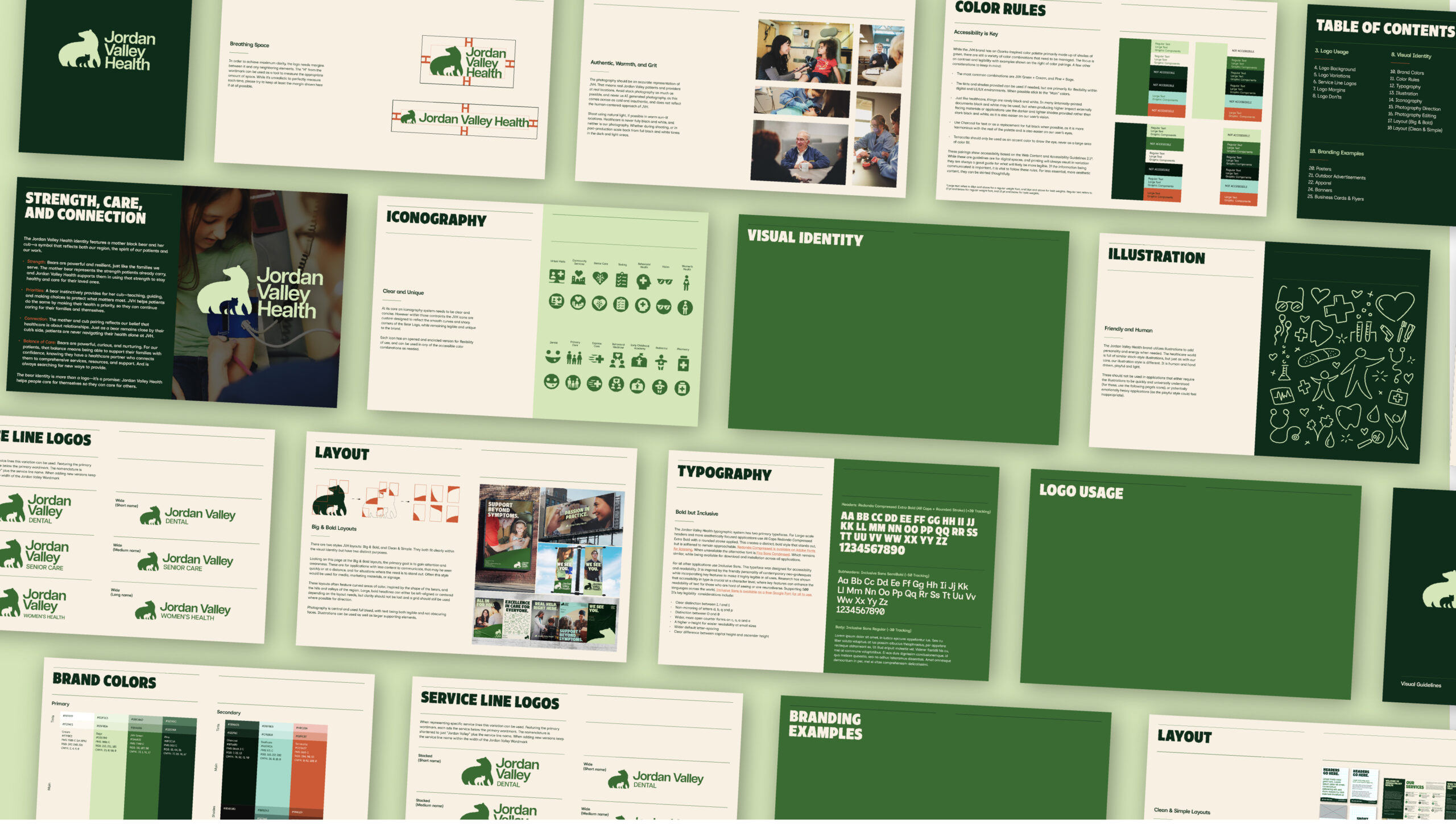
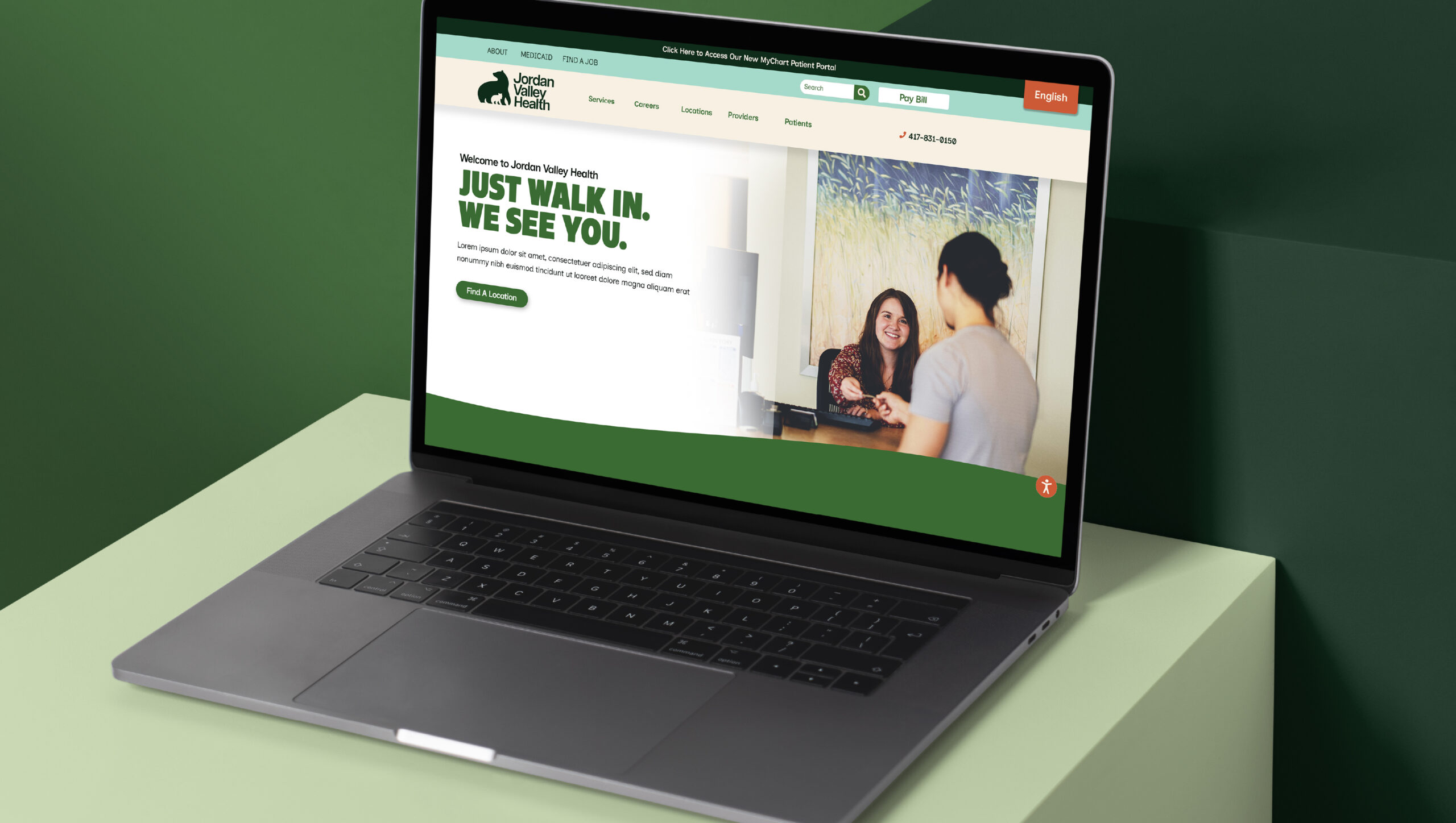
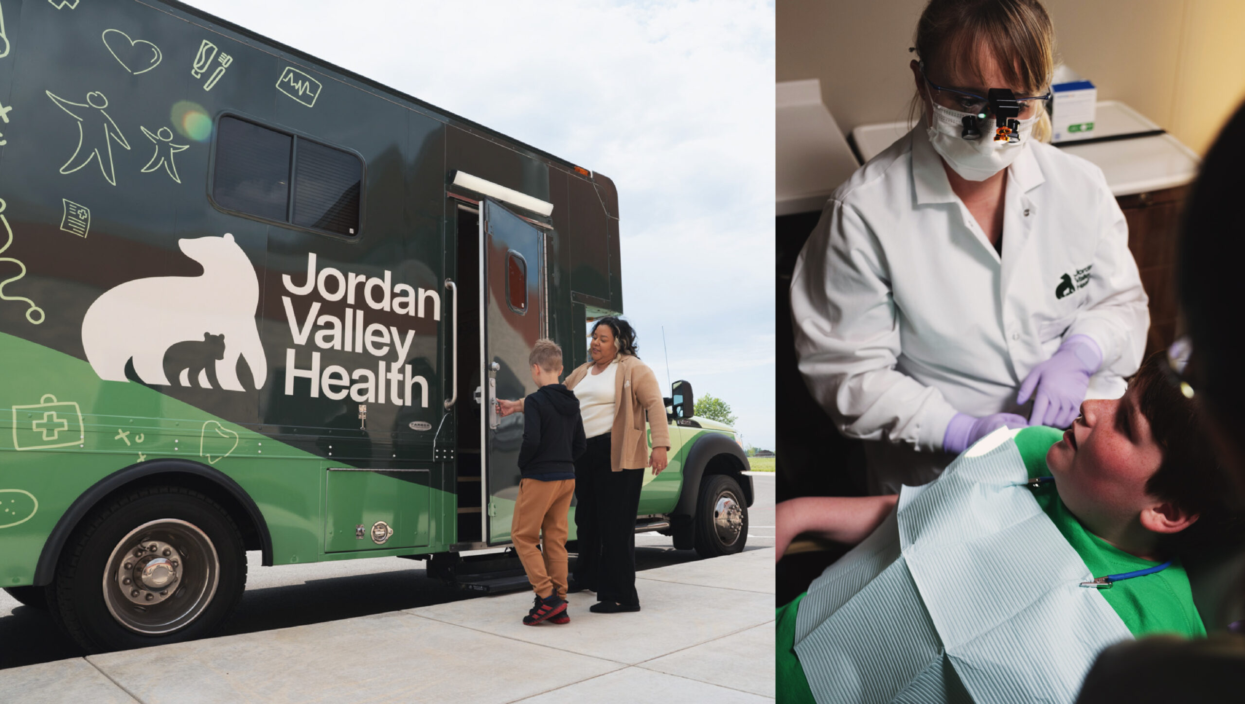
The visual identity centers around a mother black bear and cub logo, a powerful symbol tied to the region, that embodies the organization’s spirit. It represents the deep care and affection inherent in Jordan Valley, their team’s innate sense of curiosity, and how they seek to nurture their team and community. Striking a balance between sophistication and quality, while remaining approachable the visual identity uses he Ozark-inspirted color palette and bold typography and illustrations further set the JVH brand apart in the healthcare space, and create a look as distinct as the organization itself.
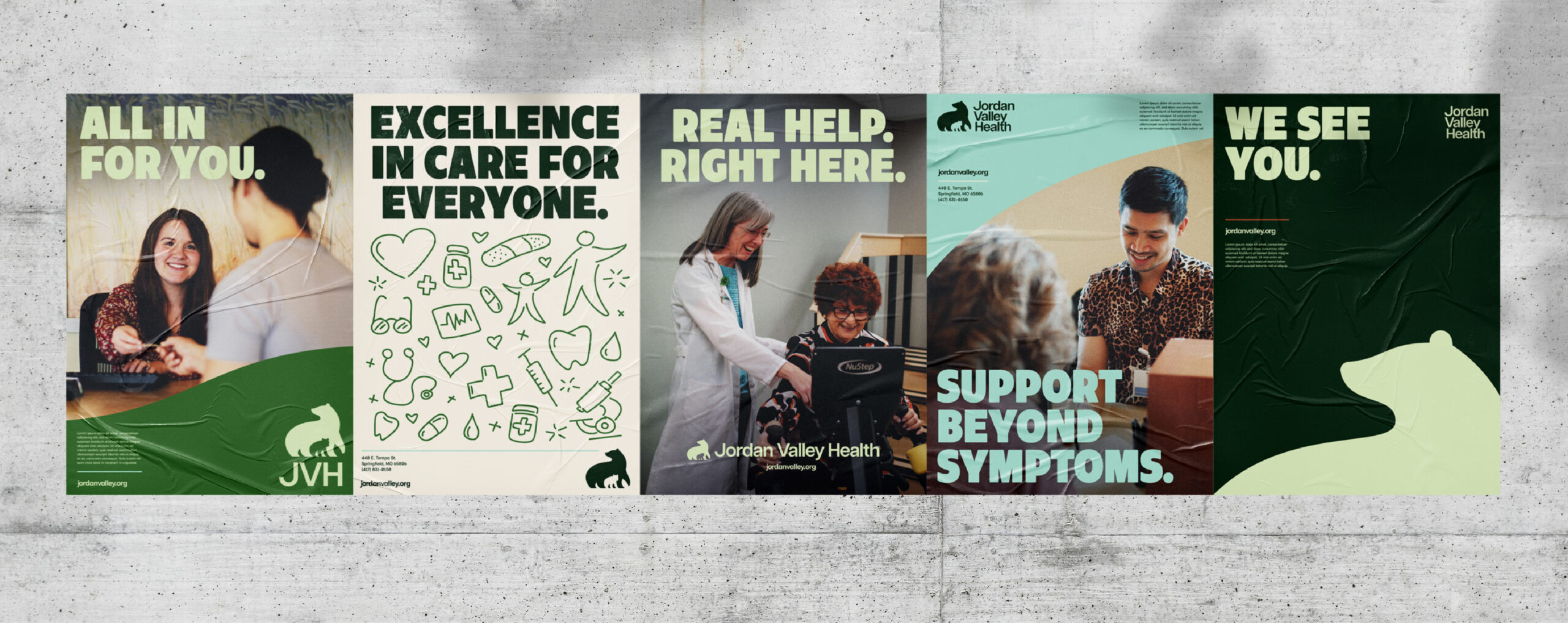
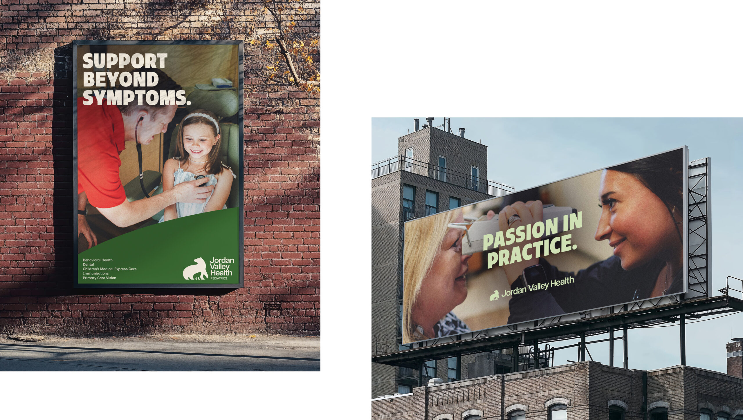
Along with brand templates and toolkits, an extensive verbal identity was also developed with the mission of translating clinical verbiage into more approachable language at its core. Taglines, positioning, values, and messaging for all applications gave the JVH team the tools it needed to confidently take the reins and lead the brand into the future.
The Results
An Organization Transformed
The rebranding, launched in 2026, is transforming Jordan Valley Health’s relationship with its community. The attitudinal framework unified staff under a shared service philosophy, streamlined communications, and continues to increase patient visits and retention. This demonstrates how research can drive both brand relevance and operational excellence. In partnership with Fieldtrip a media plan, strategy, and concept was created to launch the brand with a campaign centered on the healthcare needs of women at its core.