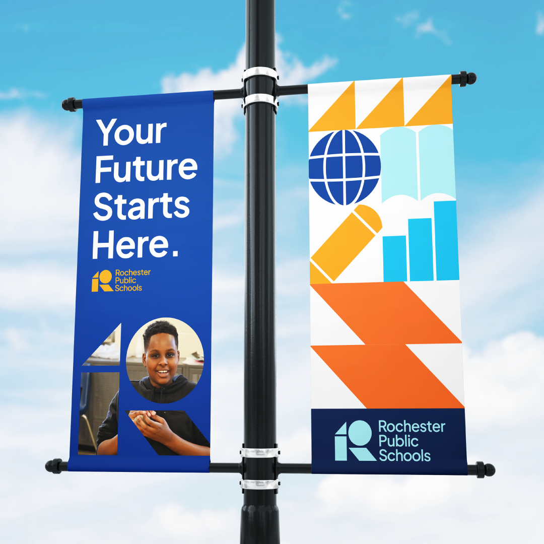
Rochester Public Schools: Brand
Rochester Public Schools (RPS) is the public school district for Minnesota’s third largest city. As a diverse public school district evolving for the future, the district was seeking a sophisticated and impactful suite of narrative messaging, including mission, vision, values, and a new brand. The verbal identity was complimented by a visual identity that balanced innovation with a sense of familiarity and belonging.
THE CHALLENGE
Finding the balance between rigor and support
Rochester Public Schools is a district looking towards the future, but some in the community saw it as a misaligned institution ignoring traditional academics like math and history. This misunderstanding was creating tension among families that didn’t see the district as being “for them.” However, RPS provides a wide range of unique learning opportunities, including both innovative and traditional choices. The district needed to be seen as a place for students who require a challenging academic environment and for students who need intentional support.
Qualitative and quantitative research showed that RPS was well known for its diverse, welcoming and inclusive culture, with teachers who are willing to go the extra mile to make education impactful for their students. The new brand needed to lean into the district’s strengths while countering misperception that risked losing students.
THE APPROACH
Preparation for a modern world
Fieldtrip’s research process included in-depth interviews, focus groups, surveys, and site visits. Technical audits identified barriers to accessibility that must be addressed, and analysis of competing districts reaffirmed the RPS brand position. Between the academic challenge, diverse learning environment, and intentional support, one thing became clear: no other option in the area could prepare students for the future like RPS. Whether it was through options to explore interests, building understanding and empathy through learning aside diverse perspectives and backgrounds, or the high quality of support provided by school teachers and staff, RPS provided many paths to success for its students.
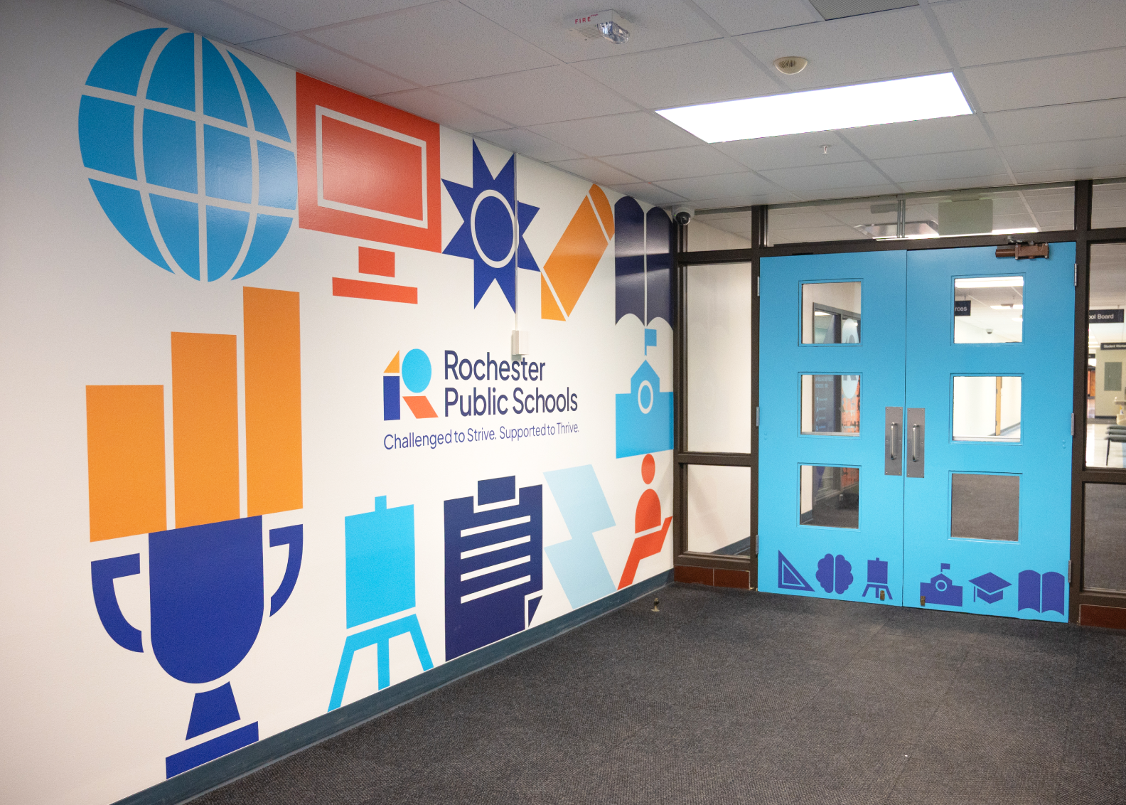
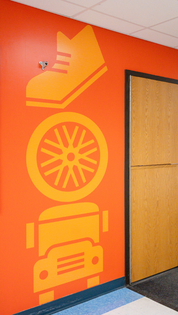
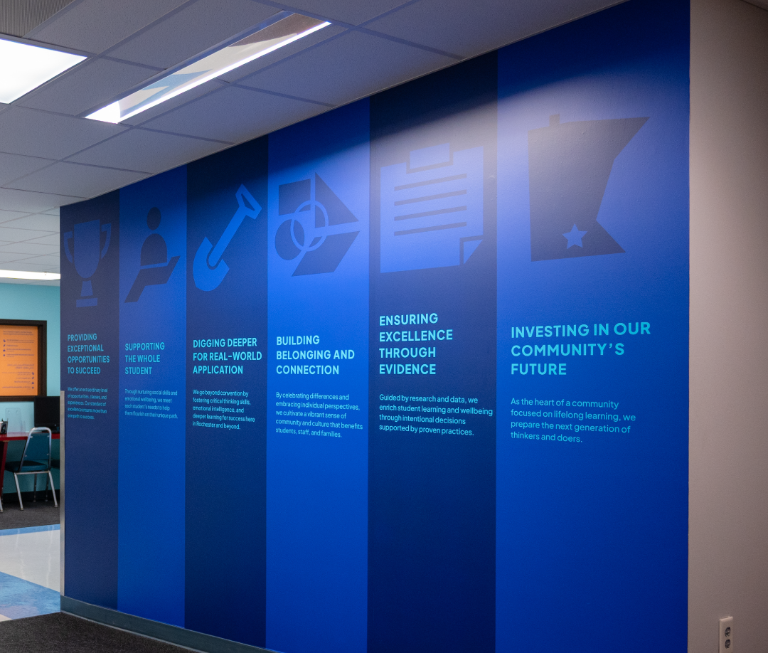
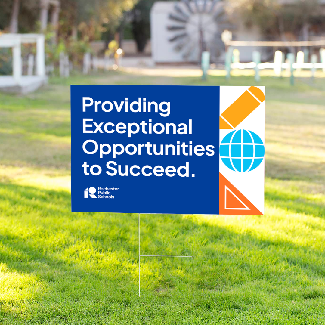
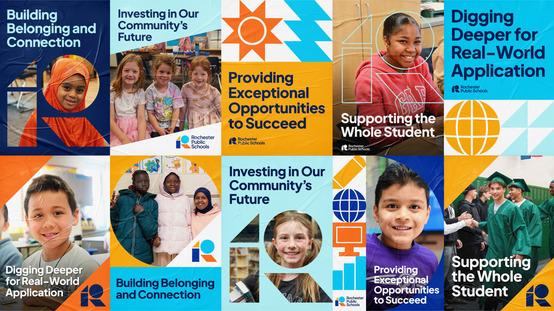
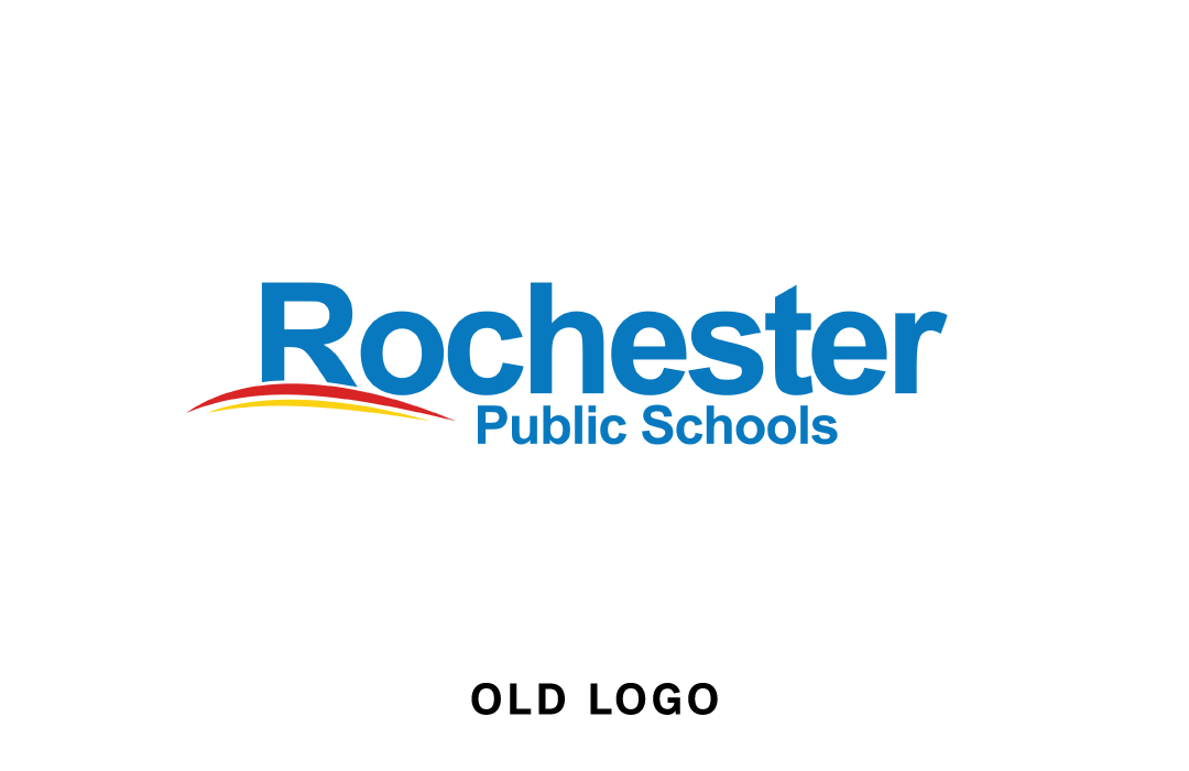
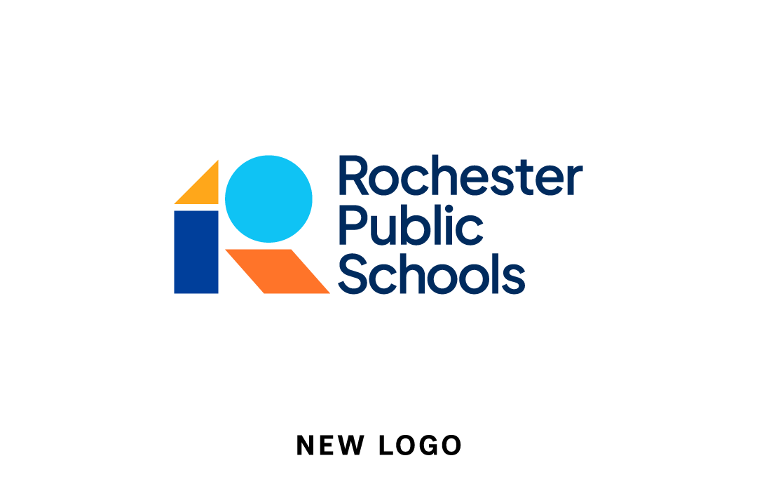
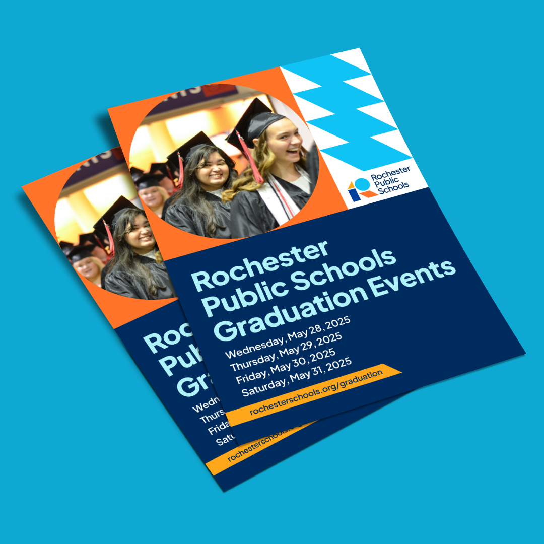
The new brand was created to elevate every aspect of that advantage. A verbal identity was written to speak to the many ways students are prepared and empowered through RPS, be it with knowledge or life skills. The new tagline “Challenged to Strive. Supported to Thrive” spoke to the balance of offerings and ambition that the district fosters. An RPS logo was built with different colors and shapes to symbolize a diverse community coming together to create lifelong stability. School districts often struggle to manage brand consistency, but the RPS brand system was designed to be modern and flexible, with a full suite of direction and applications to ensure the brand stays easy to use and keep consistent across every touchpoint.
THE RESULTS
Inspire belief for the future
Prior to the brand launch, RPS had experienced a successful referendum that reflected a community committed to improving the district. The new brand was launched to be the face of the district moving forward as it grows and progresses. Unlike previous processes the district had undertaken, this effort frequently solicited community voices, both during the research, as well as during creative development. For the first time, the district had an accessible, professional, and consistent brand. As many districts face new challenges with enrollment and funding, the new brand is a symbol of a modern district determined to engage with its community, build trust, and continue to succeed in a changing world.