I’ve been on this pale blue dot long enough to recognize that things in life are rarely black or white, right or wrong, republican or democrat, or countless other dichotomies. Perhaps the secret to life is being able to swan dive into the middle and make yourself at home in the mess of it all? In my career of crafting online experiences for all types of users and their needs, I am constantly challenged by the depths of simplicity vs complexity. As designers, it is our natural tendency (but a bias nonetheless) to view a pre-existing interface as cluttered and in desperate need of an overhaul. But is that really the right path? How do we chip away at this binary thinking and start building better (but imperfect) solutions for the messy world we live in?
The first thing we need to remember as the experts hired to solve a problem is that we are not our users. Furthermore, when it comes to industries with complex data like healthcare or finance we are even further removed from the experts found in those disciplines. But that is ok. I repeat, that is ok. Yet, we put ourselves in that imagined user driver seat, claiming things like too many buttons, too much information, or that it looks like something from the ’90s. Does everything really need the shiny dark-mode redesign treatment found all over Dribbble?
Our value as creative thinkers is not tied to having all the answers but instead to do the hard work to dig deeper and uncover as many insights as possible. Basing our solutions off assumptions is a very dangerous and arrogant game. Instead we must set aside our pride and turn to our most valuable asset, the users. By better understanding their needs we easily discover the subjective balance between simplicity and complexity. We might learn that an interface that looks chaotic to us could allow a doctor to quickly see all necessary data points for a patient in a quick glance, or any number of perspectives not obvious to the creator.
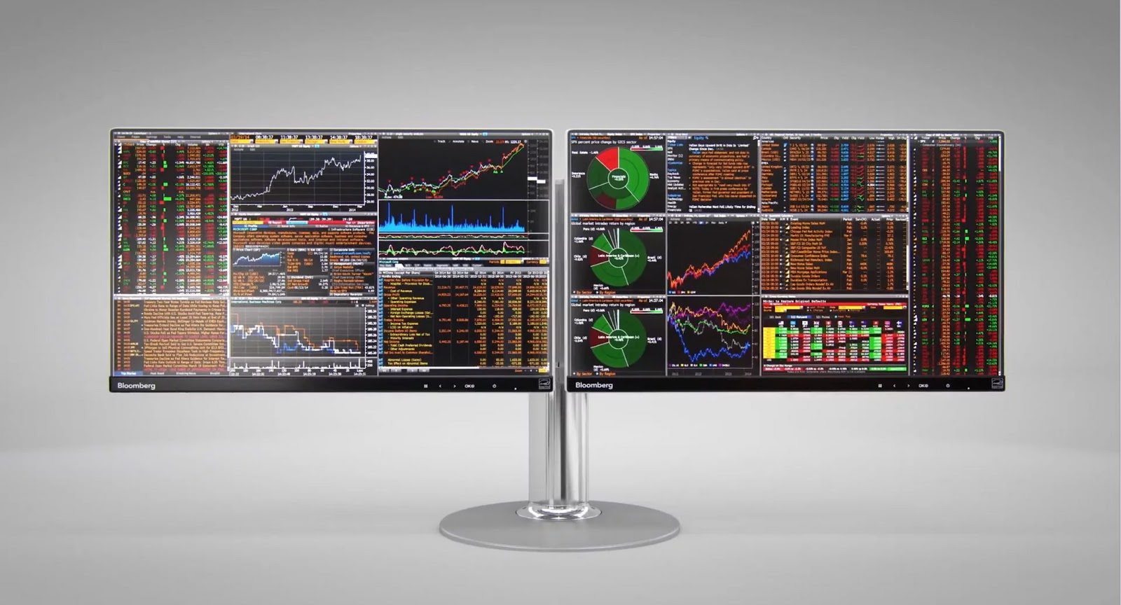
Below is a view of the Bloomberg terminal system, a software that allows users to monitor real-time financial market data. Quickly our designer minds run wild with solutions on how to make our eyes from hurting. Upon surveying users concerning a redesign (which has been attempted before) you would learn that there is very little interest and users take great pride in the challenge to understand the system, and any redesign of this software would almost certainly fail.

Performing user interviews and research is a difficult and pricey endeavor. Nonetheless, taking the bold leap to invest in what your users really desire is the right thing to do. In the case of the Bloomberg terminal that might reveal that the next step is to do nothing. I believe all too often we turn a blind eye to considering the option of staying put. Why is that?
In his book, Living with Complexity, Don Norman states:
“The world is complex; our tools need to match that complexity. Simplicity turns out to be more complex than we thought.”
I’m encouraging all creative thinkers to hold judgment and to look with curiosity to understand why something is the way it is. Understand the people your project is geared toward. That something is not your flavor of simple doesn’t mean much at all until you have the real data to back it up or pointing in a different direction. There will always be plenty of problems to be solved, but as designers, we hold a great deal of responsibility to make sure our solutions are informed and designed in the best interest of our users. It’s okay if that process feels disorderly and doesn’t match the vision in your head. By hopping all over the spectrum between simplicity and complexity you are more in sync with the world we live in.


