Heine Bros
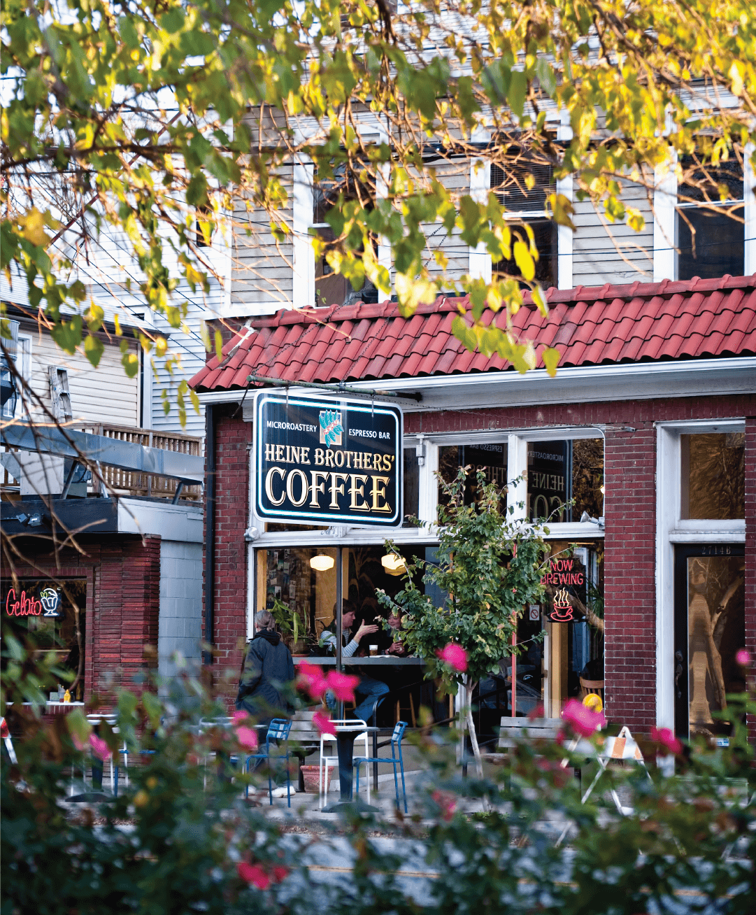
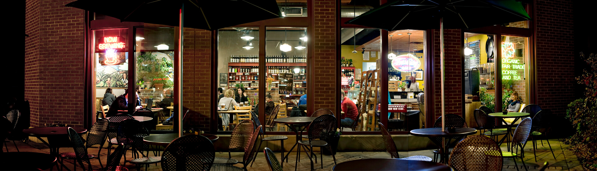
Heine Brothers’ Coffee has been a Louisville staple since first opening their doors in 1994. Since then, they have grown to 18 locations and take pride in being a 100% fair trade and organic coffee roaster.
THE CHALLENGE
Growing Louisville’s original local coffee roaster
The Heine Brothers’ leadership faced a variety of challenges: absorbing another local coffee shop brand, turning around underperforming stores, and defending their position as the original Louisville coffee roaster as more and more local shops emerged. Their original logo, while serving them well in the beginning, had become outdated and its detail made it difficult to reproduce.
THE APPROACH
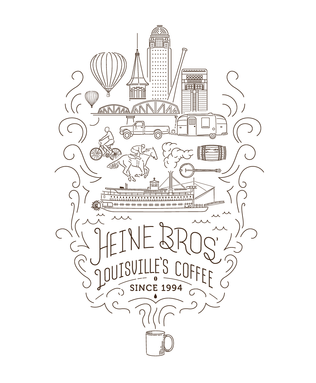
The seed-to-cup story
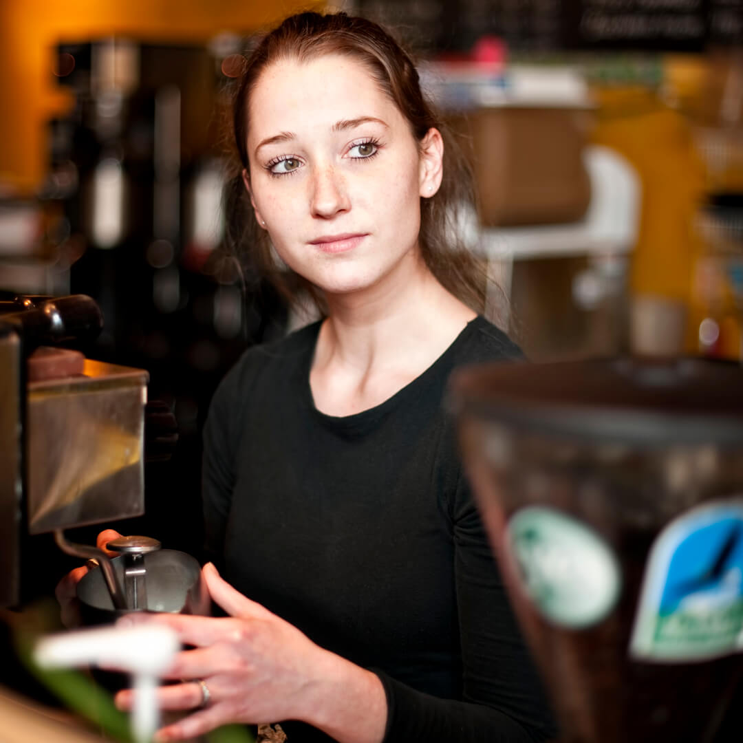
We immersed ourselves in Heine Brothers’ business by serving as baristas (or performing coffee ballet as we now describe it), working in the roastery, chatting with customers, and making visits to competing shops. Heine Brothers’ is far more than just coffee, they are a home away from home for many patrons. A place to spend time connecting with others or enjoying a few precious moments alone. Time at Heine Brothers’, even via the drive-thru, should leave each customer happier than when they arrived.
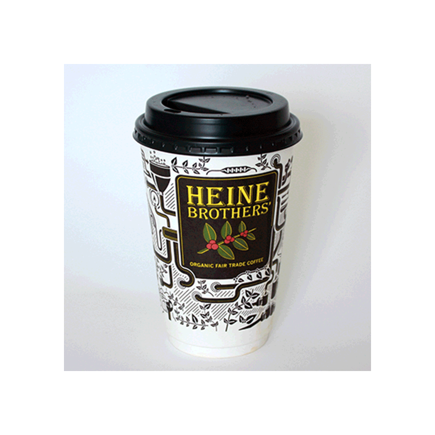
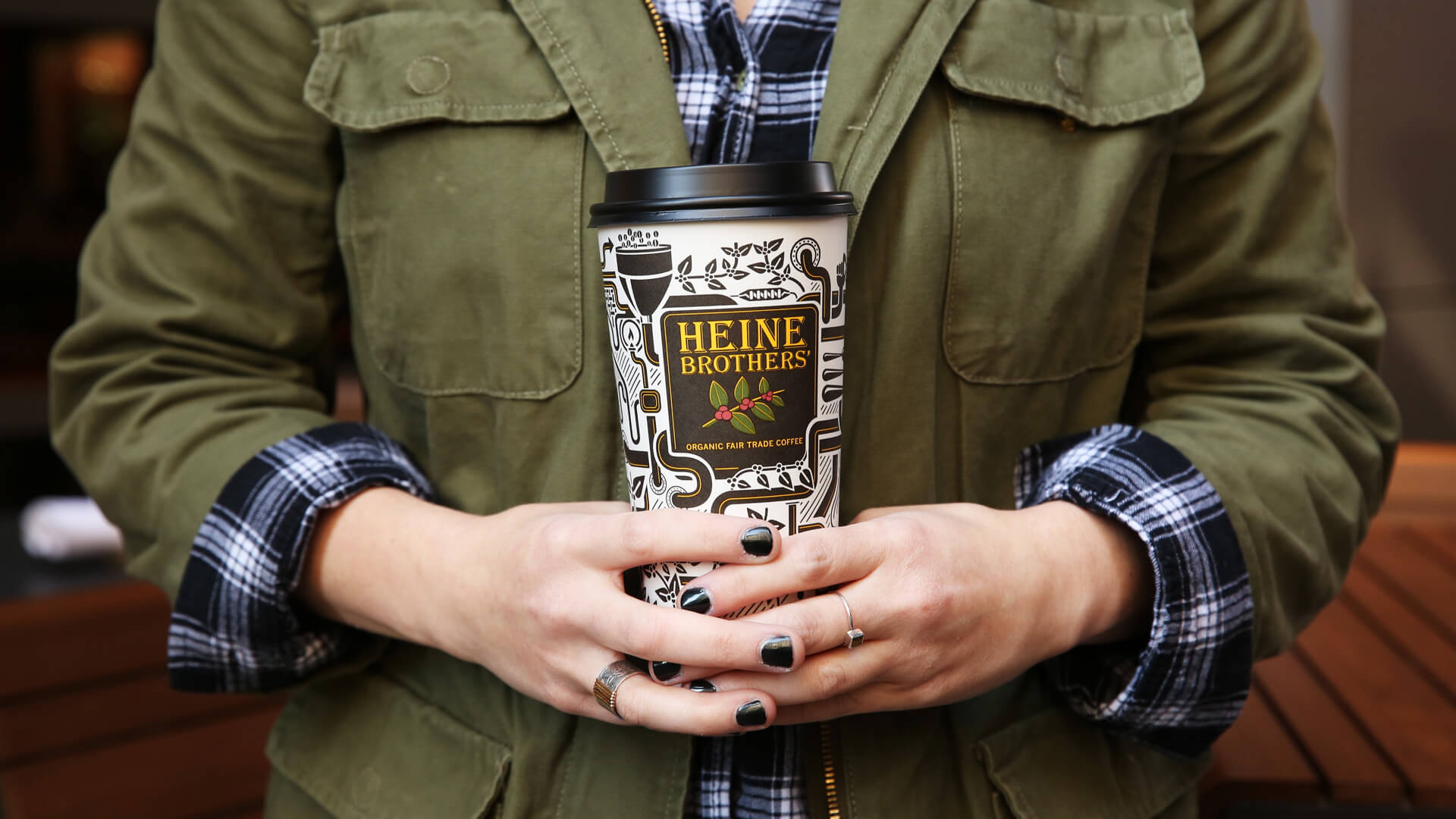
Rather than invest in a media-focused campaign, we recognized the best advertisement was carried by the customer every day: the cup. Coffee cups are a flag of loyalty put up by customers no matter what the brand. It’s a stamp of approval and a mini-billboard traveling to meetings, offices, and weekend soccer games. The attention moved to updating the brand identity, redesigning the cup, and key brand assets to visually tell the seed-to-cup story that makes Heine Brothers’ special.
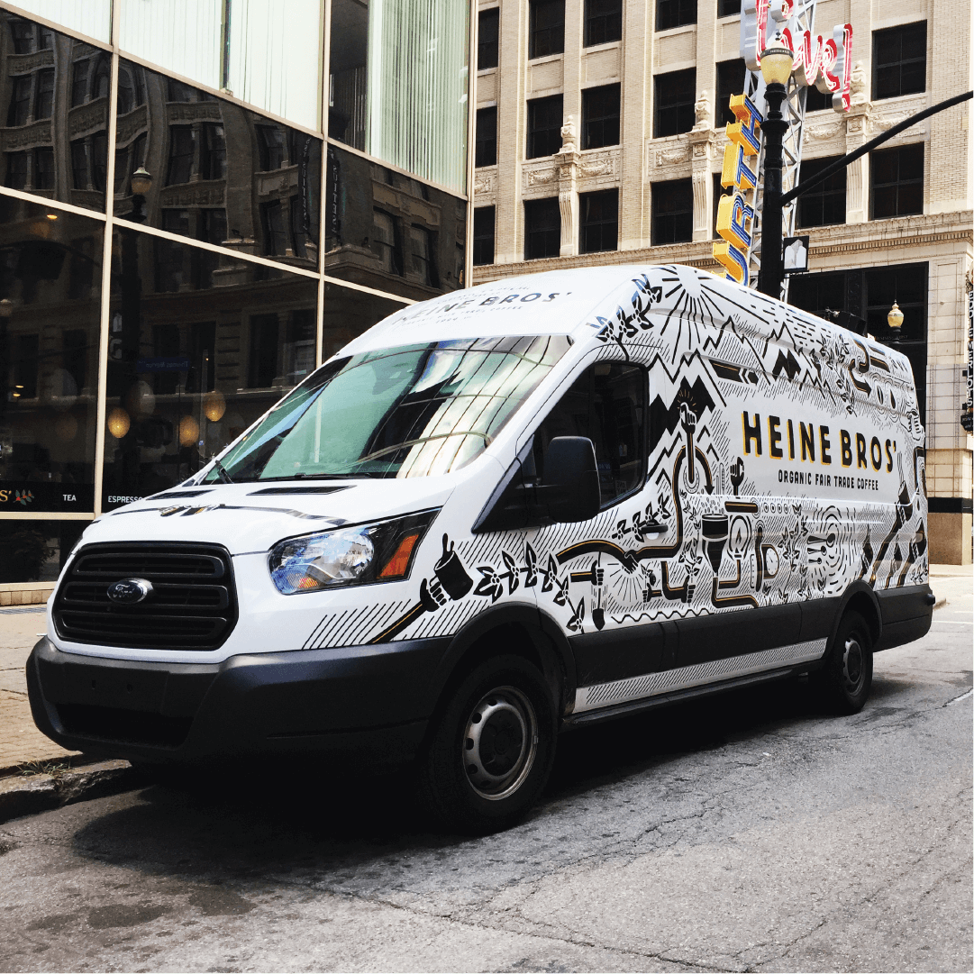
THE RESULTS
Standing the test of time
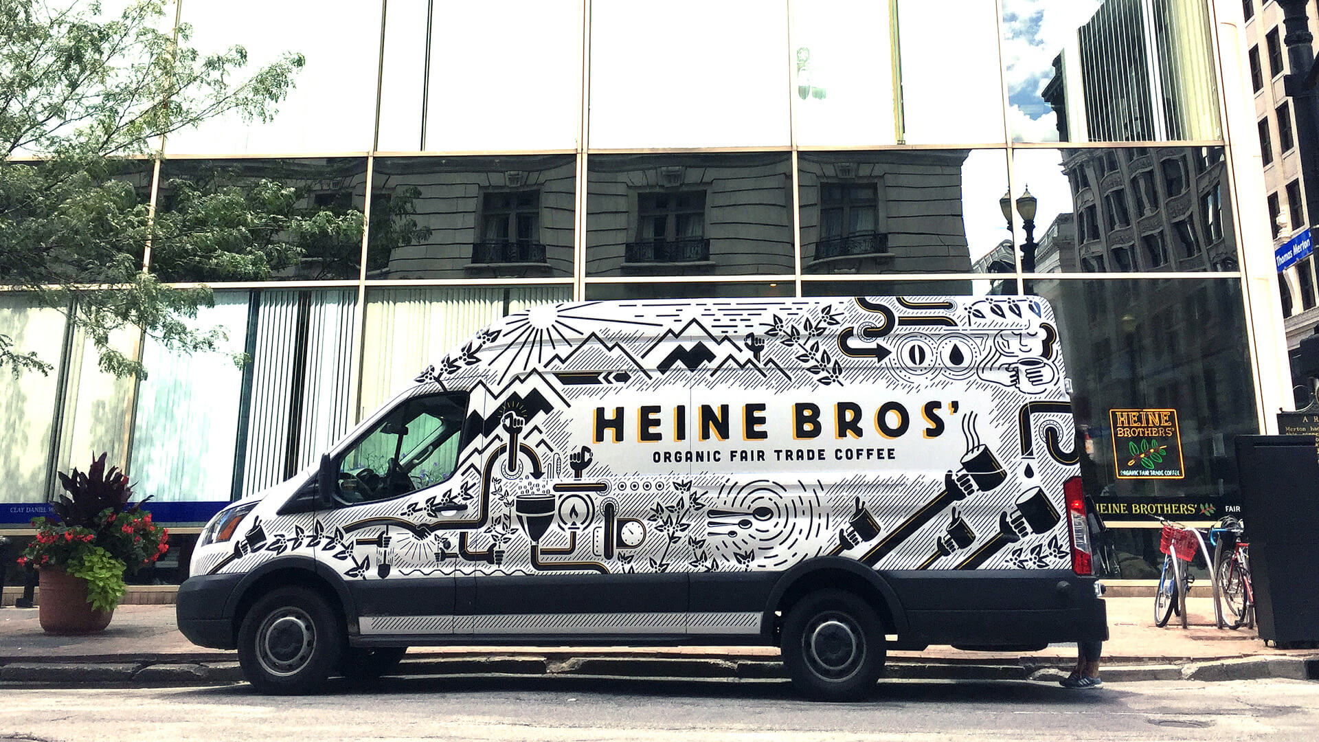
Our process guided leadership and brought clarity to their business direction. Years later the reimagined brand continues to build brand equity and recognition, with their signature cup serving as a flag across the city. The initial project expanded into van designs, and a variety of campaigns that brought lines out the door for grand openings. New locations were profitable within the first week rather than the 90-day turn around seen with prior openings.