Fieldtrip Animated F Logo

Mira

Mira, previously Pretty Incredible!, helps clients unleash their brand’s full potential with brand resource management. They create more time for their customers by organizing, producing and distributing brand marketing assets.

Consumer Research Brand Platform Naming Brand Voice and Messaging Brand Identity Print Collateral Web Design and Development Brand Launch Strategy
The image shows the word “mira” in bold, dark blue letters with a stylized eye above the “i”, and the tagline “More Time To Create.” below, on a yellow and pink gradient background.

THE CHALLENGE

Simplifying the position in the market

After 50 years of business, they had become a trusted resource for their clients. However, because of the wide array of services, it was tough to communicate their core service offering clearly to clients or prospects. They lacked a solid brand and struggled with brand recognition locally and regionally.

Black-and-white photo of printed pages taped to a wall, featuring text More Than A Vendor and various logo designs and sketches, possibly part of a branding or design brainstorming session. A comparison of old and new branding: the old brand says Pretty Incredible! in a speech bubble on a dark background; the new brand shows the word mira with a stylized eyelash above the i on a light green background.

THE APPROACH

Focusing on their biggest strength

Fieldtrip discovered there was a disconnect between the internal and external stakeholders’ perceptions of the business. Their clients no longer saw them as a partner, but a vendor. Fieldtrip honed in on the company’s strongest services which allowed them to realign their focus. We tapped into what made Pretty Incredible! great, which is allowing brand teams to have more time to create and spend less time controlling and distributing brand assets.

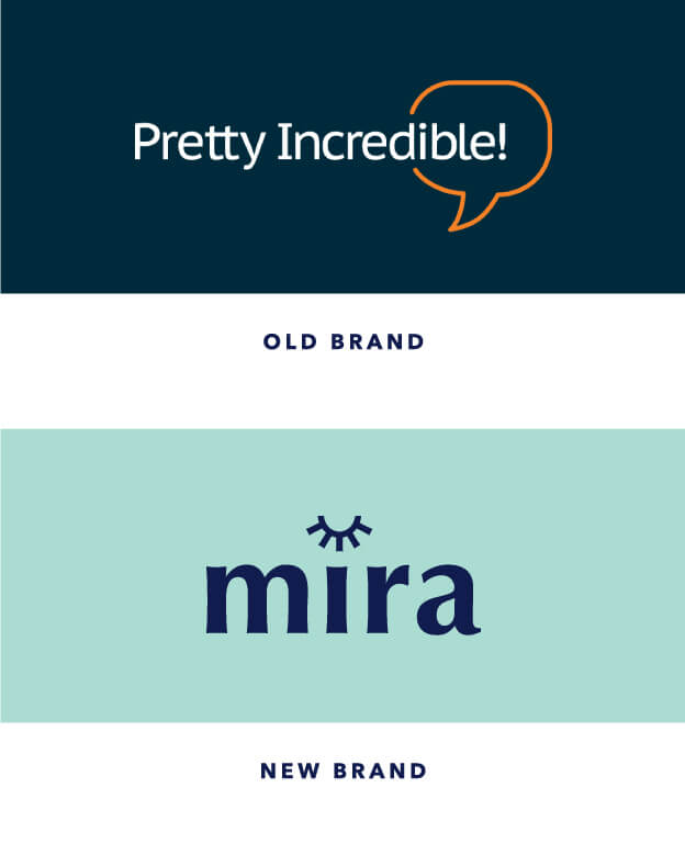
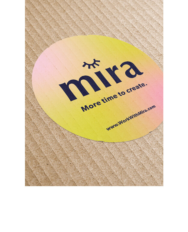
In addition, the name Pretty Incredible!, did not match the direction in which the company was headed. Changing the name was off the table at first, but after many discussions on brand direction and ambitions, it was apparent a new name was a necessary step in elevating the new brand. Mira came to life through a logo and identity that blended modern aesthetics and femininity and was able to apply consistently across all of their touchpoints.

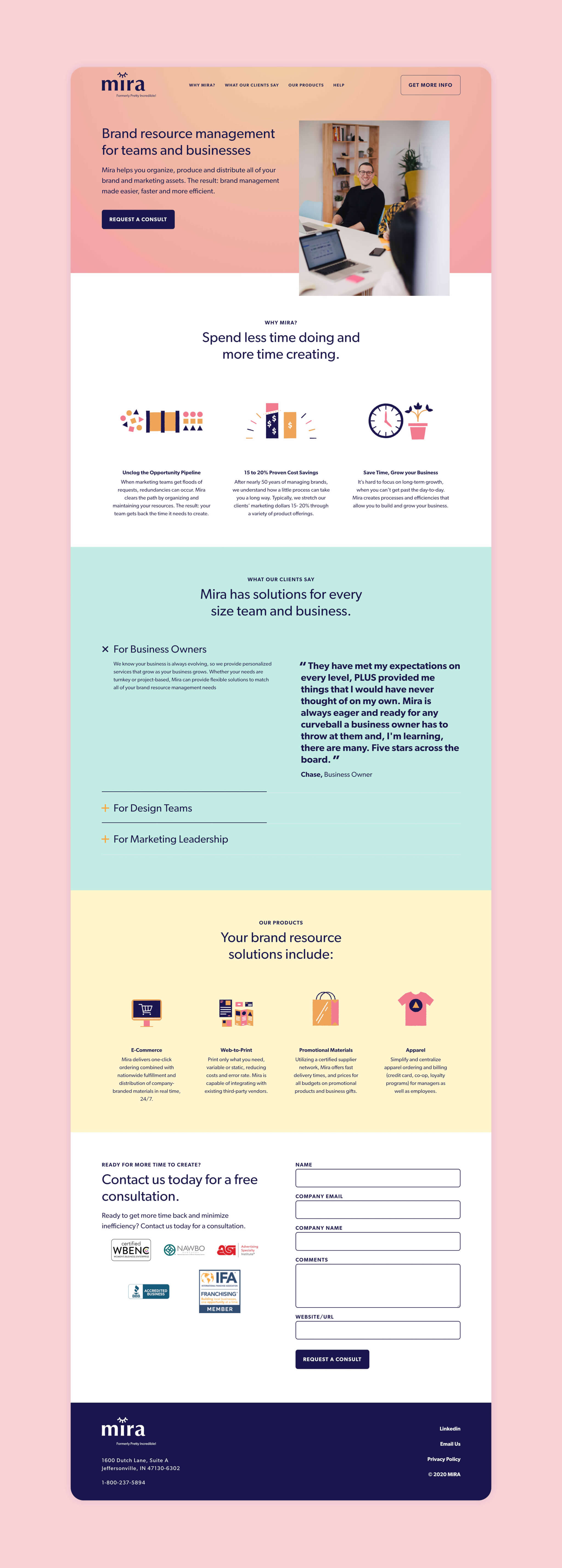
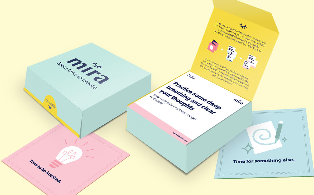
To launch this new brand, an interactive card set was created that built on the concept of giving clients and prospects more time to create. It encouraged recipients to use their newfound free time created by their partnership with Mira to find inspiration. Fieldtrip also created a user-friendly landing page that allowed Mira to collect leads and explain their services to clients.

A round, yellow-pink gradient sticker on a ribbed brown surface displays the text mira with an eye illustration and the slogan More time to create. The website www.WorkWithMira.com appears at the bottom. A hand holds a clear light bulb against a pink and blue gradient sky. White graphic lines above the bulb resemble rays, giving the appearance of a shining or illuminated light bulb.
Abstract illustration showing various loose shapes (circles, triangles, squares) on the left, two vertical orange rectangles in the center, and grouped shapes (pink circles, orange squares, navy triangles) on the right. Illustration of two vertical bars, one purple with three dollar signs and one orange with a single dollar sign. The purple bar is taller and partially shaded at the top, with lines accenting both bars. Simple drawing of a clock showing 2:00 next to a pink flower pot with a plant that has four dark leaves.

THE RESULTS

Giving clients more time to create

With the launch, Mira was ready to attend trade shows and gain more prospects and prepare to reintroduce the new brand to existing clients. Current clients and prospects were enamored with the launch kit and card set. In total, they gained approximately 900 leads and a much clearer direction for how to reach and convert the prospective clients.

A website landing page for Mira, a brand resource management tool, features a person working on a laptop, colorful icons, solution descriptions for teams, and a contact form on a pink background.
Four icons: a monitor with a shopping cart, brochures or website screens, a shopping bag, and a pink t-shirt with a triangle design, all on a light yellow background. A young man sits in a cozy window seat, working on a laptop. Sunlight streams through the window, and a light blue abstract graphic overlays the bottom of the image.
Two pastel-colored boxes are shown, one closed and one open. The open box reveals instruction cards inside, with the visible card reading, “Practice some deep breathing and clear your thoughts.” Other cards are spread around.