Oregon Child Abuse Solutions: Brand and Website
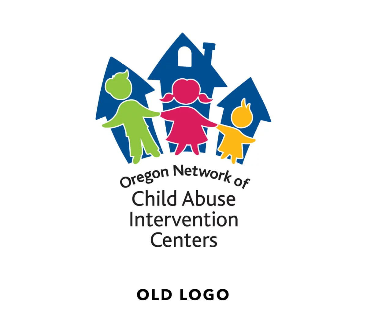
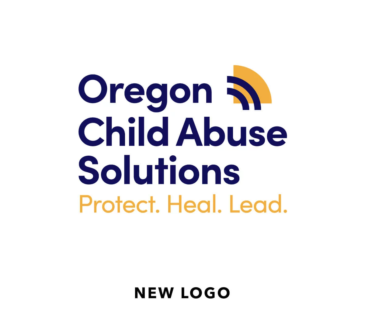
Oregon Child Abuse Solutions (OCAS) is the only statewide non-profit that fights to end all forms of child abuse. Formerly the Oregon Network of Child Abuse Intervention Centers (ONCAIC), their mission is to provide quality, comprehensive services to give children the best opportunity to grow up healthy and safe.
The Challenge
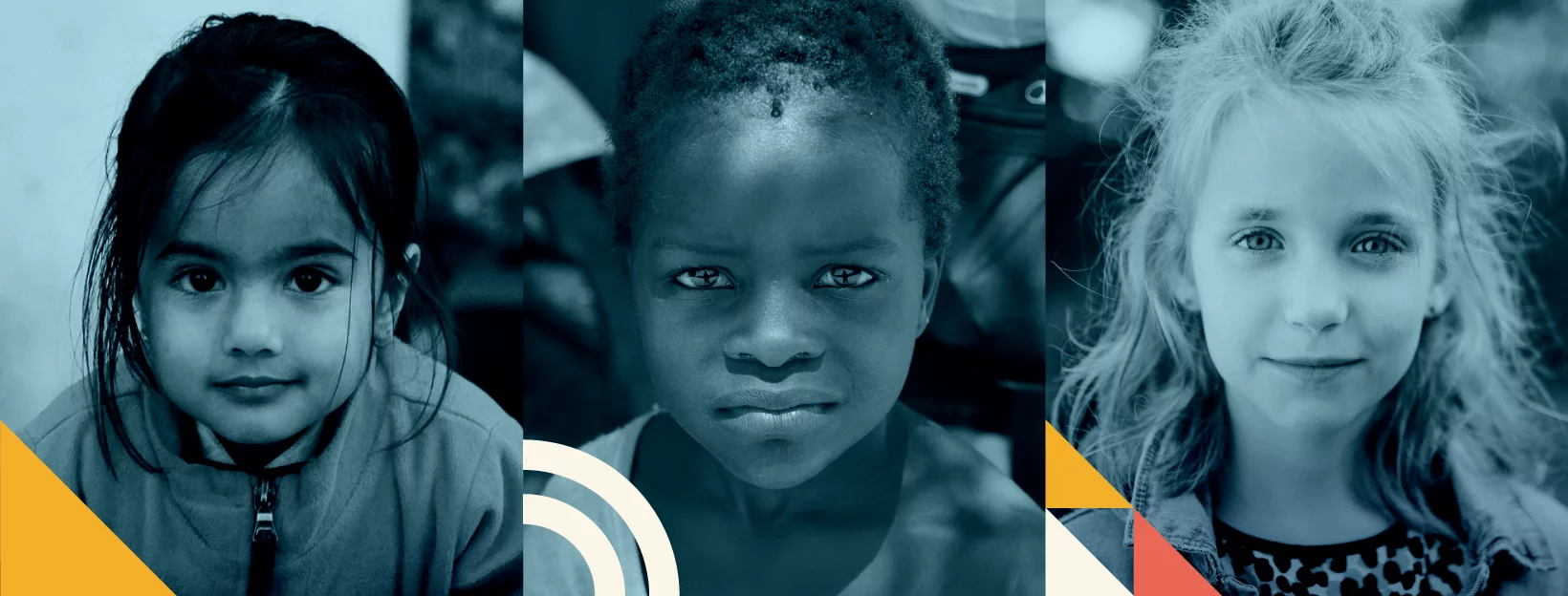
Making Oregon the safest state for kids
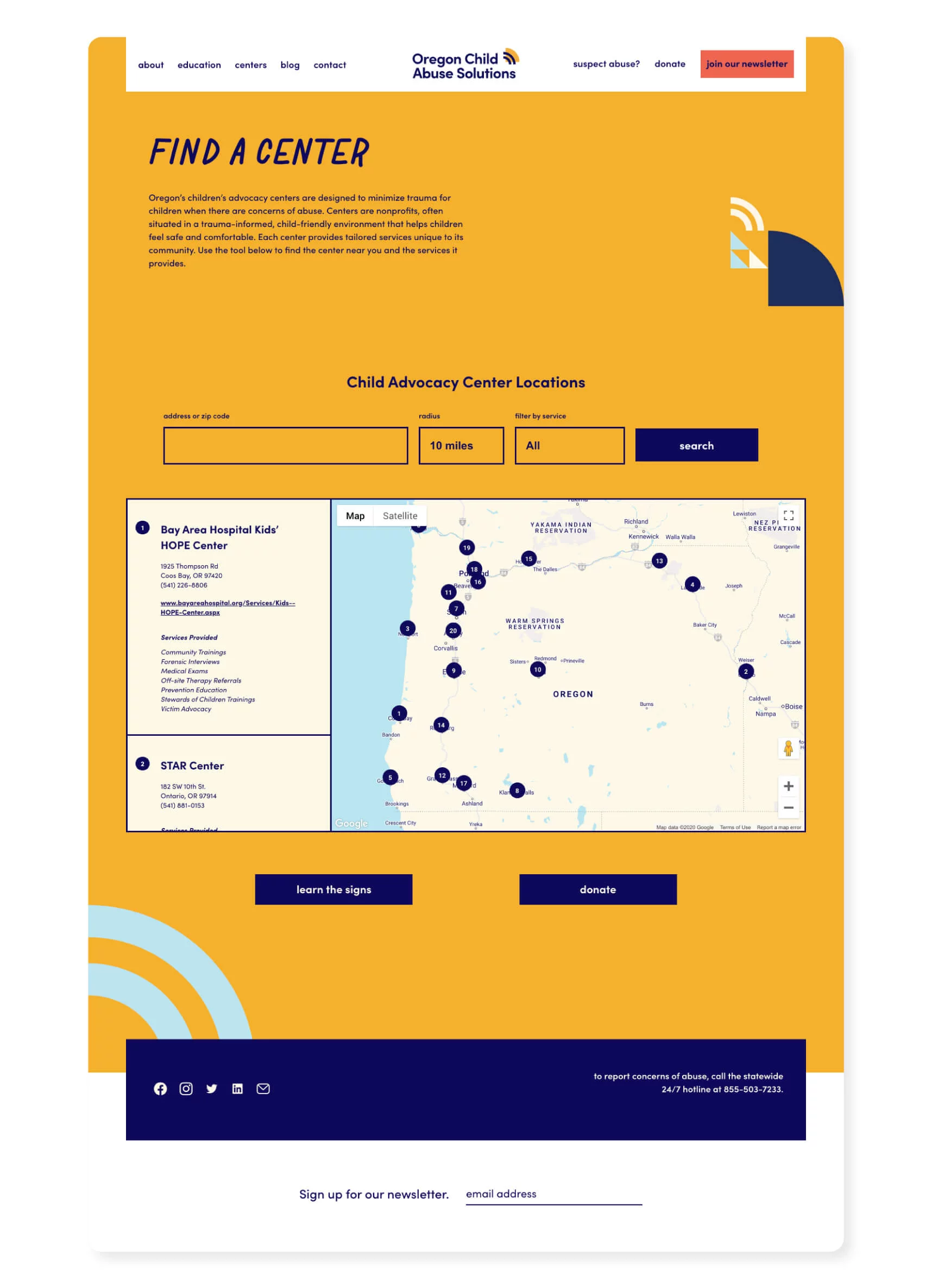
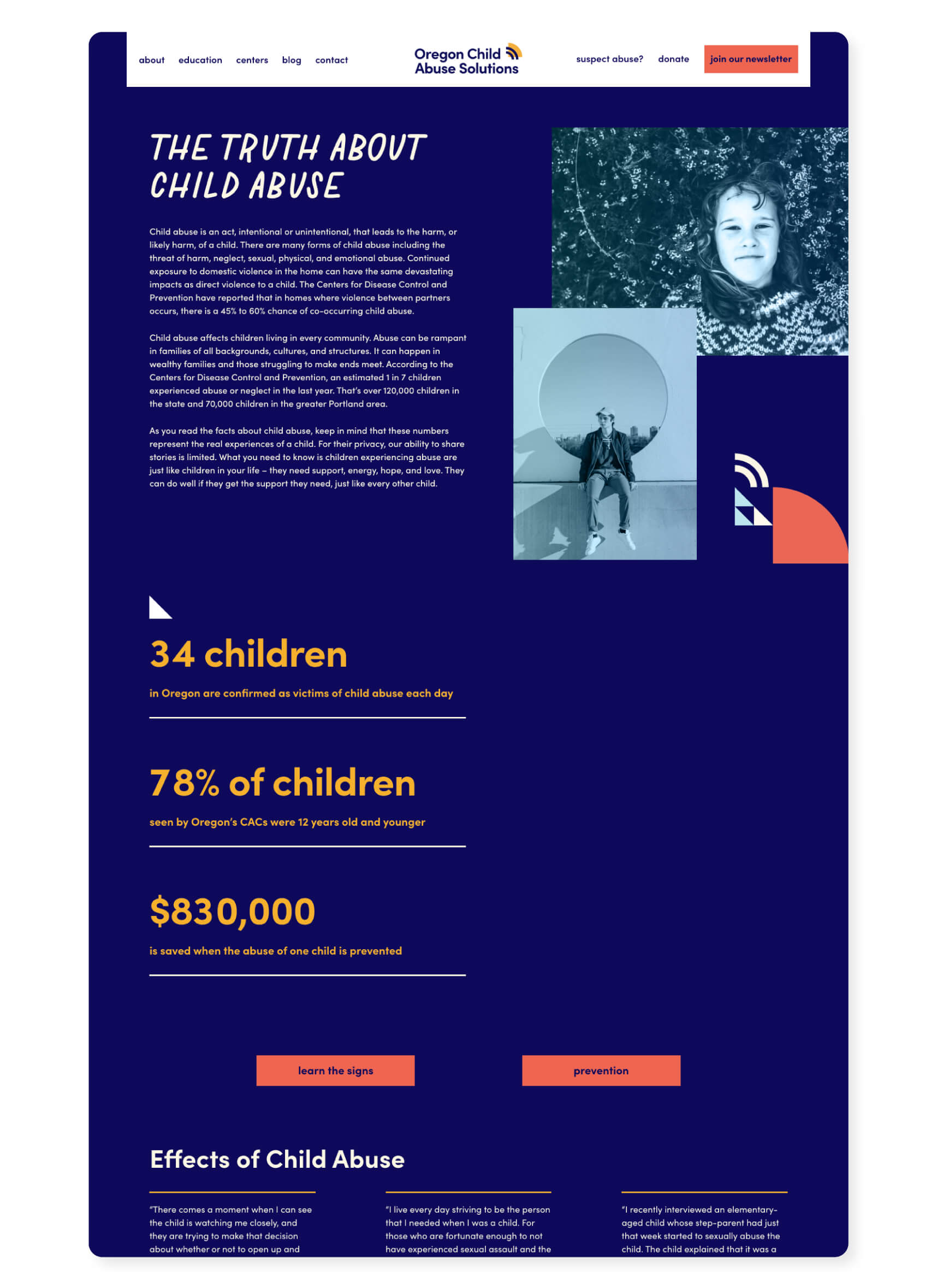
In order to make Oregon the safest place to raise children, ONCAIC needed to clarify the organization’s purpose and gain support around its broader mission. They needed to educate Oregonians about the prevalence of abuse, share proven methods of child abuse prevention, and mobilize expertise and resources in order to provide adequate care to all Oregon children. There is a stigma around child abuse and people often do not realize it is happening in their own community. A new name, brand, and website would help position the organization as the thought leader in the fight against child abuse.
The Approach
Investing in the future
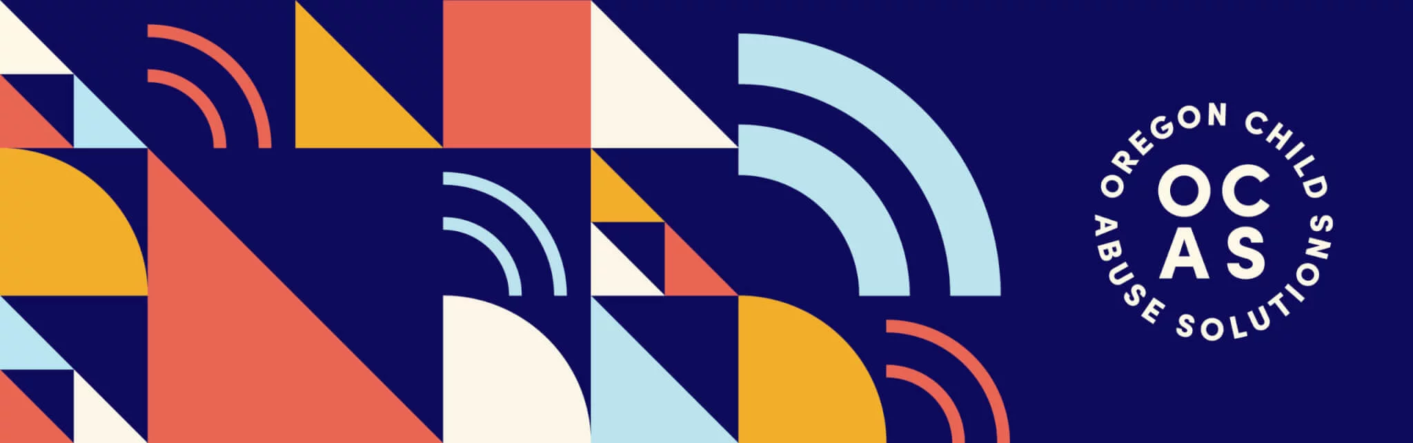
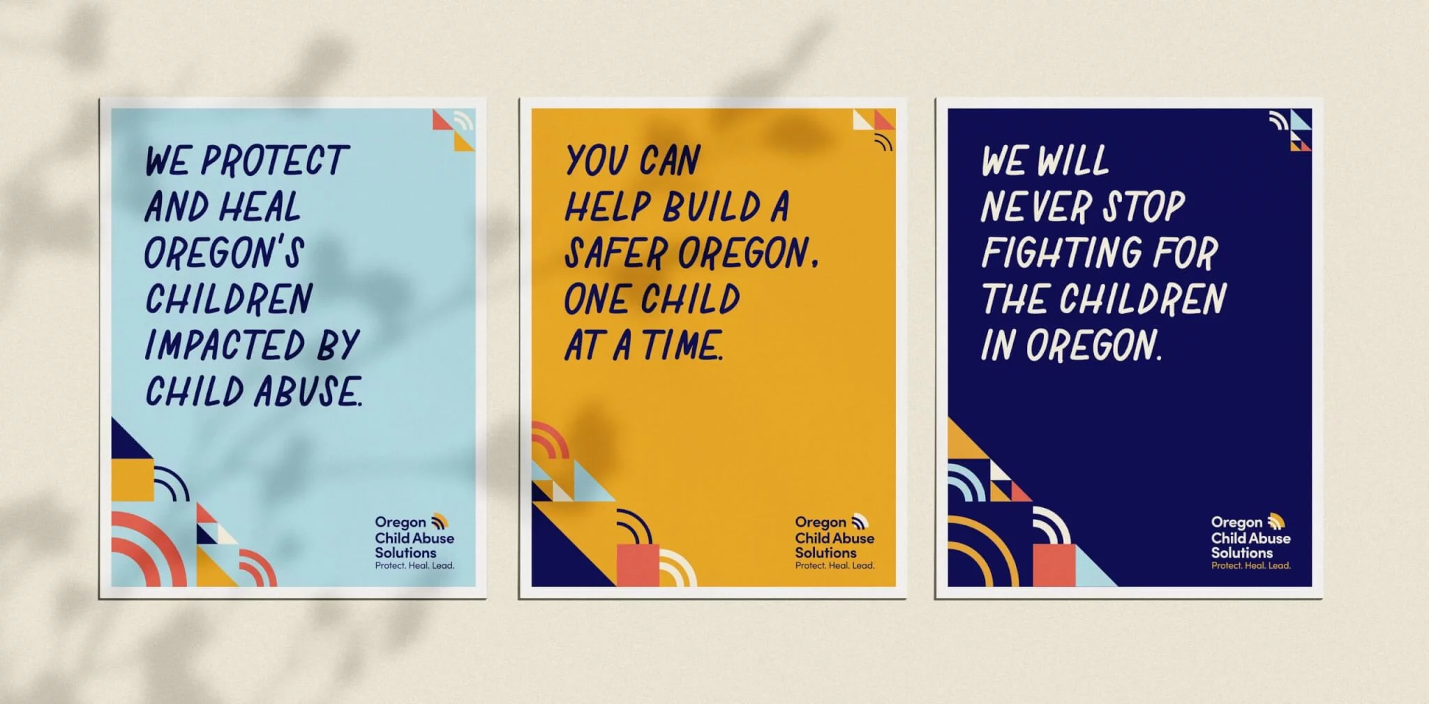
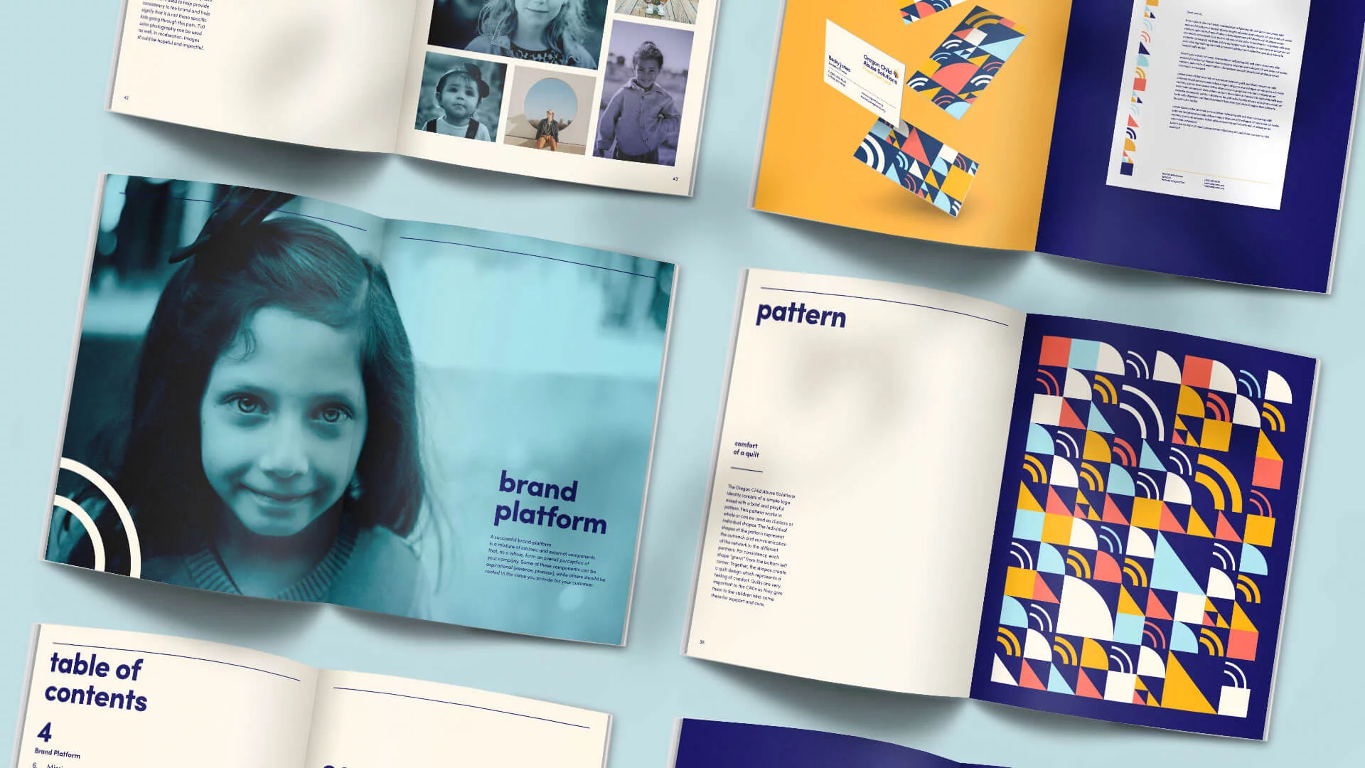
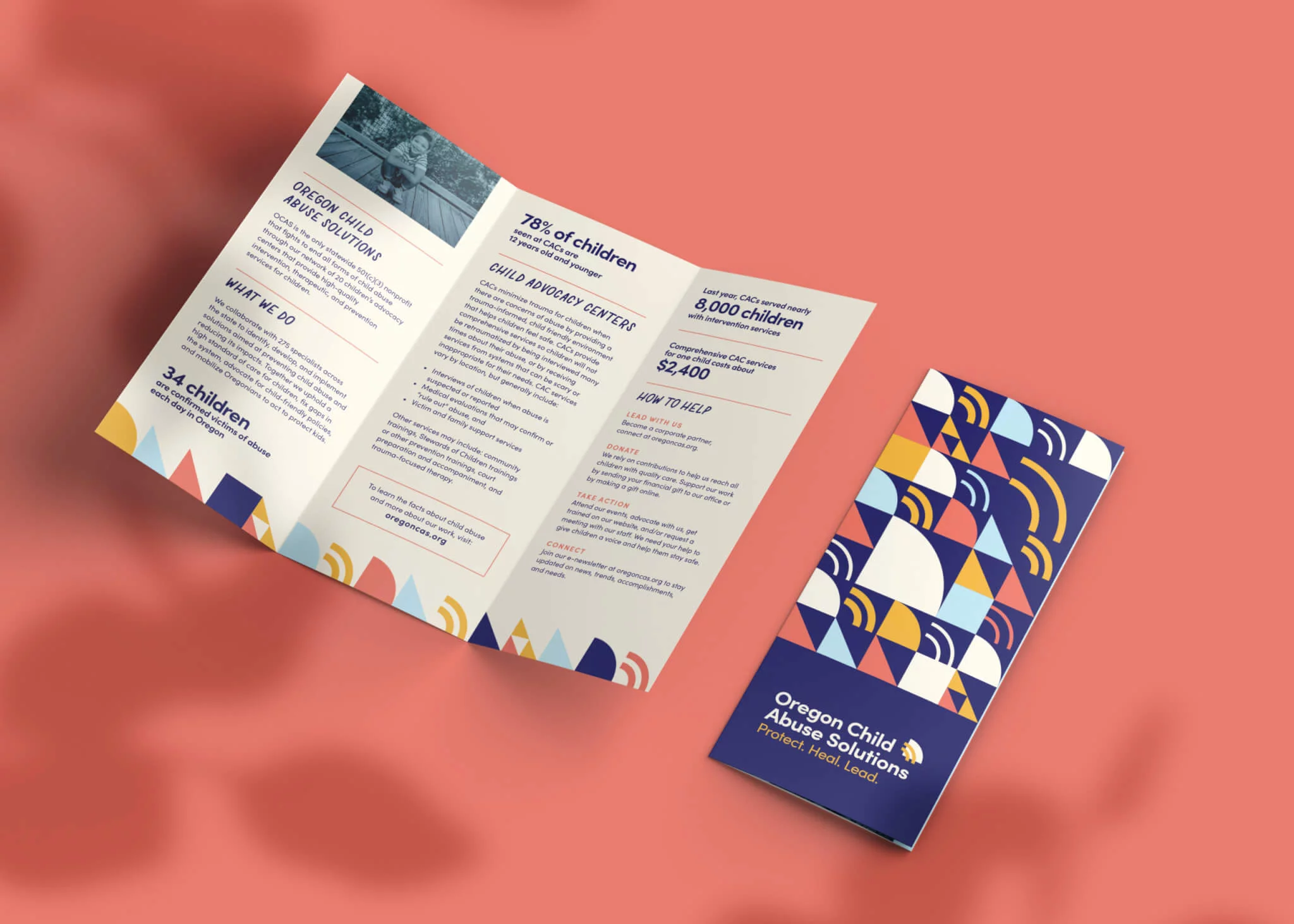
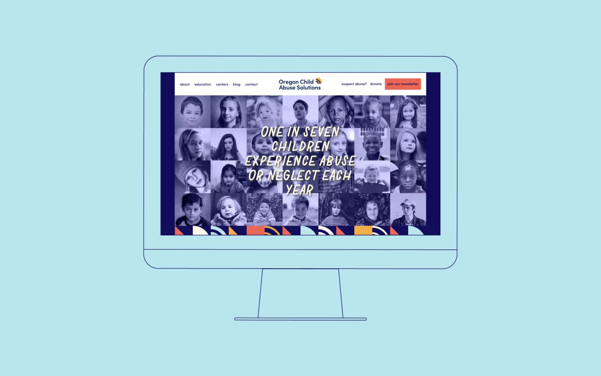
Fieldtrip began by digging in and learning about the Network through over 20 stakeholder interviews, a thorough competitor analysis, and reviewing existing brand materials. This process set the stage for a full brand platform, target personas, new name and tagline, and visual identity. The new energetic brand is built on simple patterns and shapes, and features a custom handwritten typeface showcasing the care and passion that OCAS embodies day in and day out. A new website was created to act as an educational resource and inspire change from the organization’s partners, donors, and the community at large.

The Results
Building a safer Oregon, one child at a time
OCAS is equipped with a new bold, powerful brand, website, and messaging, helping the organization stand out and reach new audiences. The increased visibility to the public and legislators doubled the organization’s annual revenue from $410,000 to $820,000. Participation in training programs jumped by 700% and training registration income increased by 500%. State legislators now understood the mission of OCAS and the organization’s role in ending child abuse. The clear, concise messages helped OCAS secure $7 million for a first-time direct state investment into child abuse response services.


Our small nonprofit failed to engage donors, legislators, and association members. We knew our mission was critical and that we had a strategic edge, but we needed more clarity, organization, and expertise to turn these strengths into a brand that compelled others to act. Fieldtrip's comprehensive process helped keep our Board, staff, and members engaged, and each stage was inspiring, insightful, and exciting. Despite time constraints and very particular stakeholders, Fieldtrip ensured we stayed on track and listened to every contributor. Now, we have one of the most compelling brands in Oregon! The brand clarity positioned us for rapid expansion, despite the pandemic.