Oro
After finding success treating addiction in their wellness clinics, Bridgeway Therapeutics looked to bring their NAD+ products to market. NAD+ is a coenzyme that humans naturally produce, but the production declines with age. Bridgeway sought to create a line of NAD+ supplements that would help with everything from sleep and cognitive functions, to aches, pains, and lack of energy.
THE CHALLENGE
Breaking through and building trust
While the supplement market is booming, NAD+ is a relative newcomer and faced an uphill battle in both recognition and building trust. Most people are unfamiliar with the product and while there are few direct competitors, it is still quite challenging to succeed in the crowded vitamin and supplement market. There is tremendous value in being one of the first brands to market, especially when you will be competing with big names and big budgets. Creating a brand architecture that could expand with product development was the first step.
OUR APPROACH
Energy and Elegance
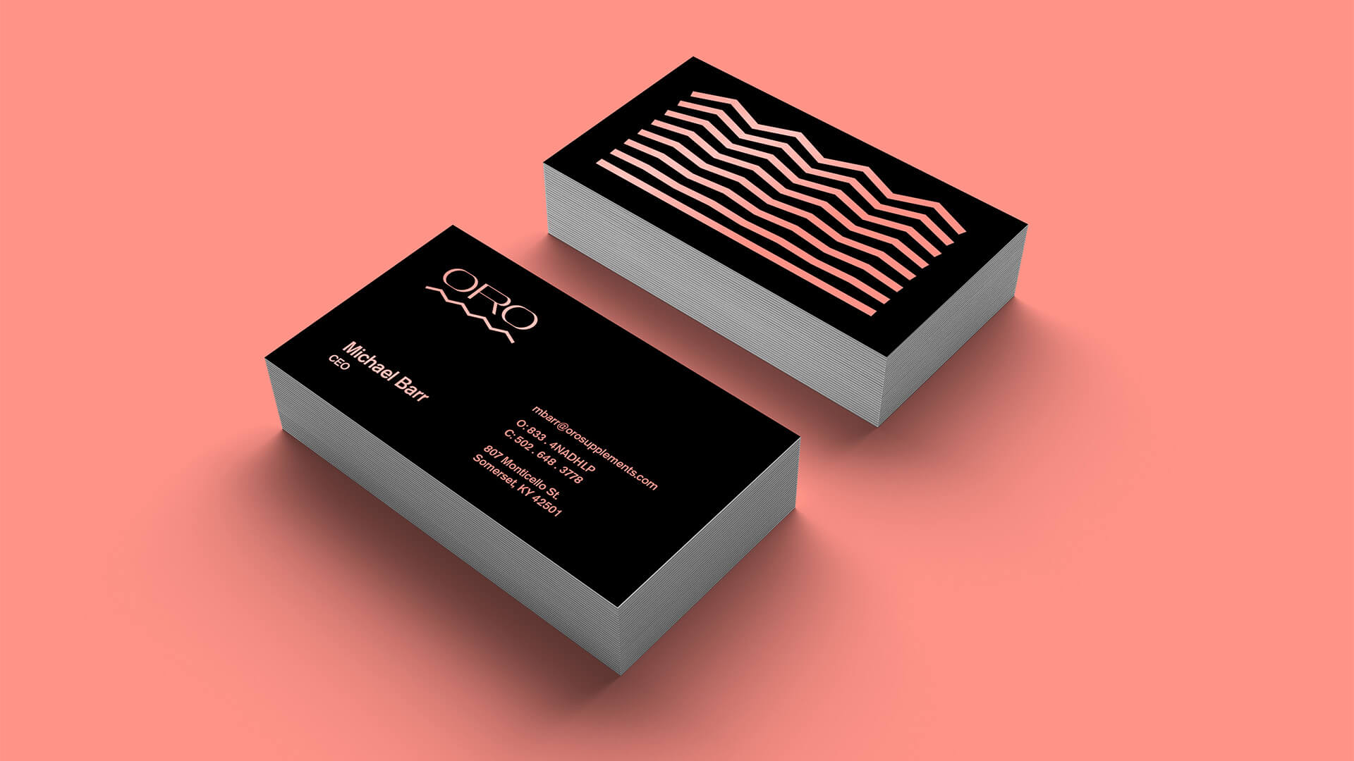
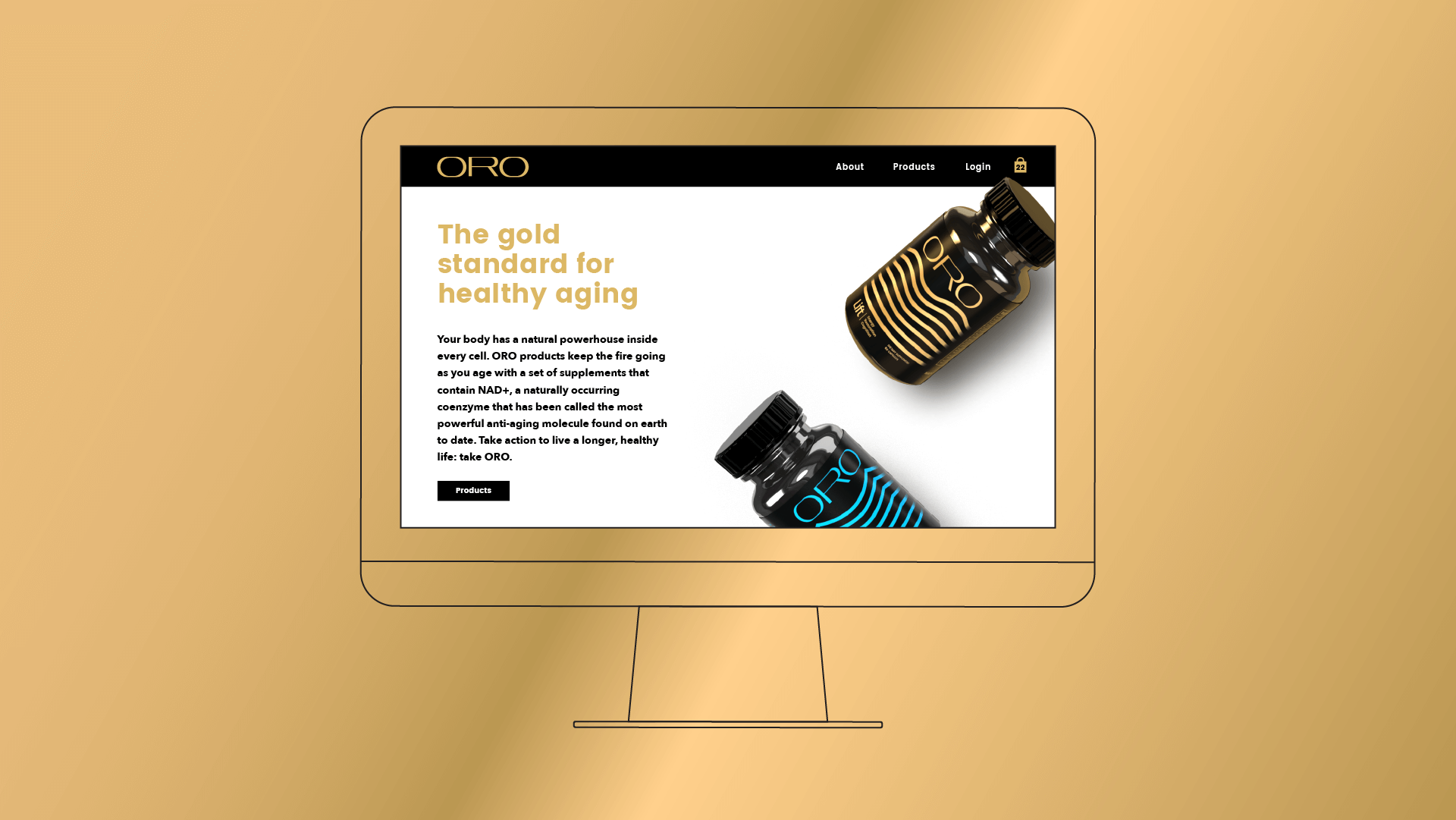
The first step was a name. The price point would be high, thus these products needed to appear premium in both name and design. The name Oro was chosen; Spanish for gold, it represented our product as the gold standard in this new category, and for customers, rejuvenating their golden years.
With the brand and product names established, the visual identity needed to be elegant and sophisticated, befitting of the product quality and consumer expectations, while bringing energy and style that stands out from the competition. In a field of scientific, sterile, white pill bottles, Oro needed to pop off the shelf.
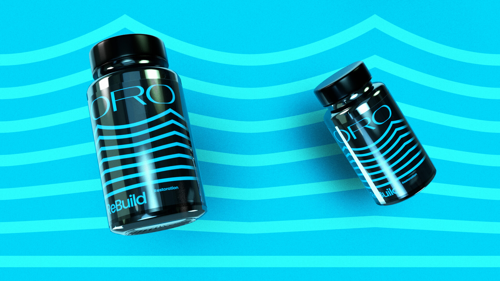
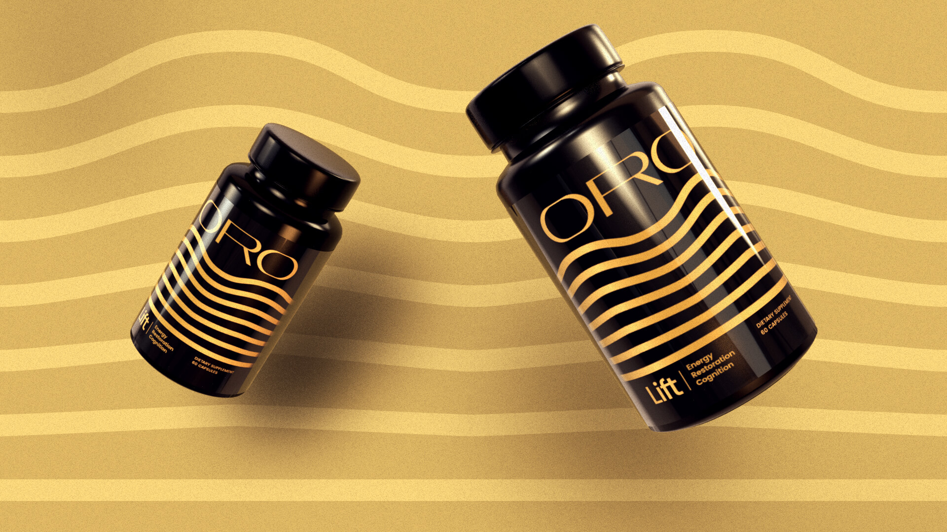
The design was themed around the gradual growth and change users would experience, with a custom wordmark created by shifting and stretching letterforms from left to right. Each product in the series would feature a bright monochromatic color scheme with a different set of waveforms, transforming from flat to dynamic at the top of the bottle.
THE RESULTS
Taking you further
Equipped with an eye-catching and energetic brand, packaging, and a website, Oro successfully launched the first two products in the Oro line, Lift and Rebuild, within a few months of beginning the process.