Vision Zero: Brand and Campaign
The Louisville Metro Public Works Department set an exciting goal: to become a part of the global Vision Zero organization by working to reduce Louisville’s pedestrian and bike fatalities to zero. It is a movement centered around user education and public works projects that make our roads and pathways as safe as possible.
THE CHALLENGE
Education and enthusiasm
The national organization of Vision Zero has not established brand standards, so after determining a name, our main task was to create a brand that stood out. The identity would need to succeed in a wide variety of situations from educational web materials to construction signs, so legibility and memorability were key. Many drivers and pedestrians lack patience for new roadworks and instructions for safer driving practices. A recognizable brand will help the public to understand that these projects were part of a larger movement and goal, and build support.
THE APPROACH
Safety and simplicity
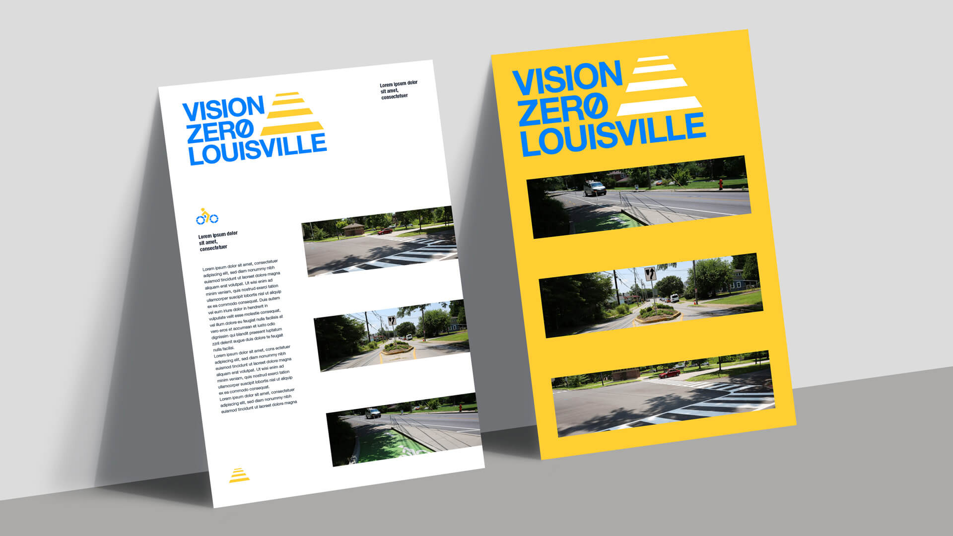
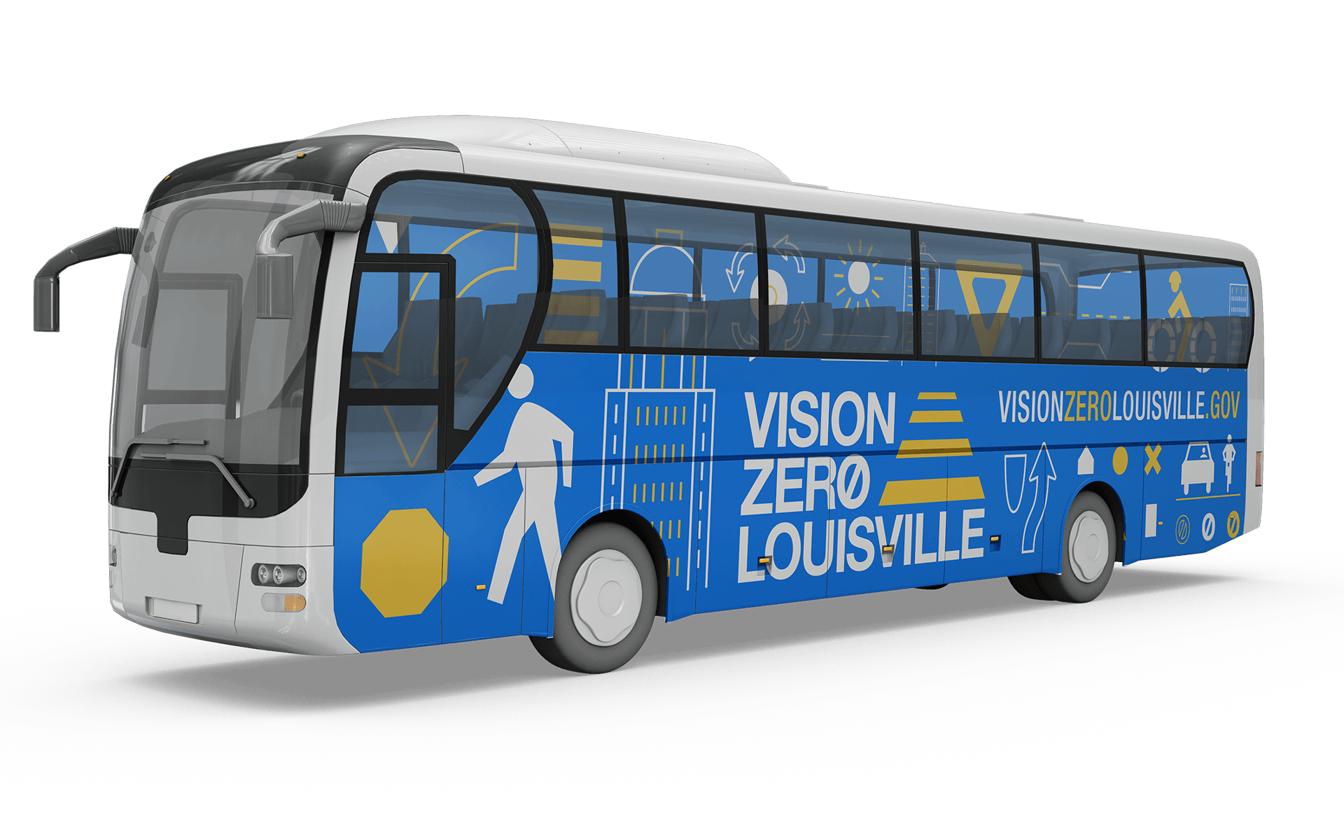
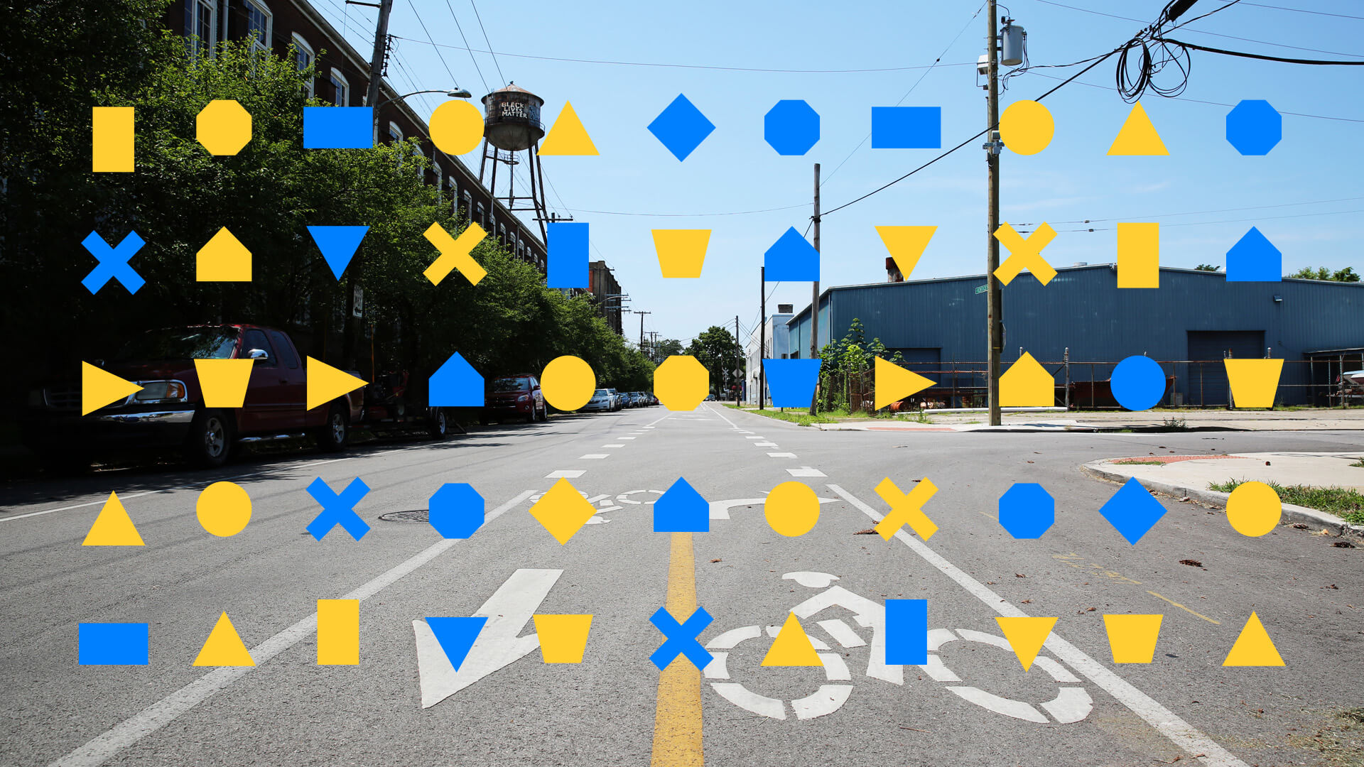
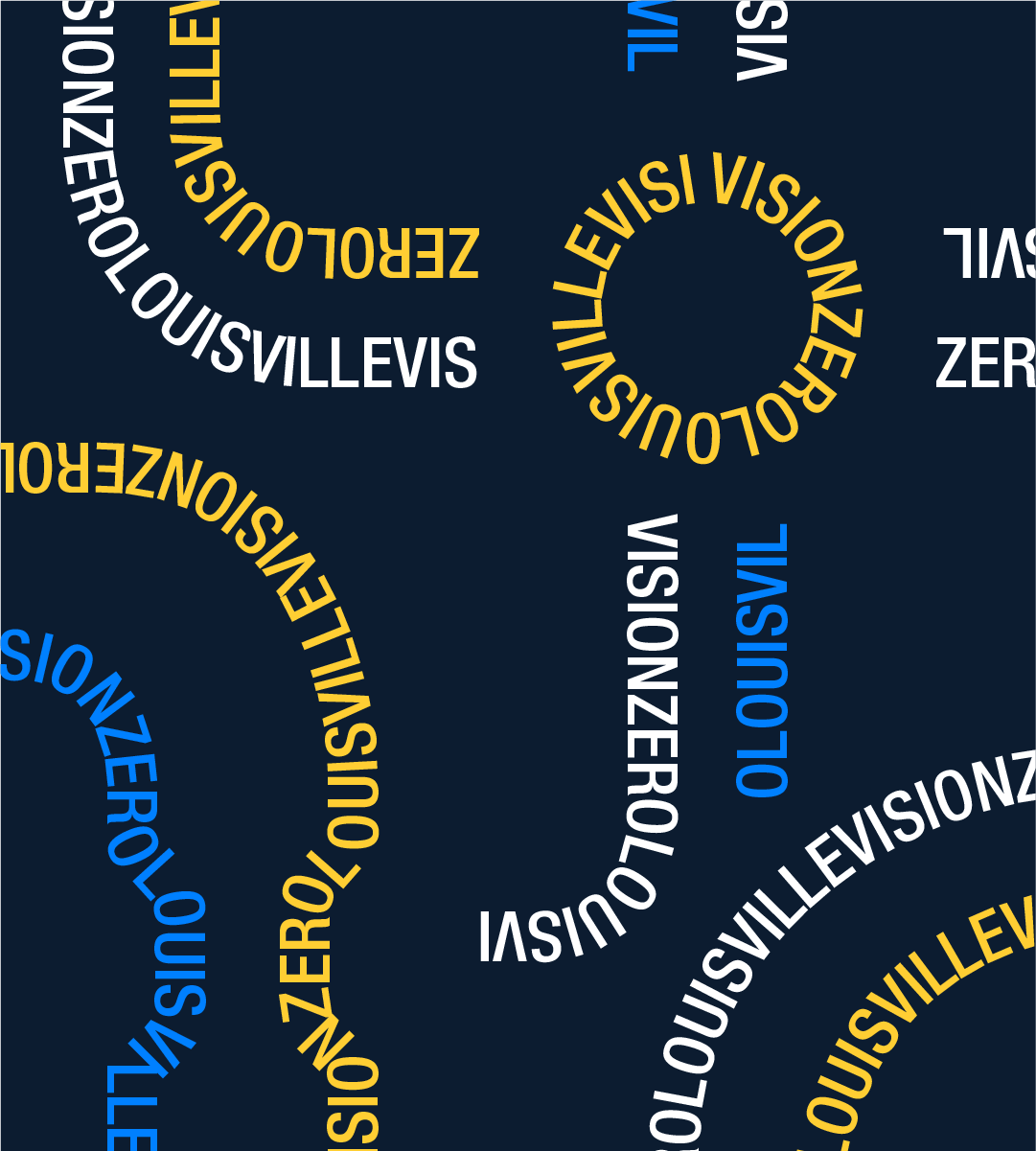
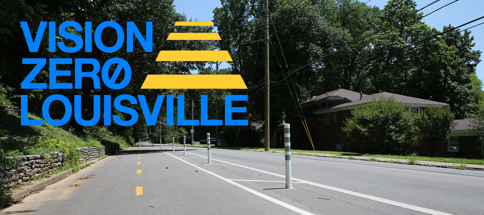
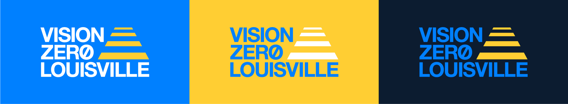
An enduring, memorable logo was needed to ensure a viewer would connect the broad scope of efforts that Vision Zero was undertaking. So a clean Helvetica wordmark was paired with a simple icon depicting a crosswalk stretching out across the road. The crosswalk is not only one of the most common recognizable designs in pedestrian safety, but it is a physical manifestation of a safe way forward. The layouts and compositions draw inspiration from Swiss typography to allow information to be presented in a clear and legible manner. A dual-color palette of warm blues and yellow echoes the city and state’s flags, but also simplifies the identity.
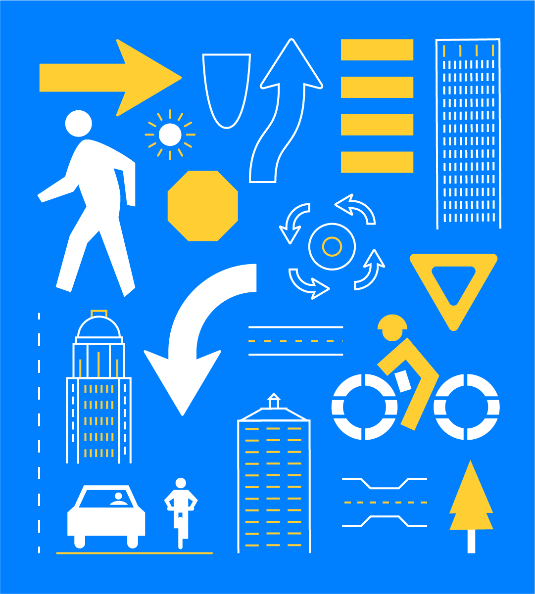
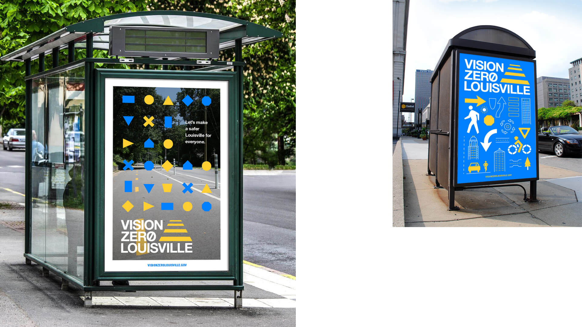
While Vision Zero needed a clean, refined identity, we sought to contrast the simplicity of the typography and palette with a lively selection of icons and illustrations depicting street signs, traffic patterns, and Louisville landmarks. These would be paired with large color fields and updated photography.
THE RESULTS
One step closer to a safer city
Equipped with a logo, colors, and visual identity, as well as a new library of photos featuring public safety roadworks around the city, Vision Zero Louisville is now able to better communicate their message, raise awareness, and increase engagement in both government and civic spaces. While the ultimate goal of a fatality-free Louisville will be difficult, a cohesive and iconic brand takes our city a big step closer.