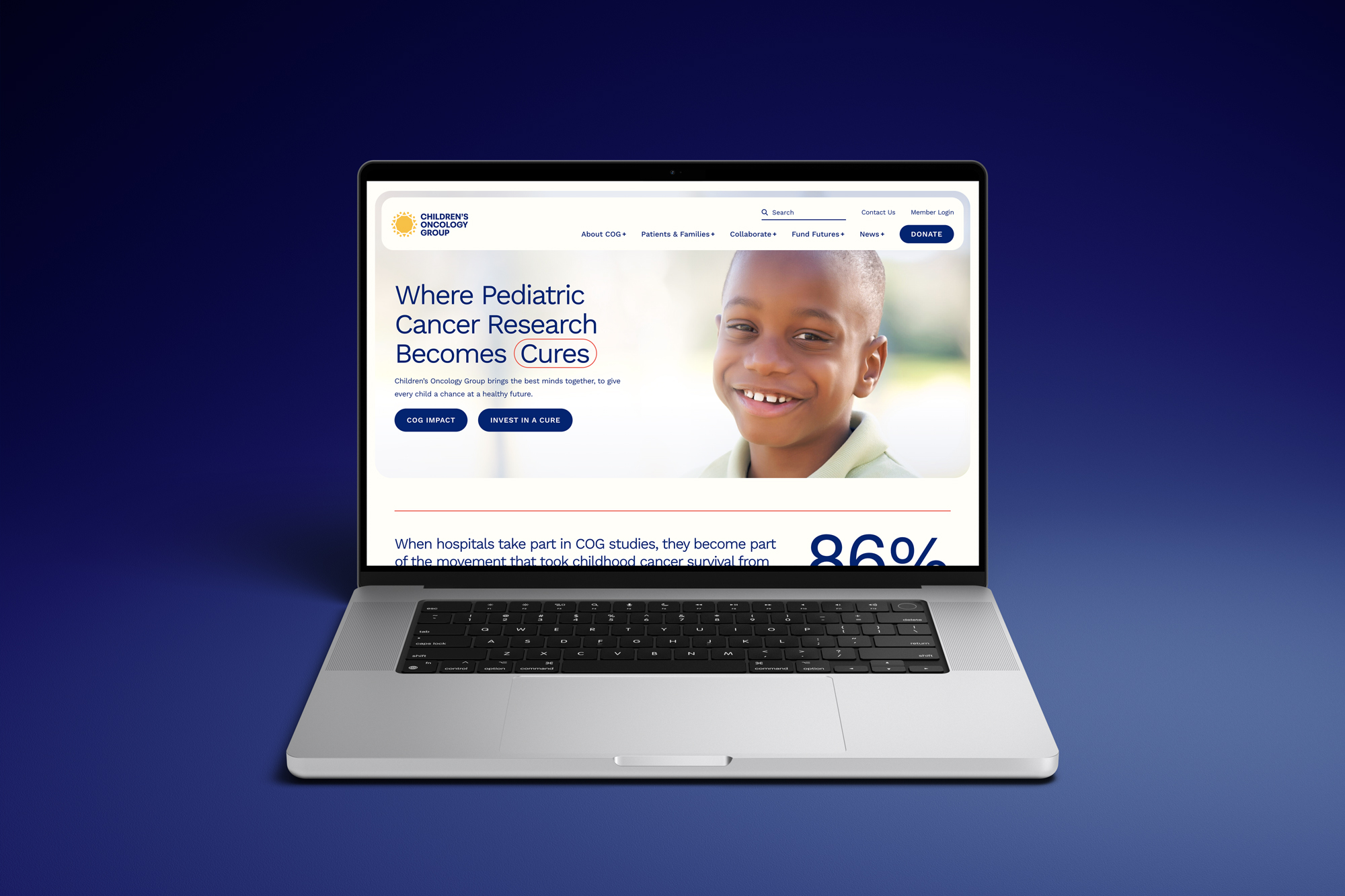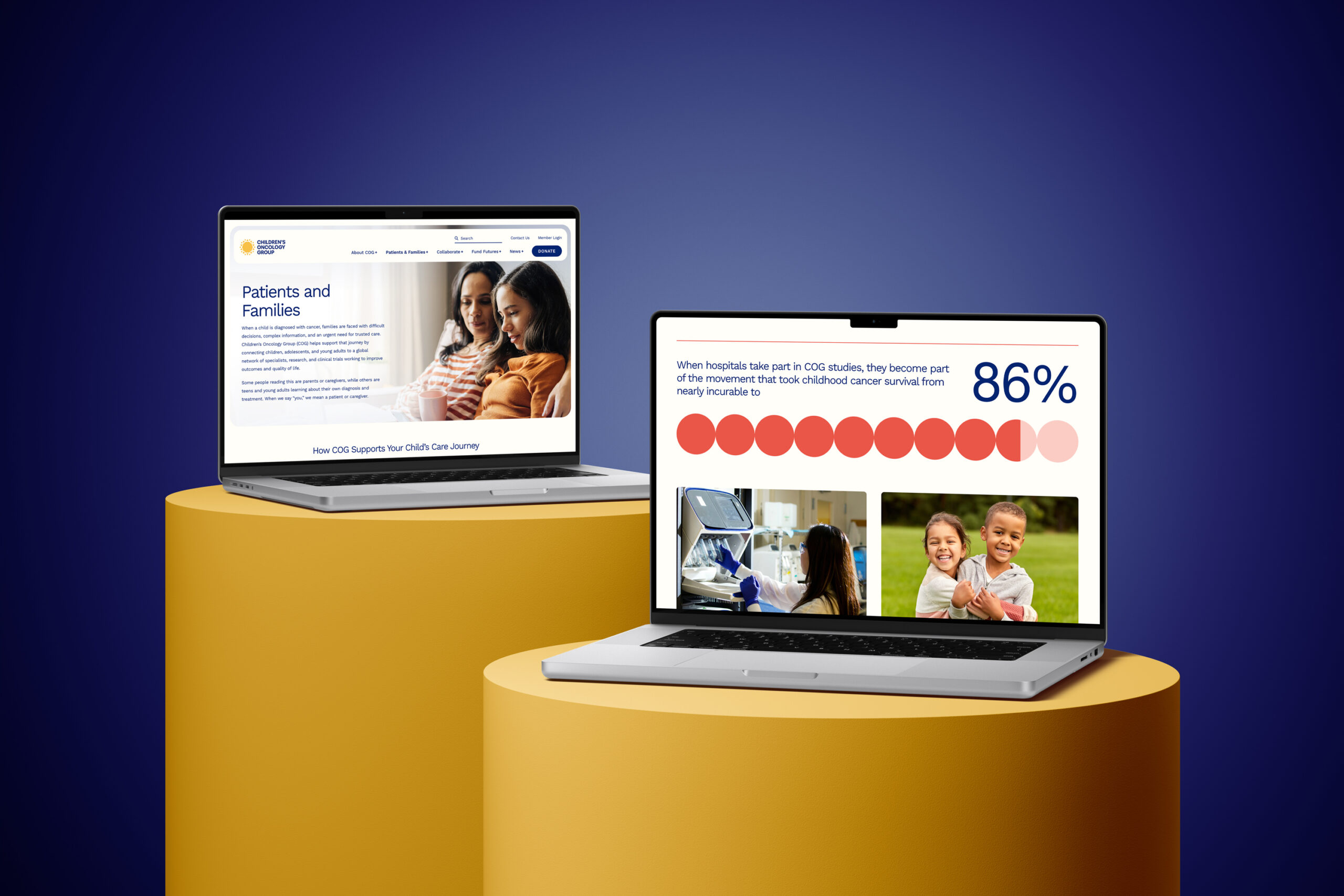
Children’s Oncology Group: Brand and Website
The Children’s Oncology Group (COG) is the world’s largest pediatric cancer research network, bringing together more than 13,000 clinicians and care providers across 220 institutions worldwide. Its collaborative research drives breakthroughs in treatment and improves outcomes for children and young adults with cancer.
The Challenge
The Brand Didn’t Match the Quality of the Work
More than 80% of pediatric cancer patients in the United States are treated at a COG member institution. Yet despite its unmatched reach and impact, COG remained a quiet giant, largely invisible to families, caregivers, the public, and potential funding partners. In many ways, it was the “best-kept secret” in the effort to cure and prevent pediatric cancer.
As changes in federal funding posed risks to this lifesaving work, staying behind the scenes was no longer sustainable. COG needed a brand that reflected its true value as the global gold standard in pediatric oncology.
The Strategy
Balance Scientific Authority with Human Empathy
Attending the Annual Fall Group Meeting revealed an incredibly passionate community of members. Pediatric clinical trials require detailed care protocols and documentation, often at a cost to the member institution. COG members commit to the demanding work of clinical trials because they truly care about the patients and the potential of their cures.
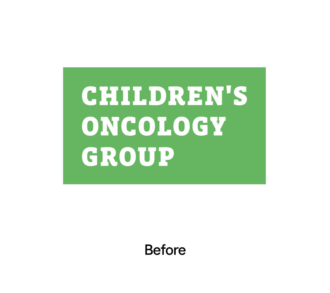
But COG’s outdated brand did not reflect that passion or authority. Even at a gathering of thousands convened by COG, the organization remained largely behind the curtain. The challenge was not to create a new story, but to help COG confidently claim the leadership role it had already earned.
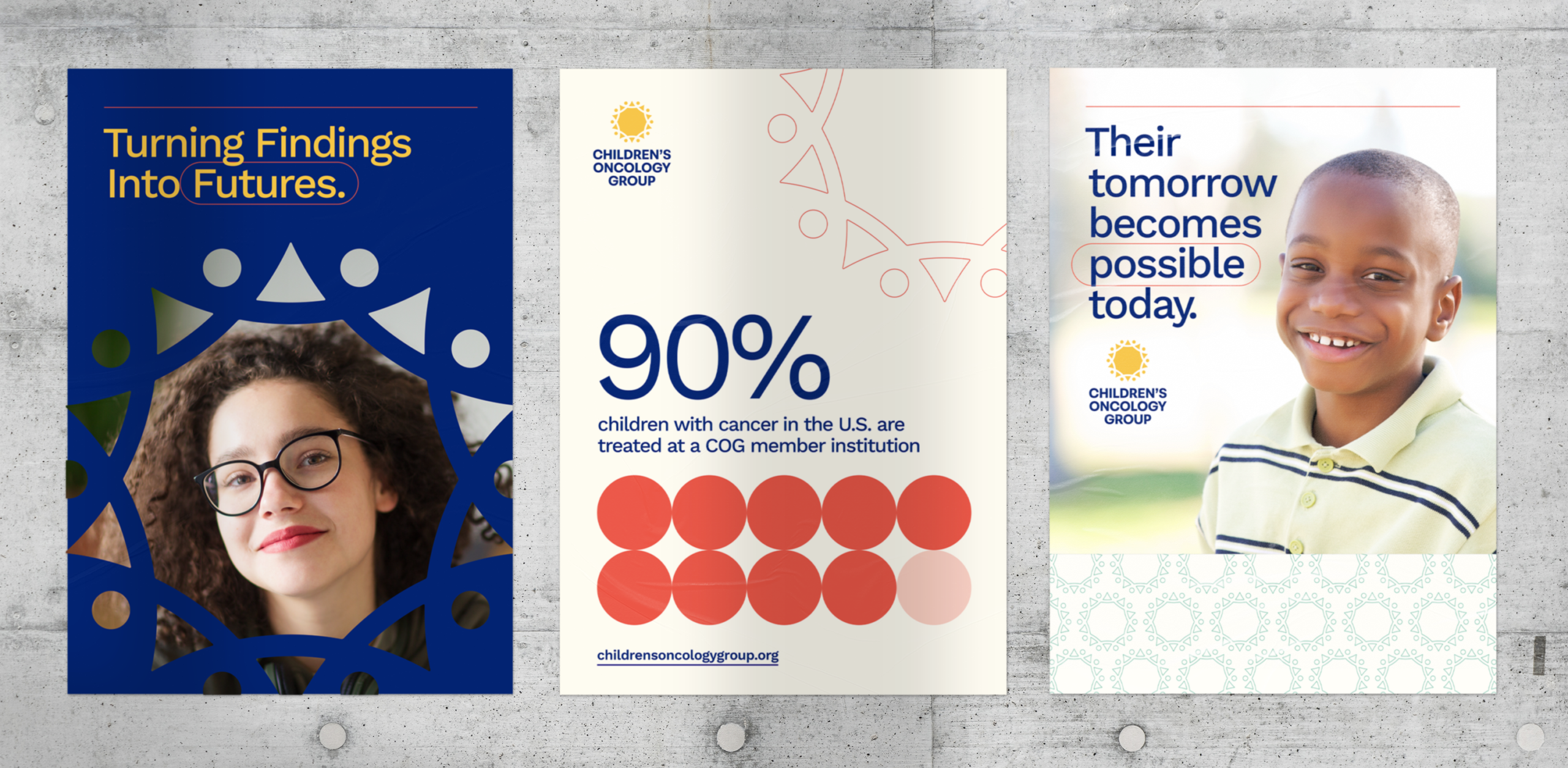
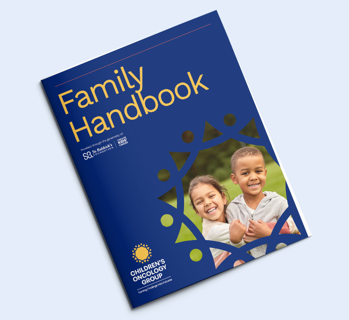
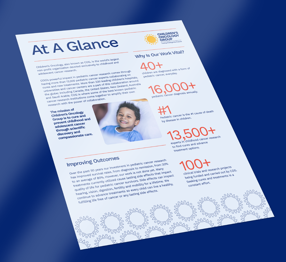
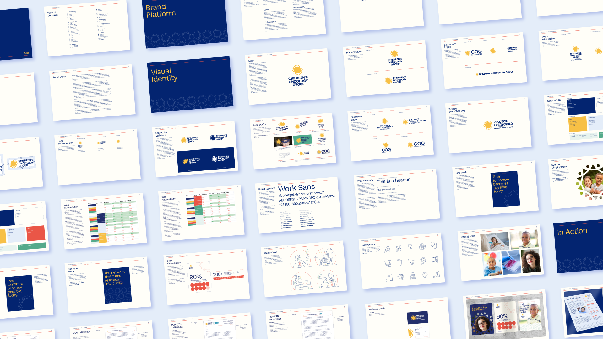
Fieldtrip led a global rebranding initiative that unified COG’s brand strategy, visual identity, and website. We built the brand around a clear strategic foundation: position COG as a leader in the fight against pediatric cancer while preserving its rigorous scientific authority, humanizing its impact, and inspiring more people to support its mission.
The brand identity represents the idea of optimism, balancing the feelings of strength and hope. The sun icon has dual meaning, representing the new days and years that COG’s research can give to patients and also represents COG’s expansive network coming together for the shared purpose of curing pediatric cancer.
The Impact
A Gold Standard of Care
Today, the Children’s Oncology Group and its new fundraising arm, the Children’s Oncology Group Foundation, are stepping forward as the organization turning research findings into cures. With a unified “gold standard of care” narrative, a clear launch plan, and practical communications tools, COG’s foundation and communications teams are equipped to build global visibility, engage funding partners and policymakers, and strengthen support for the lifesaving work ahead.