
Renegade Ventures
Renegade works with female entrepreneurs providing mentorship, guidance, and connections to venture capital. Select female-led startups will go through several weekends of in-person workshops and networking events—helping their early-stage startups develop better positioning, align strategically and gain traction as new market players.

THE CHALLENGE
Business not as usual
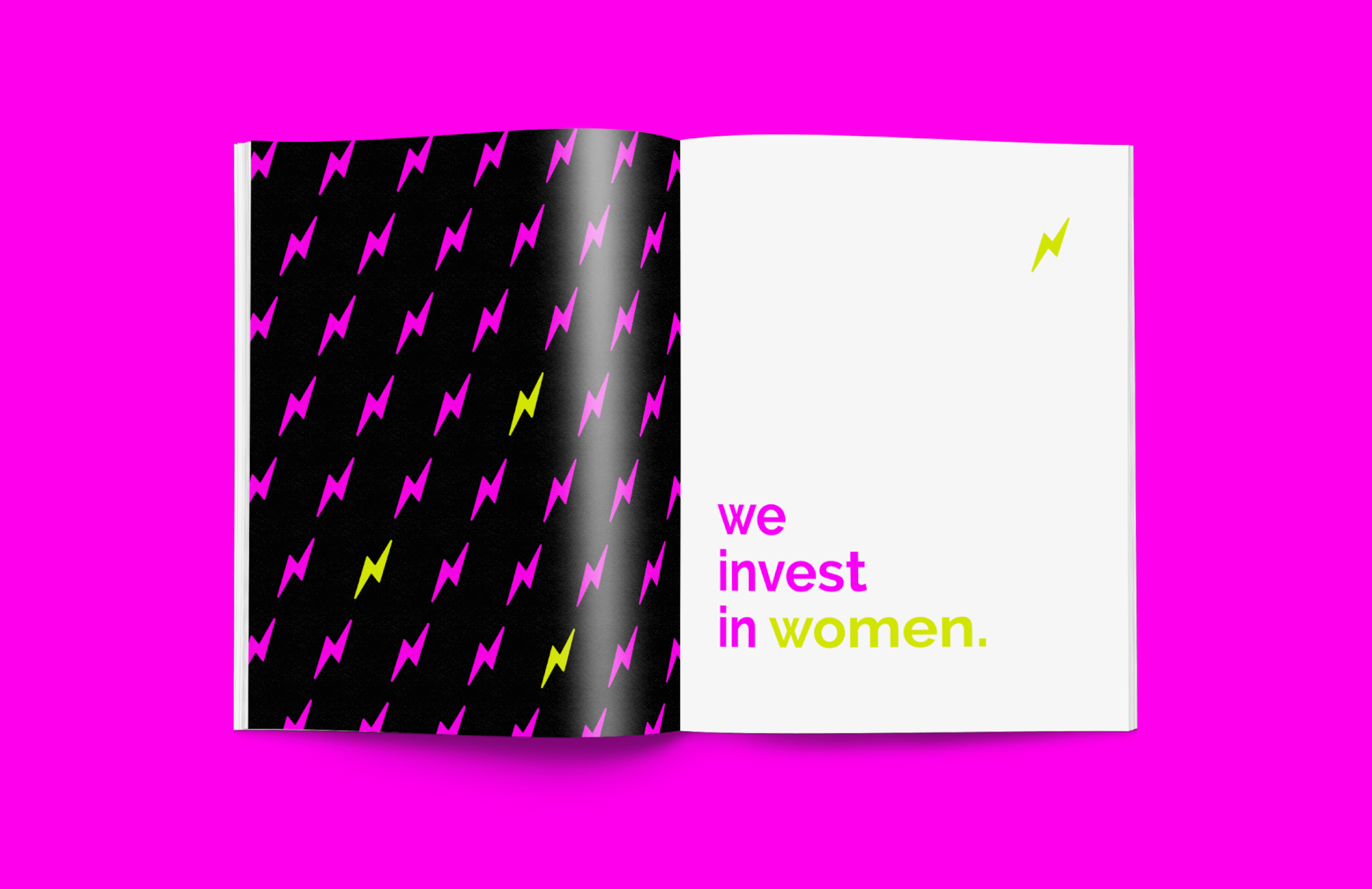
Only 2.2% of the $130 billion invested last year went to all female-founded startups, yet startups with at least one female founder raise an average of $5 million or 21% more than male-only founders. Renegade Ventures is determined to close the gap and needed a brand as resolute as the founder. The brand platform, naming and visual identity must resonate with the female entrepreneur audience and capture attention in a growing, progressive field while projecting professionalism. The Renegade brand must differentiate itself from other local venture capital programs but remain simple and purposeful.
THE APPROACH
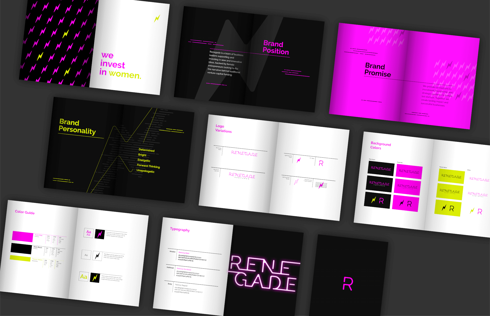
Create a simple and bold design system for female entrepreneurs
Through in-depth research of the venture capital and startup space and collaboration with the client, we built a brand platform that got to the true essence of Renegade’s mission. Along with collaborative mood board creation, we refined the initial concepts and developed preliminary names and designs that effectively symbolized the client’s vision for the brand—one of exclusivity to female business owners.

THE RESULTS
Flipping the narrative on traditional venture capital funding
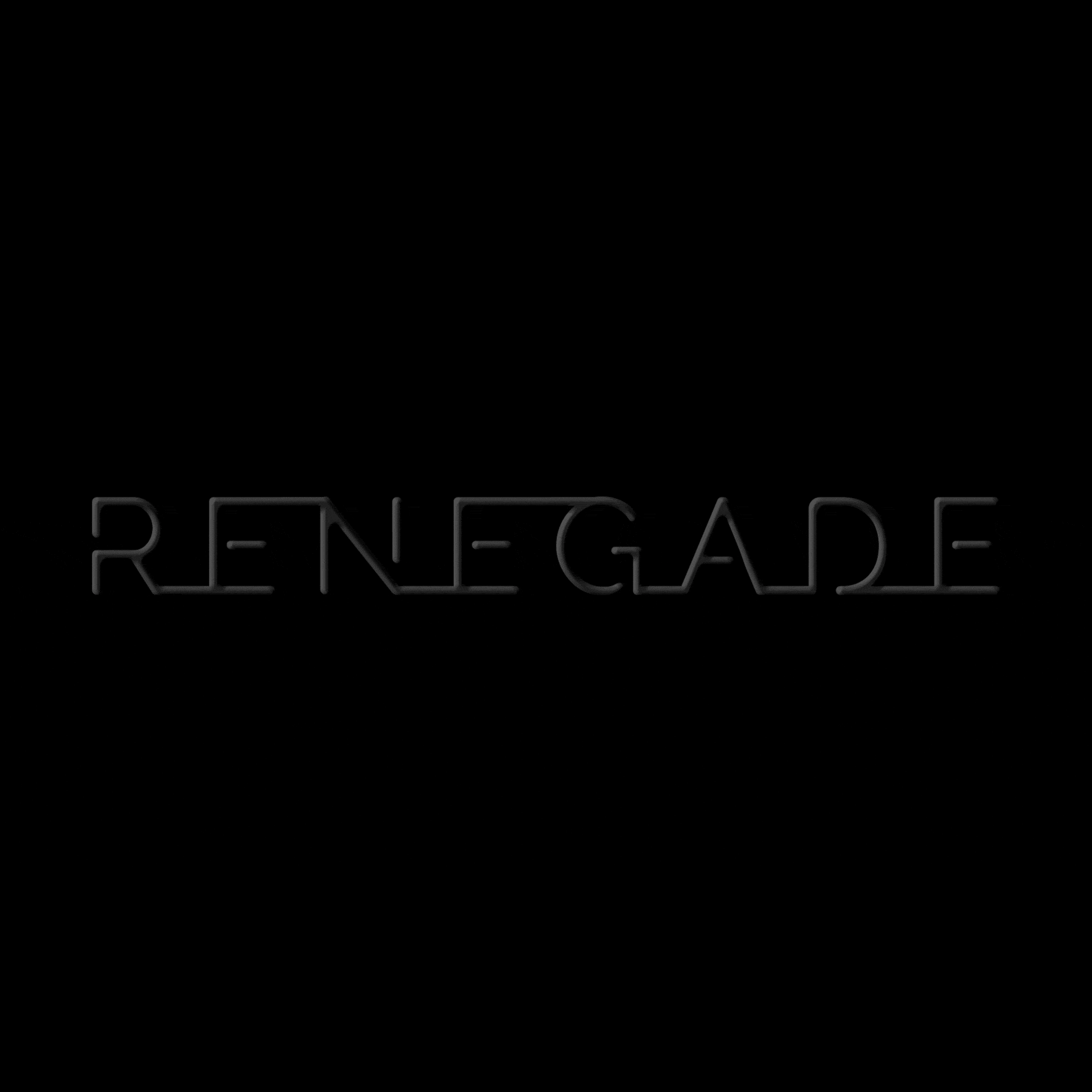
The Renegade name is a brave and direct claim to stand out in this market space. The final execution for the identity is based on neon signage—representing a confident and a literal energetic departure from existing companies occupying the startup mentoring space.


The brand turned out better than I could have ever pictured. The team at Fieldtrip was fun to work with and everyone I have shown has been impressed with the new identity.